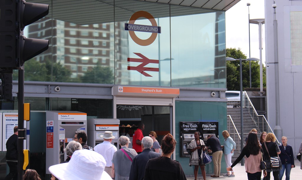
Although it doesn’t involve removing level crossings, the Mernda rail extension is being built by the Level Crossing Removal Authority (LXRA).
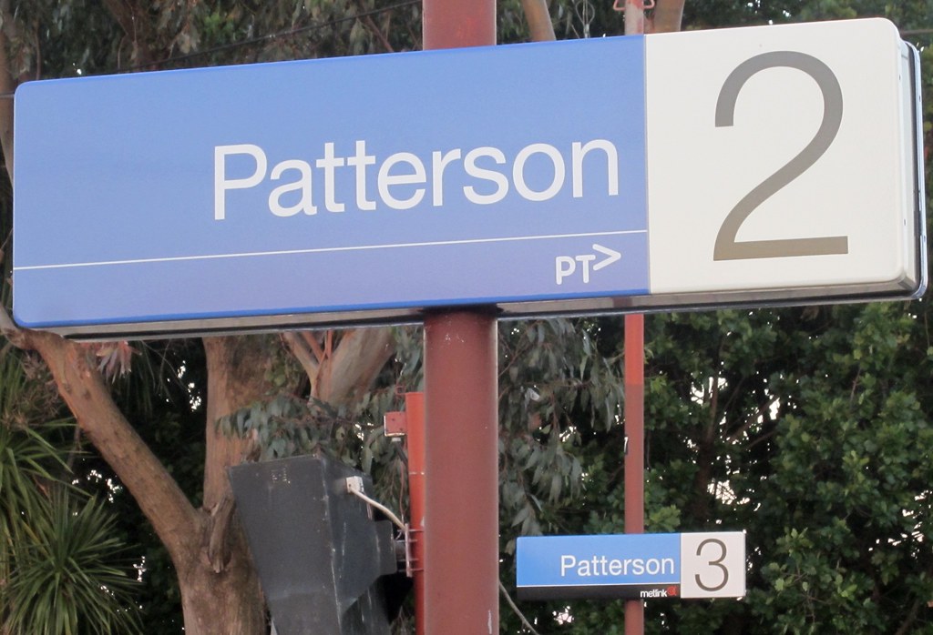
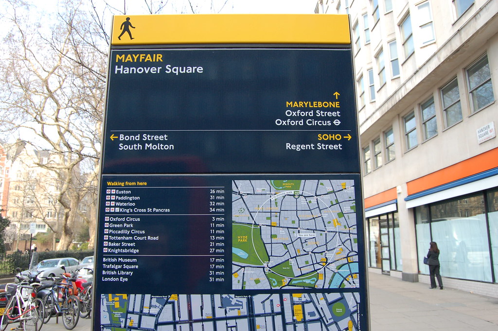
This LXRA tweet last week got some attention, and not just from those who have been long awaiting the project’s completion:
A sign of things to come #Mernda ??? #transformingMelbourne pic.twitter.com/nUc8lt4ZiF
— Level Crossings (@levelcrossings) July 6, 2018
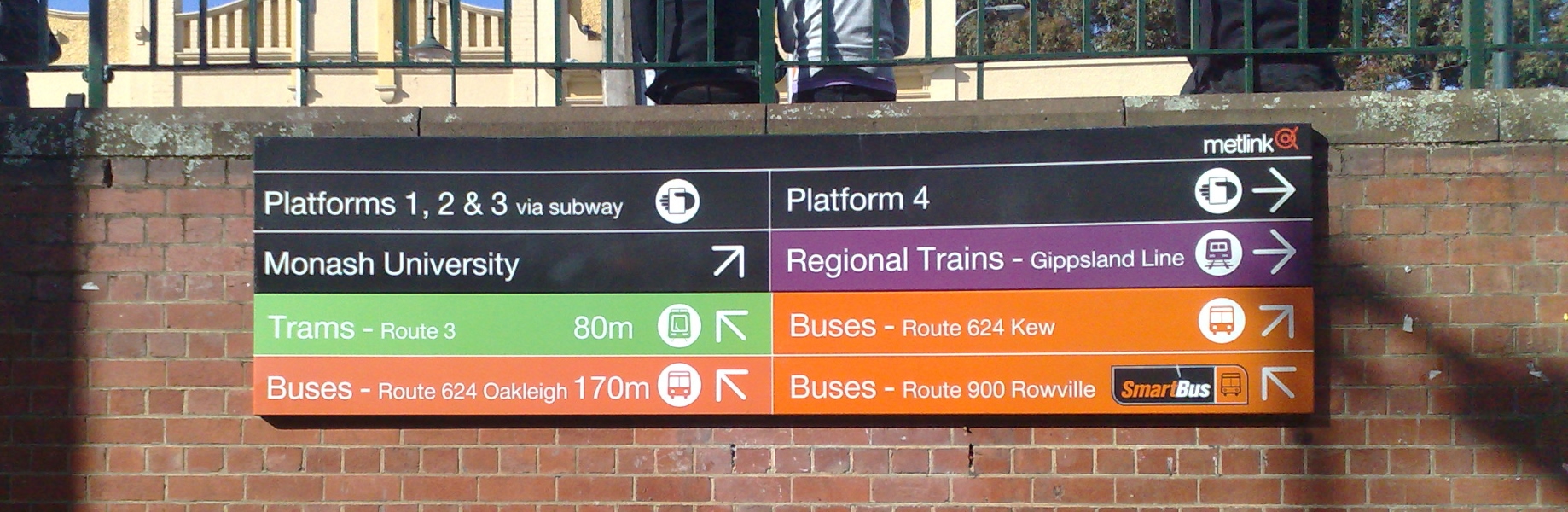
Perhaps unintentionally, the tweet text has a double meaning: the font is different from those used previously (it’s the newish Network Sans, especially commissioned for PTV) and the PTV logo, recently plastered over everything, is missing.
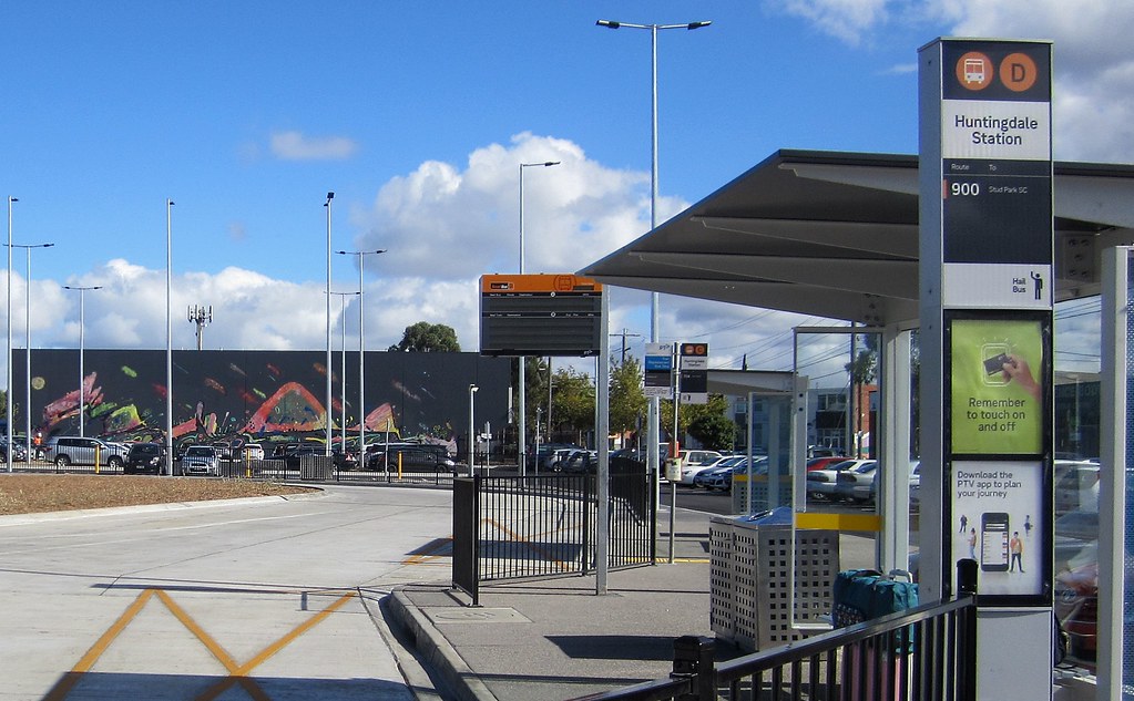
Signs in this style were also installed at the new Huntingdale bus interchange earlier this year. (“Hail bus”? Really?)
The PTV logo is also missing off the latest rail map which started rolling out in early 2017.
Okay, is THIS the final rebrand?
There have been so many public transport rebrandings over the years, most of us have lost count.
In some parts of Melbourne, just in the past 25 years, we have seen the trains branded as:
- The Met/PTC
- Bayside Trains / Hillside Trains
- M>Train (on the Bayside trains lines)
- Connex (on the Hillside lines, then across the system)
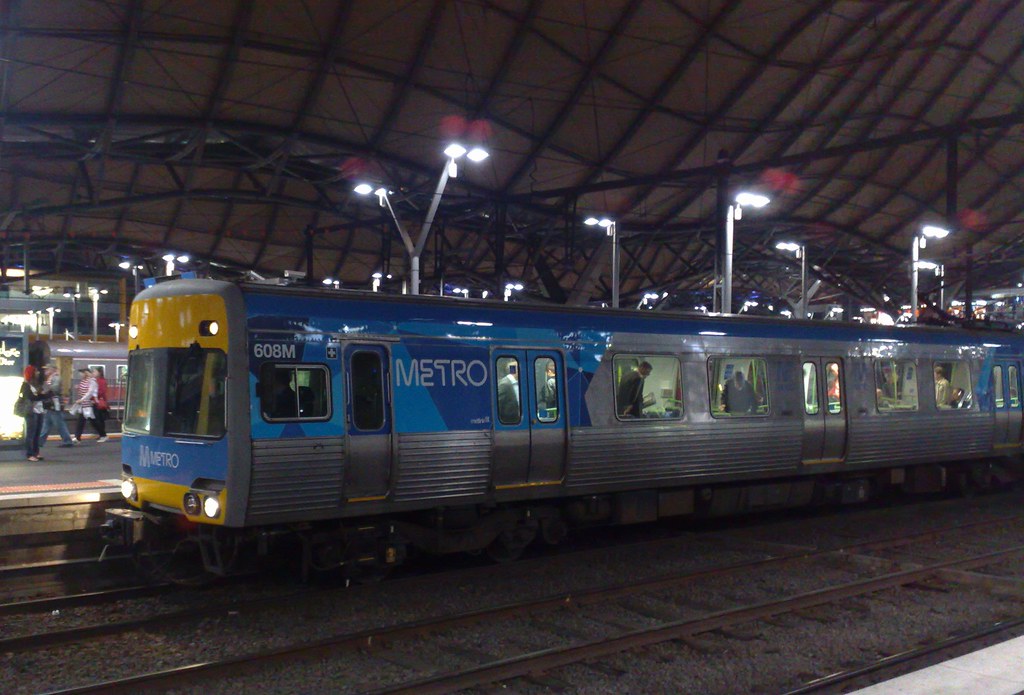
- Metro
- PTV
This is in contrast to Victorian Railways, which ran the trains from 1859 to 1983. The branding would have changed over time, but at least the name remained the same (apart from shortening to Vicrail in the 1970s).
Now what? TfV? Unclear, since the TfV isn’t appearing on these signs either.
I really hope it’s not another full rebrand. Perhaps it’s just a stripping things back to the colours, at least on station signage.
But hopefully it’s the last major change, and hopefully it’s a gradual rollout as signs need replacing, rather than a huge expensive fast replacement.
Where did the colours come from?
The modal colours — green for trams, orange for buses, blue for trains, purple for V/Line — were devised around 2003, and introduced with the Metlink (and Viclink) signage across the network.
The Metlink changes were a good start at unifying the branding, which had long been a complete mess, with individual train and tram operators having quite different styles of maps and signage when the system was initially split-up and privatised (1999-2004), and there had long been similar issues across the many bus operators.
The Metlink branding didn’t include vehicle liveries, but did at least put Metlink logos on everything, and made all the signage standard, with colours for each mode, and wayfinding showing connections between them.
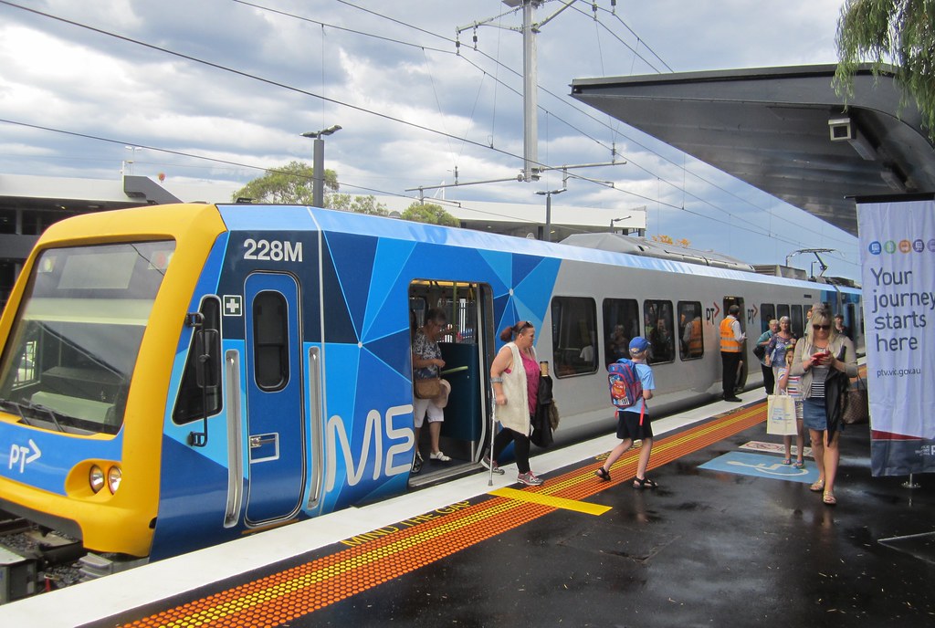
Later PTV branding expanded the scheme to vehicle liveries, by taking the Metro design and adopting it for trams and buses too.
Why did they choose those colours? Well, we don’t know for sure, but…
Green has long been associated with trams. The Met used it in the 1980s (for all modes), and this in turn harked back to the Melbourne Metropolitan Tramways Board (formed in the 1920s) which had used green initially when the St Kilda Road route was electrified in 1925, then later for their entire fleet.
Blue was used as the main colour for the Victorian Railways, first introduced in 1937 on the Spirit Of Progress, and included on the “blue” Harris suburban trains rolled out from the 1950s, and used on other pre-1980s regional carriages.
Orange was a colour used extensively across all modes of Victorian public transport in the 1970s and 80s, including prominently on the MMTB bus fleet, which might explain why it’s ended up as the Metlink/PTV bus colour.
And purple for V/Line? Perhaps they just wanted something different to the others – as far as I can make out, there is no particular precedent for using purple.
(Rumour has it that the wife of then-Public Transport minister Peter Batchelor’s liked purple.)
I don’t mind the current set of colours. They seem to work quite well, including on signage that needs to point people between multiple modes. And having been around for about fifteen years, people are getting used to them.
Logos
While Metlink had a single compact logo, which some described as a fish, PTV took over from Metlink, triggering a rebrand.
I’m not enamoured of the PTV logo, and I’m not disappointed to see it vanish off the signs (though I hope this will be a gradual phaseout as signs are replaced, rather than yet another huge expensive replacement exercise).
The removal of the PTV logo may reflect that parts of its job have been moved across to new umbrella body Transport for Victoria (TfV for short).
Let’s face it, the PTV logo was never very good. Although arguably it’s quite recognisable, in some contexts the sideways V risks being confused with a right-pointing arrow. Three letters is arguably too clumsy to use so widely and prominently.
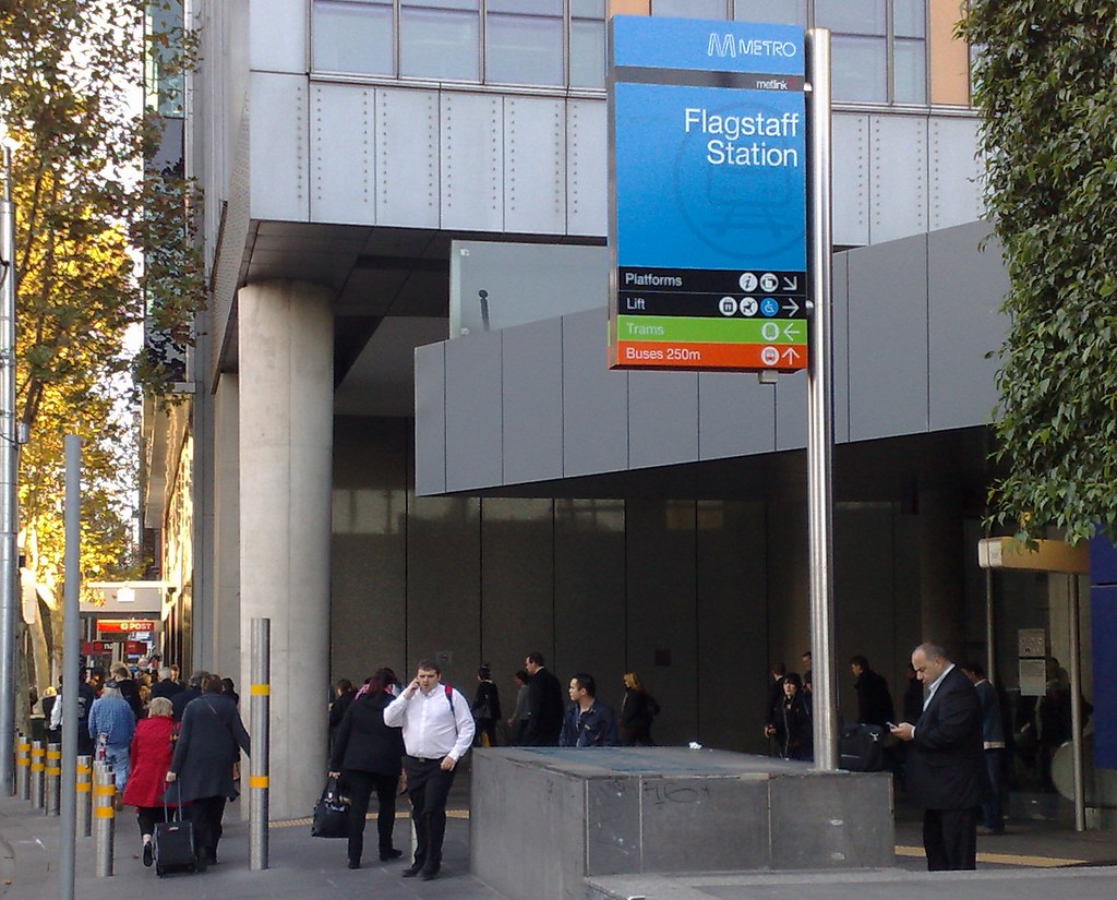
The Metro M logo (and name), for instance, is far stronger, but of course only represents one mode. Prominent blue signs on the street with a strong distinctive logo representing trains make it far easier to find a railway station when you’re in an unfamiliar place.
Alas the Metro logo has been mostly removed from the trains and stations, in favour of the PTV logo.
The Metlink squiggle logo was also the type of shape you could use more prominently and universally, though to my mind it was never terribly well recognised — perhaps it wasn’t around long enough.
If only we could come up with something simple and recognisable, and stick to it, like the London Transport logo, which originated in 1908 on the Underground, but is now used with various colours and labelling to represent the entire London transport system.
As shown above, the Brits use the old British Rail logo (dating back to 1965) to represent anything to do with the National Rail network.
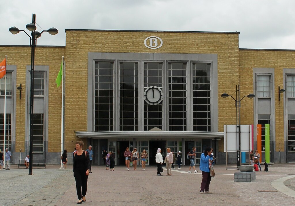
Over in Belgium, a giant B logo (used since 1936) adorns railway stations:
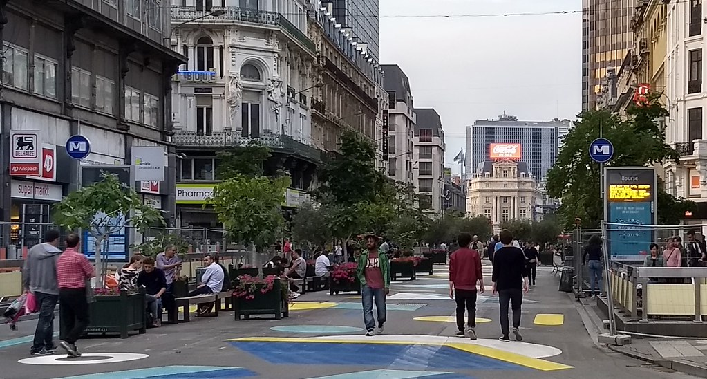
In Brussels you might be looking for the blue M of the Metro — using this letter is very common around the world:
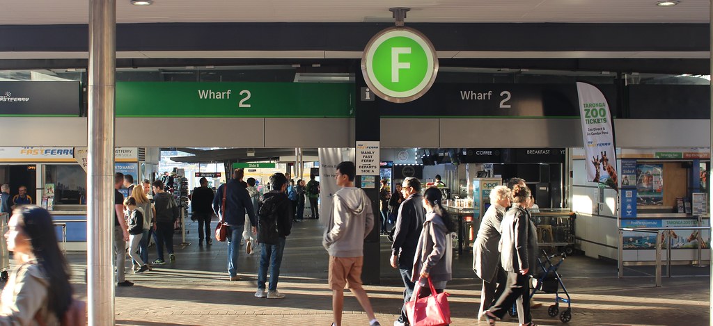
Sydney has moved to single letters to represent trains (T), ferries (F), buses (B) and light rail (L). It seems to work — the single, strong letter has potential to be very recognisable, though I’m not sure about the four different letters having so little else to unite them. But at least they have a plan, and are rolling it out progressively.
It ties into the branding of rail and ferry routes, T1, T2, F1, F2 and so on, which is quite clever; I mean to blog about this another time… though arguably the ferry routes F1, F2 may confuse some with freeways, which in NSW also use F. (I wonder if they’ll use M for the new Metro lines, or stick with T for trains?)
Is an icon better than a letter, or a letter better than an icon? Pros and cons either way.
The point is, these types of logos are very recognised, thanks to having had a long life, and a good design that you can put them anywhere and everywhere — prominently on the top of a building, or even on directional signage.
This example, part of the “Legible London” wayfinding strategy to me, very clearly communicates that there’s an Underground station nearby, because the logo matches what’s on the stations.
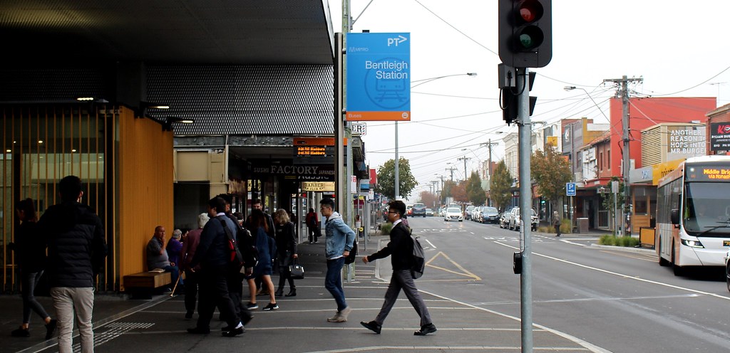
On some of central Melbourne’s wayfinding signage, the icon for trains doesn’t really leap out at you, despite it being perhaps the most important destination marked on the sign… though at least it’s the same train logo used by PTV on the signs outside stations.
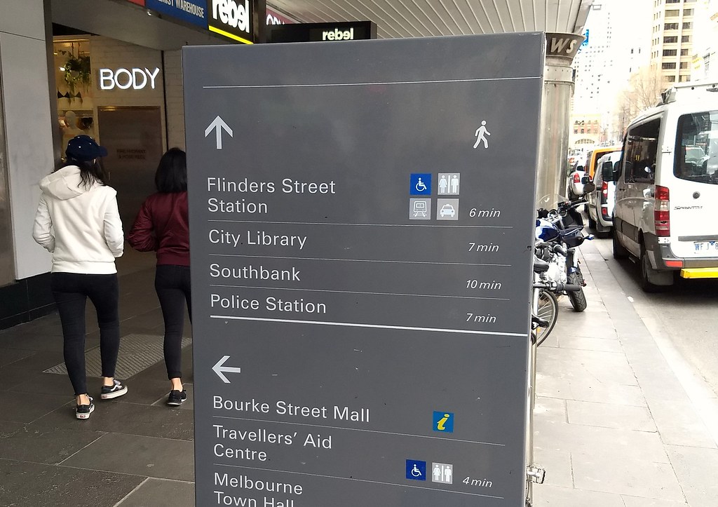
Victoria’s new (apparent) strategy of removing organisational logos in favour of just modal icons and colours might work… but then you lose that message about who to contact if you need information. How many people would remember to Google “PTV” if they didn’t see the logo plastered everywhere?
The branding on the signs ties back to what’s used on the vehicles, printed material including maps — and even the colours used on those maps, which in turn show up on the rainbow status boards and Live Updates web site.
I certainly don’t have all the answers here, but I recall chatting to a contact in the bureaucracy when the rail map was being drafted — they are thinking about these issues, and how all the branding ties together.
Part of any service is promotion, and a vital part of the public transport network is easy to use signage, and a branding strategy that works… and that doesn’t keep changing. In Melbourne, longevity might be the biggest failing.
Hopefully this time around we’ll see a good cohesive design, gradually rolled-out across the network, that they’ll actually stick with for more than a few years.
23 replies on “What, yet ANOTHER rebranding?”
Just a correction. Sydney doesn’t use F for freeway routes. It used to but was discontinued in the 1980s I believe with the Metroads branding which has now been replaced with Alpanumerics. So Sydney Freeways currently have M branding, M1, M2 etc same as Melbourne
In Sydney the confusion was at the airport, where we had signage to Terminals T1, T2 and T3 as well as the T2 train line. Often on the same physical sign. This has been somewhat fixed earlier this year by rebranding the train line through the airport from T2 to T8.
Another good read. I wander if they will replace all station sings with the new design or just put stickers over them like they did with Metlink and such.
It will be weird not seeing PTV everywhere . But I guess it’s all for a good reason .. right?
Sydney Metro will be going with M though the colour will look awfully similar to the B. Weirdly in Sydney even with the alphanumeric road numbering system there is a tendency still to use F for freeway I.e F6 or F3.
@albert3801, thanks. Do they still have the M-series bus services?
I wonder if this is coming out of the same place as this: https://wongm.com/2018/05/flinders-street-station-next-train-display-usability/
Great read especially for someone like me who has recently moved from Sydney to Melbourne. I have to admit I spent the first 6 months here thinking the PTV logo was just “PT” with an arrow. The sideways V doesn’t make any sense at all to me, and my partner still calls it PT even after having been here 12 months.
Could you imagine if as much effort were instead directed toward improving the service as a whole rather than floating another new brand (For the sake of whom)? Cripes!
This is so frustrating. On one hand, if you are going to do a rebrand I think you do it properly and rebrand everything at once so there is a consistent design out there. However I am so annoyed that we are spending money on yet another rebrand instead of improving services and infrastructure. If PTV is still going to be the ‘one-stop-shop’ for the general public when it comes to service info then their logo should definitely stay on all the signage, even if TfV is going to be taking over some of the behind the scenes work. As you said – people won’t think to google PTV if they don’t know who runs the system.
Also font and design of the Mernda sign looks very old fashioned – it makes me think of a sign you would see at little station in the English countryside.
It looks like a pretty soft rebrand to me. They’re obviously keeping the same colour scheme, the same sign layout and just adding a fresher (maybe ownable?) font. It looks entirely comfortable as an expansion on the existing font (Helvetica?) which says to me that they’re probably not going to wholesale change everything… but rather slowly add more ownership of the system as time takes it’s toll on existing signs.
It seems to me that removing the governing body is probably pretty good future proofing with the number of changes we’ve seen since I was catching a Connex to high school. A train is a train is a train. Google “Melbourne train” and you get PTV’s website.
@Daniel, yes, the M Series bus services still operate. But just to confuse things we have T series bus routes that operate over Transitways (dedicated bus roads). At least the numbers don’t overlap the train lines, with the lowest T series bus route being T61.
What about when trams were orange? I distinctly recall seeing orange trams banked up on Bourke St Mall during the strike shortly after I moved to Melbourne.
@Jen, that’s correct – buses and trams were orange, and even Comeng trains had orange highlights for a while, as well as the regional trains.
The mid-70s to mid-80s was a very orange decade.
I love the colour coding of the different modes, except for V/Line, there needs to at least be a distinction between V/Line train and V/Line coach.
I guess the orange for the buses could be, orange is nice and bright. A visibility enhancement for many roads, especially rural, and where lighting standards would not be as good as what you would get for a train line or tram stop etc??
And purple, is a distinctive color to all of the rest.
While I am with others here, saying, Id rather branding stay around for a while for many reasons, I hope at least the mode-colors most of all to be what remains.
Why?
Can someone give me a convincing reason this is needed?
If anything, V/Line services should have stuck with red, with purple being limited to regional buses and coaches. Aside from the 80s where V/Line was in orange (which was most likely an evolution of the VR “teacup” livery), they are probably most well known for the mostly red “regal” livery of the late 1990s. In fact, even the pre-PTV V/Line livery still has traces of red, as does the V/Line logo itself.
Not to mention red was the choice for passenger carriages before the VR went to blue for the steel carriages; the wooden Tait/W/E/PL cars retaining the red livery right through to the 1980s, even outlasting the VR blue and gold era (in the early 80s prior to the N/H sets and fixed running, you could even see a orange or blue locomotive leading a random mixture of red, blue and orange carriages).
How will the modal colours work together with each train line also having its own colour? The Clifton Hill group is red on the current rail network map so it’s interesting that there’s no red on the sign. On the other hand, it’s likely that the colours assigned to each line will have to change a bit over the next couple of decades, as the network is progressively reconfigured.
Just to add a story from my Mum.
When I was a kid she told me that the Trams were Catholic and the Buses were Protestant. If you were Catholic, you worked on the Trams and if you were Protestant you worked on the Buses.
The colours were chosen accordingly. The Protestants were “Orangemen” and the Catholics chose green (I don’t know why).
When she was a teenager (65 years ago) religious discrimination was still very apparent. This was something she didn’t agree with.
@Griff, not that I would doubt your mum, but tramway buses were also green up until the 70s, when everything (trams and buses, and later trains) started being painted orange.
They seem to be busy stripping colours from their Google Maps information – now all modes of transport are represented by the generic white/blue colours instead of the modal colours (e.g. look up Southern Cross and you’ll find the only coloured line is the Southern NSW one).
First it was the trams, V/Line and buses (somehow Metro managed to escape), but now the trains are also bland and colourless too. Makes seeing the different modes of transport on your journey less obvious now. Not sure if it’s some sort of glitch with the PTV data in Google Maps, or intentional on their part.
[…] PTV designs are mostly good – the colours, lines/patterns, typefaces all work quite well. The PTV logo itself is a bit meh – maybe it’s possible to start by just removing […]
Minor amendment: Network Sans was developed and produced inhouse at PTV. ATF was bought in briefly to advise on production aspects. Unfortunately, this isn’t mentioned on the ATF site.
[…] The colours had been first used by Metlink around 2004, but appear to have been inspired by colours used since early in the 20th century. […]