Update October 2014: There’s a later draft
PTV are trialling a new train network map. They’re seeking feedback on it, and you’ll see it at some stations now (Bentleigh, Malvern and Moorabbin, I think).
Note, just to remove all doubt: unlike the PTV network plan, it’s not a concept for new rail lines; it’s a prototype of a map of the existing network.
View the map larger, in a new window
My initial impression: I quite like this.
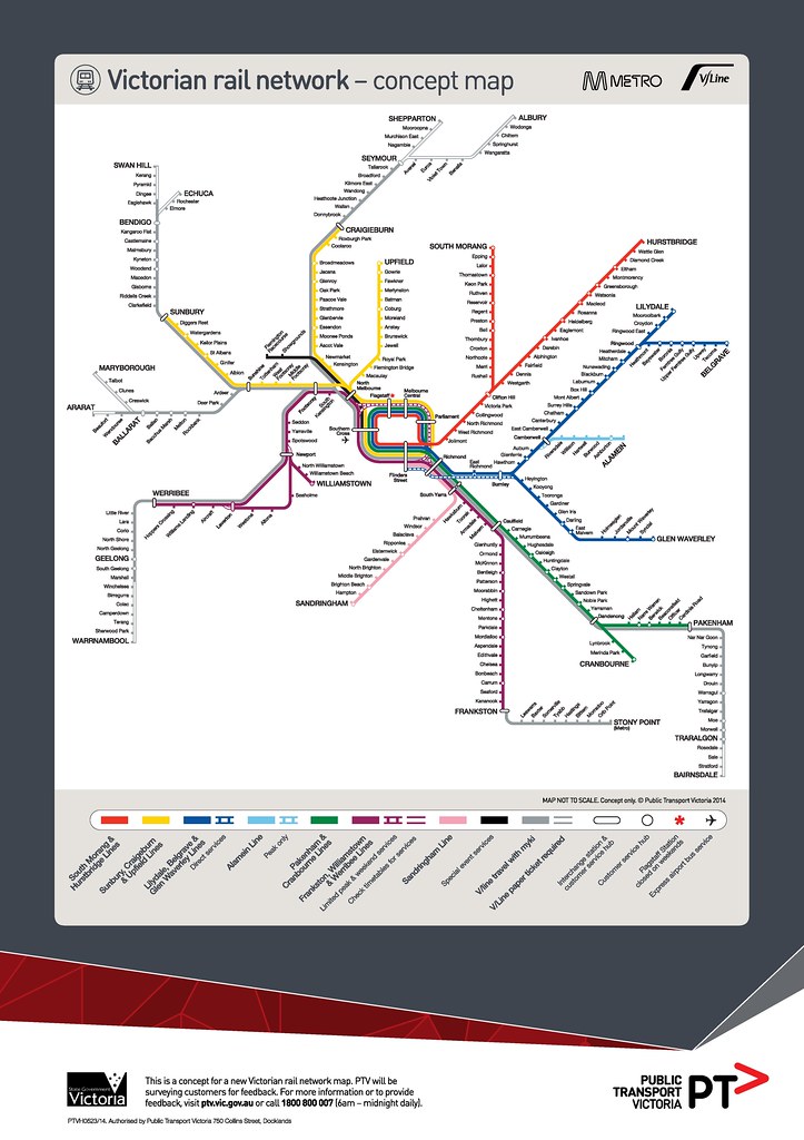
Colour-coding the lines helps make sense of the way the network actually runs (or will run in the near future). It allows them to add detail such as the stations usually skipped by expresses on particular lines, which lines run via the City Loop, and which sections run as shuttles. This helps people navigate — for instance if you’re coming from the Dandenong line going to Armadale, you’ll probably have to change trains at Caulfield.
The caveat here is that the train network is not currently operated consistently. Loop operations (even leaving direction aside) are very confusing. Express stopping patterns are all over the place on some lines. The Frankston and Newport lines are connected… but only on weekdays.
The operational variations on the various lines might need some work. See the difference between Williamstown and Alamein, for instance; potentially confusing.
A big difference is this map also adds V/Line services. With Myki now phased-in for short-distance (commuter-belt) V/Line services, one barrier to city people using them (the need to buy a separate ticket) is gone. This is an interesting move. It does take extra space, thus makes everything smaller — is the benefit worth it?
The part-time Flemington Racecourse line is shown prominently in black. I suppose that’s a good (for occasional users) and bad (implies it’s fulltime). I’m told it’s showing terminating at Southern Cross because that’s how it’s likely to be (at least on weekdays) in the near future, due to rail viaduct capacity issues, so they’d rather encourage people to change there instead of Flinders Street.
Somehow the order of lines shown at Flinders Street seems wrong, but I think that’s because I know Glen Waverley direct services don’t actually terminate next to Sandringham services.
The Skybus connection is shown, but the Broadmeadows to Airport Smartbus connection isn’t. Neither are the 401 and 601 university weekday high-frequency shuttles, specifically designed to connect to the rail network.
In the first version of the map that got out in the wild over the weekend, there were at least two errors: Violet Town and Euroa had been transposed, as had Ballan and Bacchus Marsh, and the colours indicating Myki validity had crept beyond where they should have. The stations have now been corrected (though Myki still creeps beyond Wendouree, Eaglehawk, Marshall and Traralgon) and PTV expect to do quite a few more tweaks over coming months as a result of feedback.
They don’t expect a more general rollout of the map until Regional Rail Link opens next year. It costs a small fortune apparently.
But what’s wrong with the current train map?
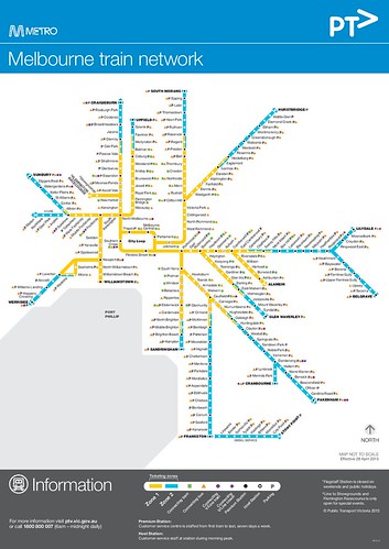 Everyone will have their own views, but the current train map (below) has a few problems. For instance:
It doesn’t show where the lines go. Someone unfamiliar with Melbourne might assume there’s a line from Sunbury to Upfield, for instance. And it doesn’t show any operational detail; the map implies all trains run via the Loop, for instance. It gives little hint as to where the best places to change trains are.
Meanwhile, we’re losing two-zone trips next year, so there won’t be a huge need to show zones as at present. The new map started being designed well before this, but it’s good to be able to take advantage of it to show other useful detail.
What about multi-modal?
I think the new map is a good step in the right direction.
But if they’re starting to mix things up on a map (Metro and V/Line), I think another thing they should be looking at is showing the network frequent trams and buses that back up the train network… though of course, that would be a much more complicated and difficult visualisation to get right.
But other cities are moving into this, and you can see the benefits from it, as described by Vancouver’s Translink:
People traveling along FTN (Frequent Transit Network) corridors can expect convenient, reliable, easy-to-use services that are frequent enough that they do not need to refer to a schedule. For municipalities and the development community, the FTN provides a strong organizing framework around which to focus growth and development.
(My emphasis. That’s the most important point. For public transport to be competitive with cars, this is essential. It’s not like, as Jarrett Walker describes, you can only drive out of your driveway every half-an-hour — but that’s what most PT users face.)
The train-only network map is still useful — good for showing the mass transit, backbone of the public transport network. But a frequent network map would be great for showing all the places you can easily get to in Melbourne on public transport — which is a lot more than just the rail network.
Also: the status board, and the bigger picture
Are maps even in important?
Sure they are. Good maps mean people can navigate their way around more easily, so they’re more likely to use the system. More passengers means more impetus to keep upgrading services.
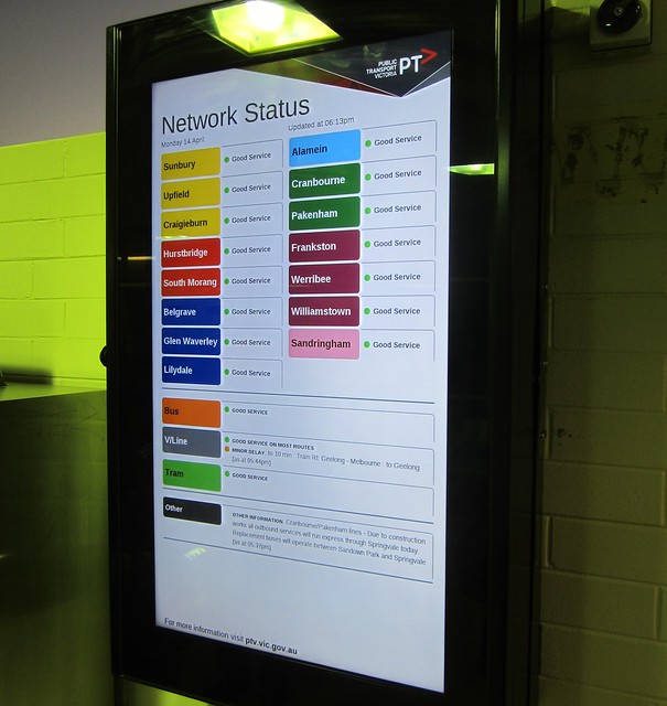
But this is about more than just a map. Related is the trial rollout of “rainbow” network status boards, installed this week at Moorabbin, Bentleigh, Malvern, and in the PTV Hub at Southern Cross. The colours on the board match those on the new map… including Alamein, which has a distinctive colour on the map to draw attention to the fact that you usually have to change at Camberwell.
It’s a little early to judge these, though I note that they don’t show next train departures — this is present on other displays at Malvern, but not at Moorabbin and Bentleigh and most other stations.
I’m told they can modify the design based on feedback, so it’ll be interesting to see how this evolves. One issue I think is that line-specific info is shown at the bottom — only a “traffic light” indicator is shown at the top, which means the information you need may not be easy to find.
I’d hope that once these boards are running well, they roll them out quickly to the bigger interchange stations, where they’re likely to be most useful.
Both the map and the status board are part of measures to standardise train operations: the slow move towards more predictable routes, consistent stopping patterns, consistent platforms at the larger stations, and “metro”-like frequent operation on dedicated tracks. And there are also moves to improve the flow of information from operators (on all modes) through to PTV so a better view of the overall network is available, including online.
Clearly they’ve got a long way to go, but this is a step forward.
Other maps:
- PTV map from their rail network development plan
- City Loop, excerpt from a 1981 map
- Campbell Wright’s frequent service map
See also:
97 replies on “A new train map is coming (and: network status boards)”