I was wondering if there was any data on how public transport patronage around Australia had fallen COVID-19 took hold, and how it has recovered in different cities.
It turns out most jurisdictions provide month-by-month or even week-by-week patronage data. Here’s how 2020 patronage compares as a percentage of 2019 patronage:
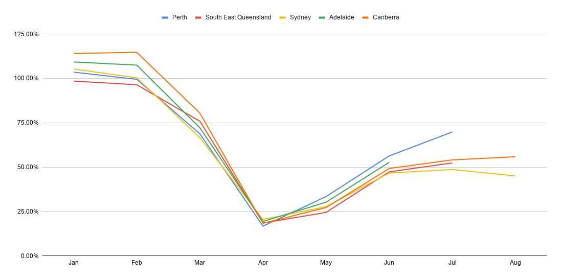
Some observations:
All these cities are amazingly similar – patronage dropping rapidly in late March as workplaces closed and those who could switched to working from home. Patronage hit a low in April and May.
After that, the numbers slowly rose as most states got past their peak in COVID-19 cases, but a long way from normal – even in states which have had very few locally-acquired cases for the past few months.
February had an extra (weekend) day in 2020, which may account for overall patronage being slightly higher than in February 2019. This doesn’t explain January, though it may reflect that some cities have been seeing growth – for instance Sydney and Canberra following recent new light rail lines openings.
It does of course remain unclear if PT usage will fully recover in the longer term.
Different cities publish data at different rates. Source details and caveats are below. Sydney and Canberra have updated to August; others either June or July. I’ll be interested to check back and update this data in coming months.
The obvious city missing from this chart is… Melbourne. This would look quite different due to a second wave of cases in the past few months.
Unlike every other major city in the country, Melbourne provides no regular detailed publication of patronage, and nothing with monthly or weekly data. All we get is an annual update (by mode) every Budget Day, some years-old spreadsheets, and occasional numbers given to the media.
Clearly there is room for improvement here.
Sources:
- Perth boardings – including by mode and by line – monthly data
- Brisbane/SE Queensland boardings – weekly data – I’ve allocated each week into a month, and then done a comparison between years
- Sydney Opal trips – monthly data – this may not include non-Opal trips, but again, I’m comparing year on year
- Adelaide Metrocard validations – daily data by stop, but banded ranges (eg 1-9, 10-19, 20-29), not exact numbers. This therefore couldn’t give me actual patronage numbers, I’m only wanting a rough year on year comparison. The have boarding figures too, but only quarterly.
- Canberra boardings – weekly by ticket type
- Of the other capital cities, Hobart and Melbourne do not provide anything other than annual data. A quick look didn’t find anything publicly available for Darwin.
9 replies on “How COVID hit PT around Australia”
Fascinating, but totally believable.
Amazing that Sydney is still under 50% recovered when the harbour city has so few cases. Commuters are staying home.
Regarding comparable data for Melbourne, I’m sure I’ve seen graphs on the TV showing transport usage well down on last year. Perhaps this is from google data and not from PTV.
Much of the world is at about the same level (except for Melbourne). A train on the Glen Waverley line cross Glen Iris Station at 830am had under 20 people in it (I am over estimating). One carriage had just 1 person in it. Did you do any specific comparisons by mode? Are Bus and Rail at those levels?
Further to my comment above. This link shows an insight into patronage across Europe and the US using our Wifi Systems which is on-board much of Europe and all of Greyhound in the US. https://www.icomera.com/icomera-public-transport-wi-fi-usage-figures-continue-to-track-the-industrys-fragile-recovery/
From the chart you can see that much of Europe is sitting at 45%, UK at around 30% and the US at 25%.
@Roger, most of the data published has been secondary sources, such as usage of PT-related apps. Not very reliable at all, especially for tracking regular commuters who don’t need to map/plan their trips.
[…] In Victoria, they also provide the only regular, consistent view of metrics for a range of government services, including public transport patronage. (In contrast, other states put this data out far more regularly.) […]
[…] many people use Night Network normally? Well we don’t know, because most patronage data is secret in Victoria. But we do know the Night Buses are not well used – this has prompted a very welcome route […]
[…] the last “normal” year. For the following year, patronage was unaffected until March, when it dropped off dramatically. And the year ending June 2021 showed the full effects of Melbourne and the rest of the state going […]
[…] all of this is up in the air due to COVID-19. It’ll be interesting to see how things recover in coming […]
[…] written before that Victoria (and Melbourne) was the only major jurisdiction in the country not publishing […]