Just a quick post while I work on something more substantive.
I want to talk about Passenger Information Displays (PIDs for short) at Metro stations.
For a while, it looked like suburban stations would all be getting two line LED PIDs.
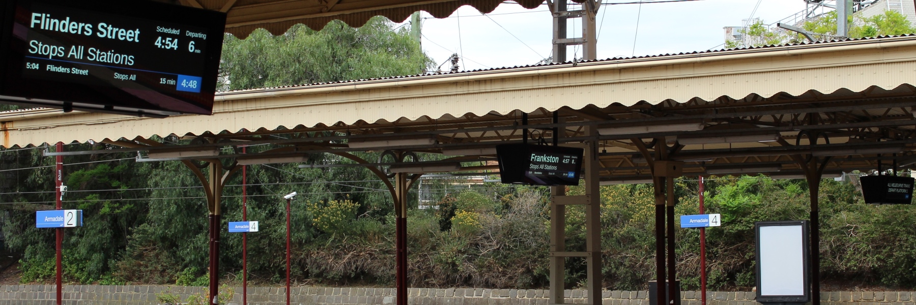
They show the scheduled time, destination, minutes to departure, and a summary of the stopping pattern, but no individual stations are listed.
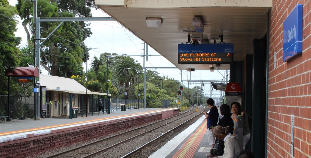
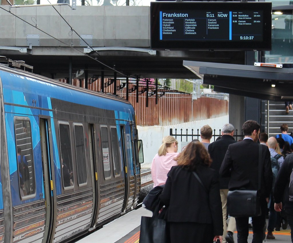
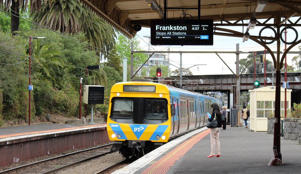
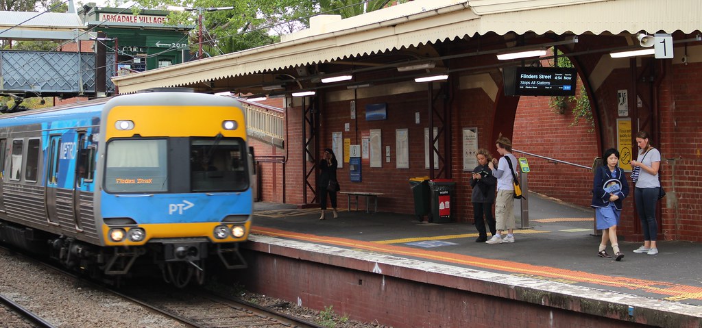
Around 2016 with many stations being rebuilt, more elaborate flat screens started to appear, which add every station the train serves, and the following two trains, as well as the current time. (Larger versions of these appear at central city stations.)
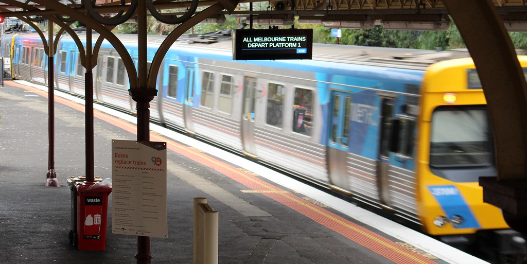
More recently, at some stations the two line LEDS (only installed in 2014) have been replaced by the screens… with a twist. Some of them have been switched to a different design, which shows less detail, but in a larger font size.
This makes sense, particularly where there’s only one screen per platform. They are far easier to see from a distance.
They still show more information than that two line LEDs, including the current time and the following train, and can be switched to show different messages when relevant.
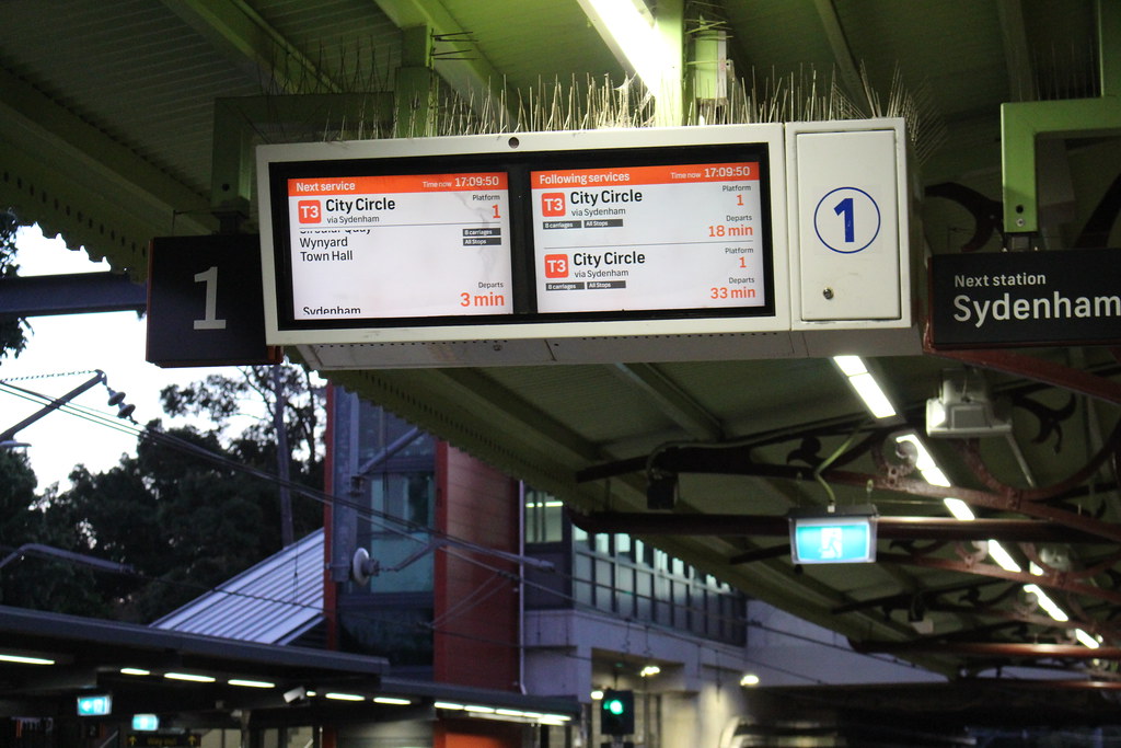
Here’s a comparison with Sydney, where they’ve gone for a two screen display, which shows the next train on one screen, complete with a full (scrolling) list of stations, and following trains on the second screen. Overall it’s got more information, but I think (partly due to the colours used) is less readable, particularly from a distance.
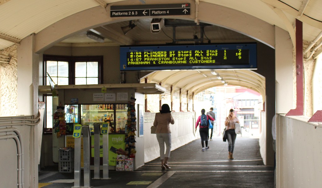
By the way, most of the above pictures are from Armadale. It and the other MATH stations have another older type of display on the concourse listing departures from all platforms:
Good accurate timely information is important on the public transport network, and while apps now mean a lot of this is now available on smartphones, it’s good to have it displayed around the stations.
Getting details of the following train is particularly important in morning peak, when the train at the platform may be delayed and packed. People may choose to let it go if they know the next one is only a few minutes away.
Not including a list of all stations… perhaps that’s okay at suburban stations, though unfamiliar users may still have issues, particularly outbound — for instance, a Frankston line train may be terminating at Frankston, Carrum, Mordialloc, Cheltenham or Moorabbin — it’s high time major interchanges like South Yarra and Caulfield got screens with all the stations listed.
But at least each new version has been an improvement. No doubt the PIDs will continue to evolve and improve.
23 replies on “Passenger Information Displays (PIDs) at stations are evolving”
I have issue with the new larger font 2 line screens because I saw one at Springvale that jusy states the destination and stated on the 2nd line “limited express” as a frequent commuter I couldn’t work out what defines Limited Express and normal Express, let alone for a tourist or infrequent traveller.
My other issue is when there’s a disruption, the old orange LED 2 line screens used to state “due to a disruption in normal services all trains terminating at X”. There was a Friday shut down on the Pakenham line a few weeks ago for planned works and the display did not advise people that all trains were terminating at Westall.
It’s like the ability to swap between the destination AND show disruption info isn’t utilised on the new big font screens.
I think Box Hill may have the last of the older Cathode Ray PIDS left on the network. Probably about time these were upgraded to the new style PIDS. Also, at Gardiner the PIDS are back to back – as you enter the station they display train information but if you are leaving the station the PIDS display Tram stop information – that’s very useful.
I quite like the Sydney ones, as they scroll through all the stations that the train will stop at rather than fit them in with a small font like you have mentioned.
What do you think the chances are of Australia ever getting a national PT ticketing system? I’m thinking something along the line of PASMO or Suica in Japan, where the RFID is almost like a reloadable electronic cash card. I’ll just say that those RFID readers in Japan are basically instantaneous.
Meanwhile, at stations like Jewell, we’re still waiting for *any* sort of train PID, let alone a replacement for an existing one.
The crazy thing is that Yarra Trams put in a tram PID in the railway station over a year ago, and we still don’t have one for the train yet.
The new ones put in on the platforms at Sunshine and West Footscray a few months ago have the full stations list – so that change to a new summary must’ve happened pretty recently (and I’ve noticed them on the new Skyrail stations). The only problem I have with the full stations list one is that the time to next departure is very hard to see unless you’re up close. West Footscray, Footscray and Sunshine also have the four line next service summary on the concourse – which is not always great at Footscray because it doesn’t always show all lines outbound or both stopping patterns (loop or direct) – which were put in at the time of RRL. The V/Line full stations list ones on the platform (and concourse) have the same information as the Metro ones, but slightly different – easier to see how many minutes to the train. At Geelong there is a summary of all platforms on the display on Platform 1, which is next to useless unless you’re standing right under it. Generally OK if the next Melbourne train is over the footbridge – apart from the 5.29 which leaves on Platform 1. Interestingly, last week the 5.48 train had to come on Platform 1, and without adequate displays there were people getting on thinking it was a Waurn Ponds train – the conductor was even making announcements on the train itself. And this morning I caught the train at Middle Footscray – no PIDs, so the old push button for announcement had to do!
I say, both the LED and the screen, both have their respective advantages. Really, both technologies should be used at all locations.
Font size is not as important as brightness. You could make out what the LED display was saying, because they where bright. These screens are not.
The advantage with the flat screens being used to list the stations for those who need that information is in my view, the best way to go.
At Essendon they had the PID displaying all stops but because there is only 1 on each platform they changed it. They really need to put a second one on each platform
@Adam: I think we’ll see that as each state starts adopting contactless payments – your credit/debit card becomes your universal travel card, just like when you land in London, you can start straight away with your plastic card (or digital wallet, etc).
Trials have started in NSW: http://transportnsw.info/contactless
QLD have announced upcoming support: https://www.zdnet.com/article/cubic-to-build-queenslands-au371m-transport-ticketing-system/
WA: https://www.watoday.com.au/national/western-australia/mobile-payments-on-the-cards-for-new-smartrider-system-20180514-p4zf9m.html
Thankfully with real time / platform information on the PTV app, you don’t need to look at these screens most of the time. It is particularly handy entering Flinders St knowing exactly which platform to go to without having to stop and stare at the sprawling list of destinations and times. If you’re travelling from the Werribee line to the Frankston line, you can confirm whether you need to interchange or not without poking your head out the door at Southern Cross or Flinders St.
Like @Nick, once real-time arrival information became available on the PTV app, I rarely look at the PIDs other than to confirm I’m on the right tram or train platform.
Larger and multi-screen PIDs in concourses are hard to scan because the information is spread over multiple rows instead of in a single row like departure boards in airports. Another issue that vexes me is that the screen designs aren’t consistent. E.g. the “next train” in Loop stations may go to another destination while the “next train” in Richmond Station refers to the platform for the next direct Flinders St or Loop train.
I really like Perth’s high contrast orange and green programmable LED displays, because they are really easy to see both night and day across the whole platform and convey all the necessary information. I also assume they are low maintenance as well, but only because everything on Transperth tends towards low maintenance design. https://www.travelblog.org/Photos/4499139
As an aside I find it strange that Perth is the only Australian system with codified stopping patterns, considering most of the trains have simple patterns. Metro would really benefit from having stopping pattern codes, that way you could easily see that the BELGRAVE Express departing NOW is not actually stopping at Laburnum without waiting for the scrawl. They’re also great for the big station boards.
Still just says “Flinders Street all stations”, which continues to annoy me”
One thing Sydney does very well is having consistent and high-quality passenger information. The displays seem (anecdotally at least) to be more consistent and common across the network than the mishmash of random screens and LED displays we have here. The branding of the lines and different service types (e.g. Metrobus) is consistent and makes navigating the extremely confusing system a lot easier. The other features such as real-time and predicted train loads are excellent as well (especially since the closest thing we have here is a yearly(!) peak-hour passenger survey).
We are moving in that direction, but the torturous amount of time it took to even roll out the new map is quite concerning.
I think it’s high time Metro looked at abandoning the terminology “Limited Express” and “Express”.
Information is key, and both these terms are meaningless when stopping patterns vary along all lines. Even with these smaller displays, there’s no reason stops for these services which are not all stations can’t be displayed, scrolling or otherwise. As the first commenter suggested, even regulars can’t be sure where a train will stop when it just says Limited Express or Express.
Limited Express – seems to be when the train misses at least two stations. Presumably we don’t have any proper Express trains!
All V/Line trains appear to be Limited Express. And the automated announcements list the stations the train is stopping at – rather than the ‘running express Footscray to North Melbourne, North Melbourne to Melbourne Central’ that used to occur on the Sunbury line (or was it the Sydenham line back then) on weekends when Flagstaff used to be closed.
The station staff at Geelong still announce all the stations that the train will stop at, including ‘before arriving and terminating at Melbourne’s Southern Cross’.
Does this mean the end of ‘All Except East Richmo’? The LED signs cut off the ‘nd’ due to the low resolution.
The PIDs on the concourse and entrance to Sunshine have been replaced – and now provide less information. It appears that since no Sunbury line trains stop at South Kensington all services are now Limited Express rather than All Except SKN. Which is next to useless if you want to travel from Sunshine to West Footscray in the evening peak, when some inbound trains run express to Footscray. I even asked at the customer service counter, and was told Limited Express means it doesn’t stop at West Footscray – however that is not correct seeing as the PID says the same thing later in the evening when there are no expresses to Footscray.
[…] we’ll see more of this – in particular more use of the line colours – and indeed more screens – spread across the network from […]
[…] good news is: there’s progress. The design seen last year at some stations is now appearing at more locations – recently at Parkdale, Moorabbin, Balaclava, Malvern and […]
The displays at the city loop stations have been upgraded recently and unfortunately someone had decided that the text “Train Boarding Now” and then “Stand Clear Train Departing” is more important than the destination of the current train. So if you arrive on the platform when there’s a train there, you have no idea what train it is. That timeframe can be around 1 minute, especially at peak times.
I agree with Tracy. Current PID info at city loop stations are silly when train at current platform is idle.
Any sort of PID at Diamond Creek would be appreciated! https://railgallery.wongm.com/melbourne-stations/F114_7839.jpg.html
Auburn recently received LCD flat screens on the platforms, previously it had no PIDs at all. Blackburn platform 3 also has a flat screen, yet platforms 1+2 still have the orange LEDs.