Since our last exciting episode, PTV have made a number of revisions to the draft rail map. Here’s the latest version:
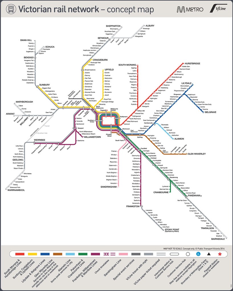
(Click to see it larger, and uncropped)
As I said back in April, I really like this new design, which better represents how the rail network operates.
Changes since that earlier draft that I can see include:
- Sandringham line at an angle which better reflects geographic reality, rather than implying it runs into the middle of the bay!
- Likewise some other line directions have been modified to reflect reality, for instance Warrnambool, Stony Point, Bairnsdale, Belgrave
- The Showgrounds/Racecourse line has been lightened so it’s not stark black now
- Most of the complicated dashed lines have been taken out, such as Alamein joining the main line at Camberwell, and the strange dual Glen Waverley markings on the old version
- A triangle indicator representing the last stop in zone 2 — while zones will be much less important (in Melbourne at least) it’ll be helpful for Melbourne users (especially those on Passes) to easily see how far they can go without incurring a zone 3 or higher fare
- Regional Rail Link is shown as a dotted line on the map… to become solid when it opens
- The earlier one had an airport indicator at Southern Cross, which some people claimed was confusing. It’s goneski.
Some people have complained it doesn’t allow space for the Doncaster line. I reckon if that’s the worst problem, that’s not saying much — unfortunately neither side of politics is saying they’ll build it anytime soon… ditto Rowville. It does have space for two that are more likely to get up in the near future: Airport (Coalition), Mernda (Labor)… though the designers may have to do a bit of fiddling to get either rail tunnel scheme in.
What do you think? Leave a comment here or on the PTUA’s Facebook page — they will be passed back to PTV.
(Yes, I’ll tell them Balaclava now needs to be marked in as Premium ahem a Customer Service Hub. And the asterisk can disappear from Flagstaff soon — hooray!)
Update
I should have posted this originally, but it slipped my mind… the text from an explanatory note (following up from the previous draft) provided by PTV:
Victorian Rail Network Map
Concept 2 – Explanatory NoteThis document outlines some of the changes to the new train map that have been made as a result of public consultation and feedback. The new map is proposed to be introduced in 2015 when Regional Rail Link Stations at Wyndham Vale and Tarneit are opened. Feedback is sought on this revised version so further improvements can be made.
- Feedback on the new map has generally been positive.
- While the map is designed to be schematic, the direction of some lines has been altered
to be more geographically accurate following customer feedback.- Feedback indicated that using a dotted line to indicate direct services from Glen Waverley to Flinders Street was confusing. In this version Glen Waverley has been given its own line colour. It is usual that Glen Waverley trains operate direct to Flinders Street, but generally return to Glen Waverley via the loop in the afternoons and on weekends. This information has been included in the key.
- The dotted line at Camberwell to represent peak hour Alamein trains travelling to/from the city was viewed as being misleading and has been removed, replaced with a note in the key. This map will be primarily used by occasional users, and reflects that passengers traveling from the city to Alamein will normally need to change at Camberwell.
- The new Regional Rail Link stations have been shown in this version.
- New stations that will open later this year (Waurn Ponds and Epsom) are now shown
- The special events line has been lightened to avoid giving the impression that it operates all the time.
- The boundary of the metropolitan area (Zone 1+2) has been indicated by little triangles – so that passengers can see the boundary of the metropolitan fare (which will be a maximum of a Zone 1 fare from 1 January 2015).
- Transfer points between V/Line and Metro service have been revised to reflect where transfers are more likely to occur.
- The designation for the Stony Point line has been changed to make it clearer that the service is operated by Metro. The line has been kept in grey as the line is operated by trains branded with V/Line and the service level provided is more consistent with a V/Line service than other Metro lines.
- The Airport bus designation at Southern Cross was perceived by some users to be confusing and this has been removed.
- There is now clearer designation of the boundary of the myki area on V/Line services. Feedback indicated people preferred the boundary to end at a station rather than between stations.
- East Richmond is shown on the Glen Waverley Line even though some Lilydale/Belgrave trains do stop there. In the long term, it is intended that East Richmond will be exclusively a Glen Waverley Line station.
- When Regional Rail Link opens, the V/Line service running parallel with the Werribee Line will be removed and the map will reflect this. This may provide the opportunity to improve the design of the Werribee Line, including swapping certain station names to the other side of the line.
A number of changes that were suggested have not been included. These include:
- Consideration was given to including Overland stations but this was decided against as the product provided to customers differs from that offered on V/Line. There are two Overland services between Adelaide and Melbourne per week in each direction.
- It is not proposed to include tourist railways.
- While bus and tram connections are not proposed to be shown on this map, it is intended that electronic versions of the map will be display connecting bus and tram services when customers select a particular station.
- This map is designed to be part of a suite of products for customers. Local area maps that show train, tram and bus services will be improved to assist passengers making multi-modal journeys.
- Line diagrams for each line, based on the colours shown in the new map, will include a range of information that cannot be easily shown on a network map.
- The map is intended to show the network as it will exist from 2015 and does not include proposed train stations or train lines that will not be completed by this time.
- Consideration was given to showing loop directions. At present only the South Morang/Hurstbridge Loop has been altered to operate clockwise seven days a week. When more loops are altered to operate in a consistent manner, then loop direction will be included on the map.
66 replies on “PTV rail map – latest draft”
As mentioned back in April – this is looking really good. I see they’ve also changed the colour of the Glen Waverley Line to Brown, but this implies that it doesn’t run around the city loop.
What really needs to happen is a mode color key map.
That is, all Metro lines in Blue, and V/Line in Purple. I always like having V/Line colors split into short range and long range. Or, give MyKi-Vline one color and NonMyki-Vline its own color.
Perhaps with Metro, there could be different shades of blue. One shade for City Loop trains, another for non loop lines.
I am seriously looking at standing for the coming election, and hope to make a difference to public transport, and have the system work like I want it.
There shall be a new ‘Outer shuttle’ train color and routes. Say, Violet distinctive from the current color, to use the Sprinter fleet, and the Frankston Stoney Point route being one existing example. Dandenong/Pakenham to Warragul is another, Sunbury to Castlemaine and Werribee to Geelong are two others I am keen to have at least hourly services on.
The existing order for VLocities should be more than enough to replace sprinters on existing runs other than Frankston-Stoney point.
This is a very simple plan, yet it is effective.
They really need to show which stations has connecting bus and tram services as this is crucial for people who need to make travel plans or make quick emergency alternative transport arrangements if there are issues, such as disruptions on the line or personal change of plans.
It has also stopped showing there being through Alamein trains in peak hour have they been dumped or are they just not shown?
Glen Waverley trains are shown as direct only, but many of them go through the loop.
I would suggest the Alamein and Glen Waverley trains be shown in the same colour with the peak only section shown, with the outlining like the Williamstown line at Newport, between Camberwell and Burnley.
@Australian Rail Maps, the GW line doesn’t run around the Loop on weekday mornings. Three guesses as to what might happen in the medium to long term! Hint
@Jim, I think to restrict a rail map to only shades of blue would be a huge waste of possible colours, as well as making it almost illegible for most people — colour-blind or not.
@MPTG, the need to show bus and tram connections got kicked around last time. At the time, the PTV contact Adrian said: In market testing we found that this added no value to customers. However, electronic versions of the map can include this information (eg. when you touch a station it can give you a list of connecting services, etc..). On a static map it isn’t useful, but it will be VERY useful on other mediums.
@Tom, no, it’s just that the map has been simplified. There has been (as yet) no radical change to timetables. It’s a coincidence this post is coming out on the same day as a (minor) timetable change.
I suppose the difference here is that Alamein only runs through to the city in peak. Williamstown does so all day until about 7pm on weekdays, and presumably this will be on weekends as well.
I still think showing the Alamein line in a different colour to Lilydale and Belgrave lines is odd. Surely the line colour indicates which line it is part of. Who other than an expert or a local person knows when services are through services or you have to change, without checking first? I’ve had to change for Williamstown, for Altona, for Belgrave but I would not have a clue when is the change or through service. I check each time. I just don’t see it relevant to the colour of the line.
I quite liked it when Sandringham trains disappeared into the bay. The map makers have lost their imagination.
Something I find odd about this map, and the colours used on the health-board, is that the Cross City lines (Frankston, Werribee and Williamstown) are in purple. This is the colour normally used for V/Line services.
You’ll note that the light green of trams and the orange of buses have been avoided in the colour-coding of railway lines, so I don’t understand why the same couldn’t be done for “V/Line purple”. I can see some members of the public potentially getting confused, believing that V/Line operates the Cross City group.
I contacted PTV about this some time ago, and got a rather bizarre response that said, yes, V/Line normally uses purple, and gray is the colour reserved for ferries. That doesn’t really explain why the colours are the way they are on the map and healthboard, though…
Just a few other minor details, as well:
* Once Flagstaff is open all week, it might be nice to repurpose the “asterisk” for Heyington to mark out its lack of wheelchair access, instead of having the info hidden away in the caption at the bottom.
* Seymour trains stop at North Melbourne. The current V/Line rail map shows this very clearly. It might be difficult to show it on this map, but it’d be nice if they could do it somehow…
* There’s ample room to space out the Swan Hill, Echuca lines to make them less crowded
* The Bay still hasn’t made a comeback. Instead, we have a big empty white space. This is my biggest sadness (which in some ways means that a good job has been done).
One other thing, they extended the commuter zone to epsom near Bendigo.
The grey of the Flemington Racecource line next to the slightly different grey of another line really needs changing – pick another colour so it is obviously distinct. If South Morang is supposed to be red, then make it more reddish, and make the racecourse orange. Better, make it pink, and the Sandringham line something else.
Oh, and the colours should be arranged such that the loop looks like a rainbow – no point having those colours if they don’t line up properly around that loop.
At long last the misconception that has lasted the better part of eight years, will finally be gone in 2015. I.e. The current train map wrongly suggesting that Zone 2 cuts out beyond Melton, when in actual fact it goes up to and including Bacchus Marsh. Bacchus Marsh (and Lara, Riddells Creek and Wandong), if I’m not mistaken, have had Zone 2 inclusion since March 2007!
Another point noticed elsewhere: Cranbourne isn’t shown as a Premium/Customer Service Hub station, even though it is one. It was marked properly on the previous draft.
@Andrew, isn’t the fact that Alamein is shown disconnected a prompt to check? Most of the time you’ll have to change at Camberwell… if you don’t, it might be a bonus.
@Aaron, interesting that they’re reserving grey for ferries.
@Ian, I think the Flemington line is deliberately grey so as not to imply it’s a fulltime line. Perhaps it should be hatched instead.
@Lucas, I think you’re right. 2007 was the year Zone 3 was merged into zone 2. This was easy on the eastern side of town, where all the Z3 stations were suburban. To the west and north it included V/Line stations including in zone 3 for Myki, such as Lara.
A further consequence of this is that the fare from Melbourne to places like Lara will be at the zone 1-only price from January, but going one more stop will be quite a bit more expensive.
Hi everyone, and welcome to round two! :)
I’m the Product Development Manager at PTV and if you haven’t read the comments on the previous version, please take a look at Daniel’s earlier blog post.
The revised map was developed after consideration of feedback recieved from a number of channels (blogs like this, facebook, emails, letters, focus groups, user testing, etc). The need to balance different objectives is obviously the critical thing.
Most suggestions have, of course, been identified previously so I hope I can provide clarity as to why certain choices were made. You might not agree with them all, but hopefully you will see the logic that was used. Also, it is important to remember that this map is just one in a suite of products that is being developed. Many suggestions that have been made will be incorporated into more appropriate products.
Ian Smith on Sun 12 October 2014 at 9:29 pm said: The grey of the Flemington Racecource line next to the slightly different grey of another line really needs changing – pick another colour so it is obviously distinct. If South Morang is supposed to be red, then make it more reddish, and make the racecourse orange. Better, make it pink, and the Sandringham line something else. Oh, and the colours should be arranged such that the loop looks like a rainbow – no point having those colours if they don’t line up properly around that loop.
On the map the colours are being used to represent lines that will one day have a Metro style service. The grey lines are designed to let customers know, subconsciously, that these are services that are less frequent and require timetables and planning. Hence Stony Point and Racecourse being in shades of grey like V/Line. No plans to create a rainbow in the CBD. The choice of colours is designed with a number of objectives, including people who are colour blind (for example, note the red and green lines aren’t next to each other). If we gave Racecourse a colour other than a shade of grey or black, people might assume it was a full time service. We looked at doing a dotted yellow line, but we also want to communicate that people should ideally change at Southern Cross for these services as it is likely that we won’t be able to get all of these services to Flinders Street during busy times due to track capacity. A dotted black or grey line just draws the eye too much and frankly looks a bit crap. So all things considered, keeping the racecourse line as grey seems to be the best option.
Lucas on Mon 13 October 2014 at 10:01 am said: At long last the misconception that has lasted the better part of eight years, will finally be gone in 2015. I.e. The current train map wrongly suggesting that Zone 2 cuts out beyond Melton, when in actual fact it goes up to and including Bacchus Marsh. Bacchus Marsh (and Lara, Riddells Creek and Wandong), if I’m not mistaken, have had Zone 2 inclusion since March 2007!
Well not quite. Fares were aligned but they were under two different ticketing sytems (eg. you couldn’t travel to Lara with a Zone 2 Metcard, but the fare from Lara to Melbourne was in most cases the same fare). So what you are highlighting only really applied since myki was rolled out to regional trains. We knew we wanted to release a map that showed all V/Line services covered by myki, and here we are! :) But you are quite right that this was an issue that needed to be addressed, and hence the introduction of a single map for Metro and V/Line services.
Andrew on Sun 12 October 2014 at 7:06 pm said: I still think showing the Alamein line in a different colour to Lilydale and Belgrave lines is odd. Surely the line colour indicates which line it is part of. Who other than an expert or a local person knows when services are through services or you have to change, without checking first? I’ve had to change for Williamstown, for Altona, for Belgrave but I would not have a clue when is the change or through service. I check each time. I just don’t see it relevant to the colour of the line.
The map is designed as a ‘primary planning tool’ – we want people to be able to use the map to travel through the network without having to refer to timetables. As service frequencies increase, fewer people will use timetables over time. So the map needs to work in the same way a map in London, Paris or New York – passengers can plan their journey and work out where to transfer without having to refer to other materials. In relation to Alamein, there are no plans to remove CBD peak services, but for most passengers, including off-peak passengers, we want them to clearly see they need to change at Camberwell. When we did customer testing we tried it with the Alamein line being the same colour and less than 10% of people worked out they needed to change at Camberwell. The objective is to prevent people from waiting for an Alamein train in the loop, or at Hawthorn, wondering why it doesn’t turn up.
MPTG on Sun 12 October 2014 at 1:26 pm said: They really need to show which stations has connecting bus and tram services as this is crucial for people who need to make travel plans or make quick emergency alternative transport arrangements if there are issues, such as disruptions on the line or personal change of plans.
This information is important, but this map isn’t the best place to show it. This map is part of a suite of products. Absolutely want to develop electronic versions where you touch a station to get more information on connecting buses, but consumer testing showed there was no benefit in having connecting bus or tram symbols (especially as practically every station in Melbourne has a bus connection of some form). Line diagrams will also be an important source of connecting service information.
Tom the first and best on Sun 12 October 2014 at 2:46 pm said: It has also stopped showing there being through Alamein trains in peak hour have they been dumped or are they just not shown? Glen Waverley trains are shown as direct only, but many of them go through the loop. I would suggest the Alamein and Glen Waverley trains be shown in the same colour with the peak only section shown, with the outlining like the Williamstown line at Newport, between Camberwell and Burnley.
The key for Alamein and Glen Waverley will explain how these services work. Remember, that one of the key markets for the map is occasional users or people doing a new trip for the first time. If someone uses the map (without looking at the key) then they’ll operate on the assumption that if they turn up at a loop station they’ll need to catch a train and change at Camberwell or Burnley. If they arrive at the station where direct services are being provided (eg. peak Alamein) then it becomes a ‘bonus’. They haven’t been disadvantaged by the map – their travel time is likely to remain unchanged. I’m not saying we have the text in the key right for Alamein and Glen Waverley, but the way the lines are presented appears to be very well received by passengers.
Happy to provide further clarification and accept more suggestions. :)
Daniel on Mon 13 October 2014 at 1:10 pm said: Another point noticed elsewhere: Cranbourne isn’t shown as a Premium/Customer Service Hub station, even though it is one. It was marked properly on the previous draft.
Whoops – good pick up! Will make sure that gets changed.
@Adrian – Am I right in assuming that if not most, then a good portion of Werrible line trains will continue to bypass the Altona Loop? (I’m talking about timetabled bypasses, not the still all too common unscheduled bypasses, but that’s another story…). If so then it seems to me you would want to use the ‘Check Timetable’ outline for the whole Altona Loop. At the moment it’s only two points where the Altona Loop connects to the rest of the line, which are pretty easy to miss if you’re just looking on the map for a station name and see it with a solid line like most of the Metro services.
@Adrian – Good work on the map! Much clearer than what we have right now.
East Richmond is unclear on in this design. It is the only station to show the stop indented into another line that doesn’t stop on it
Have you considered this option:
http://i.imgur.com/TRGbjia.png
East Richmond marker moved closer to Burnley, and below the line, East Richmond and Burnley text displayed at 45° angle, Belgrave/Lilydale line now clearly extends express past East Richmond.
Another point, further to my last comment: The criteria for suburban Premium Stations are pretty clear (open first to last train). However, the criteria are a lot less clear for V/Line stations. Many stations are staffed for essentially the whole day but not until the last train (e.g. Lara, Wendouree), and other stations are open for sufficiently long hours given the relatively low train frequency (e.g. Ararat).
I think the designation “Customer Service Hub” should be extended to those V/Line stations that are staffed for most or all of the day. On this version of the map, most staffed V/Line stations aren’t marked, presumably because they aren’t open late enough in the evening or on weekends. This doesn’t quite make sense to me.
Of course, the real solution here is to standardise V/Line station opening hours. They seem to be wildly inconsistent.
Hi JJ – I do like your East Richmond option. :)
The only problem is that for the medium term East Richmond will be served by a combination of Ringwood and Glen Waverley trains. What is on the map is deliberately a little confused – as we don’t have consistent operation yet. The question is whether your option is appropriate when we don’t yet have a high level of consistency. So it’s a question for debate and consideration – do we show now what it will be, or what happens most of the time (but not all of the time). It’s a genuine question – there are pros and cons for both options. Feedback welcomed. From the customer perspective the advantage of JJ’s option is that it would prevent someone wanting to go to East Richmond from Ringwood waiting for a train that stops there, rather than seeing from the map they need to change at Burnley.
@Adrian, good to know the logic behind it. I would err on the side of caution – like Alamein. Don’t show the stop on the blue line, and if someone happens to stop there (or pickup a service there to Belgrave/Lilydale) it could be considered a bonus.
I know years ago I had a few instances waiting for the right train at East Richmond, before I knew the network better. If trains generally don’t stop there, I would remove the marker.
I would also be interested to hear what others think on it.
Julian Wearne on Mon 13 October 2014 at 3:50 pm said: @Adrian – Am I right in assuming that if not most, then a good portion of Werrible line trains will continue to bypass the Altona Loop? (I’m talking about timetabled bypasses, not the still all too common unscheduled bypasses, but that’s another story…). If so then it seems to me you would want to use the ‘Check Timetable’ outline for the whole Altona Loop. At the moment it’s only two points where the Altona Loop connects to the rest of the line, which are pretty easy to miss if you’re just looking on the map for a station name and see it with a solid line like most of the Metro services.
The Werribee/Laverton/Willliamstown lines on the map can be tweaked when RRL is opened. We will look at swapping some of the station names to the other side of the line, such as Yarraville. It will give better visual separation from the CBD.
JJ on Mon 13 October 2014 at 6:23 pm said: @Adrian, good to know the logic behind it. I would err on the side of caution – like Alamein. Don’t show the stop on the blue line, and if someone happens to stop there (or pickup a service there to Belgrave/Lilydale) it could be considered a bonus. I know years ago I had a few instances waiting for the right train at East Richmond, before I knew the network better. If trains generally don’t stop there, I would remove the marker.
I think you’ve identified the ‘test’ for these decisions – if someone is not using a timetable, which option is more likely to avoid a scenario where they wait for a train rather than catching the next service and changing. For example, the map means that someone travelling from South Kensington to Sunshine should know to change at Footscray or Toorak to Huntingdale will know to change to Caulfield. If you apply that logic, then showing East Richmond on the Glen Waverley line is right. But I don’t want people to complain that it’s misleading – hence this consultation – ideally a consensus will emerge.
Adrian W, I do like the map. There needs to be a list of maps, one each for the four respective rail modes as are in my mind, Trams, Metro, V/Line interurban and long range Vline.
One extra map needs to be produced of which shows all four or five rail modes and to just have the mode-color for each respective mode.
As I currently hope to stand in my seat of Narre Warren South with a very strong ‘pro public transport’ stand, I want to introduce a new ‘outer suburban shuttle’ train mode. Given its own color, say a blend of purple and blue? and shall comprise of the whole Sprinter fleet, and the Stoney Point service is one of four routes I am keen to campaign about, each to be operating to an hourly frequency all day long.
hey Adrian, if you are reading this,you need to add 24hr station toilets on the map so we know where there is a 24hr toilet if we need one!
Adrian,
Good work overall :)
Since it’s a train map, not a “rail” map, might be worth changing the title. Also, I’d suggest changing the Bairnsdale line a little, so that it lines up with other V/Line services at Southern Cross, rather than lining up with the Flemington route. Thought – Flemington in pink, Sandringham in bright green.
Not sure how I feel about the junction indication at Deer Park, feels a bit messy. Might be better if the Ardeer / Deer Park line lines up with the Little River curve. And will some VLP trains still run via Werribee post-RRL?
Otherwise, agree re suggestions above for East Richmond, Flagstaff, Cranbourne and Heyington.
Is it worth adding to the notes that CSH’s have toilets?
It is insane not to show the bay or the river.
They could also put an aircraft icon in the white space between Broadmeadows and Sunbury. It is the 50th busiest airport in the world, and would stop tourists asking us locals, “where is the airport on the map”.
Racecourse and Showgrounds looks too similar to a regular V/Line in my first impression. I like the hatched line used on the Frankston (purple) line for “this goes here sometimes, but check the timetable”. Can it be used for the Flemington line as well?
http://i.imgur.com/cRBWCZF.png
This works well on the London Underground Map for Kensington Olympia (special events only, check timetable for where it stops and when):
http://i.imgur.com/Hj6McTu.png
(side benefit of moving Flemington to yellow is that the Seymour line will also show going through North Melbourne instead of around it)
@JJ, one problem with that design is it implies Showgrounds/Racecourse trains travel through the Loop, which they don’t.
@Daniel I would have thought the legend would note: * Special event services, check timetable. Which would show Flinders Street and/or Southern Cross departure times.
Whether this is an improvement on the current draft map, I think it is – but I can see how others may not agree.
This one is much better. There is less sloping text. And the text which is sloping, all slopes the same way. The previous version was poor in that aspect.
JJ on Tue 14 October 2014 at 7:45 am said: @Daniel I would have thought the legend would note: * Special event services, check timetable. Which would show Flinders Street and/or Southern Cross departure times. Whether this is an improvement on the current draft map, I think it is – but I can see how others may not agree.
The only problem is that for Showgrounds/Racecourse services you don’t want people to check timetables – you want them to use it as a turn up and go service as generally they run fairly often. The current draft is designed to get customers to change at Southern Cross where possible as they will always be able to get the trains from there (when they are operating), but not all trains will serve Flinders Street. Daniel is correct – we can’t imply they go around the loop either.
Jacob on Mon 13 October 2014 at 10:28 pm said: It is insane not to show the bay or the river. They could also put an aircraft icon in the white space between Broadmeadows and Sunbury. It is the 50th busiest airport in the world, and would stop tourists asking us locals, “where is the airport on the map”.
The inclusion of the bay is hard when the map covers Warnambool to Bairnsdale. It risks making people believe the map has some sort of scale rather than being schematic. That’s one of the dangers of the map – it makes some pretty distant stations look pretty close to Melbourne. In relation to the Airport, there isn’t a lot of point showing where the airport is – you want to show how to get there. That’s why in the last version we experimented with an airplane symbol at Southern Cross to show bus services to both Avalon and Melbourne airports. It wasn’t well supported by the public – and I don’t think that having an airport symbol that doesn’t show how to get there is actually particularly useful to passengers. ;)
David Stosser on Mon 13 October 2014 at 9:51 pm said: Also, I’d suggest changing the Bairnsdale line a little, so that it lines up with other V/Line services at Southern Cross, rather than lining up with the Flemington route.
The reason we didn’t do this is that people in focus groups misinterpreted it and thought that Geelong Line trains would go to Flinders Street, or that they could catch a Bendigo Line from South Yarra. The lines are deliberately misaligned to ensure people know the services terminate/originate at Southern Cross.
Daniel and JJ, could the Flemington line be done as hashed purple instead of hashed yellow? It usually uses those platforms at Flinders St and Southern Cross.
The trouble with using a dotted purple line is that it might imply that services continue to Frankston. There are pros and cons of all options. Just pointing out that just because the map has some disadvantages, it doesn’t necessarily mean there’s a better option. ;) We’ve tried to map this a dozen ways but it’s a difficult problem to solve.
@Adrian – appreciate your efforts and consultation. It’s clear that the map also must work around the limitations of the rail network, and a part time line such as the Flemington don’t have a perfect option, just the best and most clear. Your version does seem the most pragmatic of what has been presented or suggested there so far.
Much better. A diagrammatic map might as well be geographically accurate as far as possible, not least for people who are trying to match it up with their device / street directory.
Maybe run the Lilydale line eastward (in map sense) as far as Camberwell to give the red and the navy blue a little more visual separation in keeping with geographical reality.
Based on feedback from a number of sources, what are people’s thoughts in relation to making the Racecourse Line in V/Line grey, shown as a branch of the Seymour Line, but with an asterix at Showground and Flemmington stations, with a note in the key saying “Special events only – operated by Metro”. The benefits of this approach are:
– Makes the map clearer by removing a line
– Preserves the message that people transfering to/from special event services should do so at Southern Cross.
– Uses the precedent for Stony Point for use grey for a Metro style service
– Preserves colours for higher frequency ‘Metro’ style services
– Preserves the ‘mis-aligned’ grey lines coming into Southern Cross from each direction (avoiding people thinking that V/Line trains continue past Southern Cross which isn’t a message we want to promote)
Disadvantages are that it doesn’t acknowledge that the services are electrified.
Thoughts? There doesn’t seem to be a perfect option – but we’re looking for the best alternative available.
Adrian W, There needs to be some distinction between V/Line and Metro. Therefore, the Flemmington Racecourse branch should not use the same color as that for V/Line.
AdrianW,
Having Flemington as light grey could work, but I still think there’s potential with some variant of purple – just not as a solid bar.
I partially disagree with Jim’s comment – nobody should need to care who the operator is, only the type of service provided. When the Racecourse line operates it tends to be a very dense service, so that would justify some form of coloured line. The hashed/outlined colours are used to indicate high-frequency partial-time services, whereas solid colours are high-frequency full-time and grey is low-frequency full-time. (In fact, having the “Operated by Metro” bit is somewhat irrelevant on the Stony Point route because the trains are branded V/Line and all complaints/comments/etc are sent via PTV these days anyway. What relevance does the operator have? And is there a risk of occasional travellers expecting a train with MTM logos?)
Also, you mentioned earlier that linking the two V/line routes either side of Southern Cross caused issues with through traffic, nobody should be expecting to catch a train from South Yarra to Bendigo because of the symbol used there. It’d be more of a risk at say Clayton or Dandenong, but through passengers have to change at Dandenong and Ringwood on occasion and there’s no symbol/marking at those. What was the decision process for those two, versus Newport/Laverton/Camberwell? Was it in terms of number of passengers total, or percentage of total passengers who would be affected (i.e. nearly all at Camberwell and V/Line at Southern Cross, most at Laverton/Newport, hardly any at Dandenong/Ringwood)? What if you had a V-shaped dual-bubble at Southern Cross, i.e. :>=== bubble, with two points marked for V/Line and an outlined link between them per Newport/Laverton?
I might have a chance in the next few days to make a few mock-ups.
@AdrianW, I’d say there’s some benefit to that proposal. I’m a little uneasy about giving the same colour to Racecourse/Showgrounds as V/Line, given what that might imply to passengers, but then again yes it’s a prompt to check timetables/travel information, and both services are limited stops. And yes, the Seymour/Nth Melbourne problem does need to be fixed.
@David, note Showgrounds services are often quite infrequent. This weekend’s services for Armageddon are every 20-40 minutes. For PAX last year, they were 20-40 minutes in the morning and evening, but no trains at all in the middle of the day.
Agree about the Stony Point line – it looks like V/Line, it has a V/Line-type infrequent service… who (apart from Metro) cares if it is run by Metro?
David Stosser on Wed 15 October 2014 at 4:45 pm said: Also, you mentioned earlier that linking the two V/line routes either side of Southern Cross caused issues with through traffic, nobody should be expecting to catch a train from South Yarra to Bendigo because of the symbol used there. It’d be more of a risk at say Clayton or Dandenong, but through passengers have to change at Dandenong and Ringwood on occasion and there’s no symbol/marking at those. What was the decision process for those two, versus Newport/Laverton/Camberwell?
I’m assuming this is primarily related to shuttle services. PTV has previously talked about the phase out of shuttle services in the medium term. The number of shuttle services from Dandenong and Ringwood have been significantly reduced with services during the day operating a ten minute services to these stations and then splitting into a twenty minute service on each branch. In the medium term we want to extend that operating pattern later. We haven’t included shuttles on the map, as the shuttles will be disappearing (and we can point to evidence at those stations of progress that have been made so far towards that). At Camberwell, we don’t need a symbol as the Alamein line is shown as a different colour – so the expectation is that passengers are changing between line. Any services that continue from Alamein past Camberwell to the city are examples of ‘bonus’ services that go beyond what the map is showing. We experimented with a number of symbols at Southern Cross when the grey lines were ‘level’ with eachother at the station, but they just weren’t understood by users in testing. Hence, the decision to off-set the grey lines so that people wouldn’t assume the V/Line services continue past Southern Cross.
> Agree about the Stony Point line – it looks like V/Line, it has a V/Line-type infrequent service… who (apart from Metro) cares if it is run by Metro?
The Stony Point line appears on the healthboard on the Metro Trains website (note its absence from the PTV healthboard), and Stony Point line updates are posted on the Metro Trains Twitter account…
Is there a reason why the Dandenong lines are green whereas the Burnley Loop are blue? This is a bit confusing to those that are used to the old colour scheme (Red-Clifton Hill Loop, Yellow-Northern Loop, Green-Burnley Loop, Blue-Caulfield Loop) featured in the older CRT screens in the city loop (now replaced) and the older network maps which didn’t heavily feature zones 1/2.
This map is a big improvement.
A number of lines are more geographically accurate which is very nice to see. Though I have comments on two which perhaps could be further improved.
Craigieburn – The line should curve beyond Craigieburn, not at Broadmeadows. It just looks a little odd. Straight line for Craigieburn, then curve into a 45 degree line for the V/line continuation.
Lilydale/Belgrave – Perhaps consider going horizontal between Camberwell and Box Hill (or Blackburn, or Ringwood) before resuming the 45 angle, just to allow a bit more space between there and Hurstbridge as it looks rather cluttered at the moment.
Perhaps the solution to the Racecourse colour could be to use the brown selected for the Glen Waverley line. Compared to all the other colours used, brown is boring and dull. Use it on the Racecourse line, and use something more vibrant for Glen Waverley instead, perhaps orange? Also, if brown was selected, you could make it dashed similar to the cross city looping so that it wouldn’t look like a full time service, or look like a solid colour.
Can you possibly make the Sandringham pink a little brighter? It doesn’t stand out anywhere near as much as any other colour used. Just a little bit brighter should do.
I still think Stony Point should be shown on the PTV healthboard, as it is the line most prone to have buses replacing trains on the whole network. Also as most passengers for it are either entering through a Metro station (Frankston) or transferring from the Frankston line, chances are they would look at a healthboard at some point of their journey so the information on its service should be there.
Overall though, this is a vast improvement over the previous draft. Thanks for taking our feedback seriously!
@Adrian “Based on feedback from a number of sources, what are people’s thoughts in relation to making the Racecourse Line in V/Line grey, shown as a branch of the Seymour Line, but with an asterix at Showground and Flemmington stations, with a note in the key saying “Special events only – operated by Metro”.
I think the hatched line works better than an *asterisk, personally. I immediately see that as “temporary” in some way, without even reading the key. When I see the purple line on your map, I know instantly – that is only running sometimes, and I should check a timetable or journey planner. I figure it would be the same for flemington:
http://i.imgur.com/J13Pkw9.jpg
– the above map looks very clear to me, but is a a bit messy having that gap in the loop
– Seymour goes through North Melbourne
– Flemington line shows correct stops at North Melbourne and Southern Cross. I understand removing Flinders St here if that is inconsistent or unlikely to continue in future.
– The neatest visual design here would instead be to have V/Line trains meet where the gap shows. However:
– as you already note, if V/Line trains from both directions meet in alignment at Southern Cross, I don’t see how any irregular user would know that Southern Cross is the point they all start/stop. It would look like one could board a Geelong or Seymour train from Flinders Street, which isn’t the case.
– therefore, what about the Traralgon line moving to the middle of the loop? The purple line could then contract around the edge, as could the north/west V/Line.
– like this:
http://i.imgur.com/CwrjrGZ.jpg
– but with the purple line taking place in that gap next to yellow, and the north/west vline then sitting next to purple on the outside.
– result is V/Line tracks clearly separate (one inside the loop, one outside), and no visual gaps in the loop segment – so a win for form and function!
– drawback is the Traralgon vline service having to go under 4 lines of metro track on the map after Richmond.
Chris on Wed 15 October 2014 at 9:47 pm said: Is there a reason why the Dandenong lines are green whereas the Burnley Loop are blue? This is a bit confusing to those that are used to the old colour scheme (Red-Clifton Hill Loop, Yellow-Northern Loop, Green-Burnley Loop, Blue-Caulfield Loop) featured in the older CRT screens in the city loop (now replaced) and the older network maps which didn’t heavily feature zones 1/2.
We did look at using the ‘historic’ colours – which is why we used yellow for Upfield/Craigieburn/Sunbury and red for Hurstbridge/South Morang. However, we are introducing a number of new colours (eg. the Frankston and Dandenong lines used to be the same colour) so we weren’t particularly concerned by this (eg. it was a ‘nice to have’ rather than a ‘must have’). It’s been many years since these colours were in use and we don’t think that the public are necessarily still aware of them. In terms of why the colours are the way they are, we relied on expert advice in relation to having particular colours together (eg. we’ve separated green and red for people who are colour blind). Aesthetic considerations were also important. So two of the colours stayed the same and some others changed.
Aaron on Wed 15 October 2014 at 7:47 pm said: The Stony Point line appears on the healthboard on the Metro Trains website (note its absence from the PTV healthboard), and Stony Point line updates are posted on the Metro Trains Twitter account…
Yes, and we will be reviewing all of this. The map development process has been used as the trigger to discuss a whole range of issues in terms of how we present various lines. The Stony Point line is a good example. At the moment PTV’s preference is that Stony Point line services should be listed on the PTV rainbow board under V/Line rather than creating it’s own line. Put simply, we are only using colours on lines that will have ‘metro’ style services.
Flanders Street on Thu 16 October 2014 at 12:15 am said: Perhaps the solution to the Racecourse colour could be to use the brown selected for the Glen Waverley line. Compared to all the other colours used, brown is boring and dull. Use it on the Racecourse line, and use something more vibrant for Glen Waverley instead, perhaps orange? Also, if brown was selected, you could make it dashed similar to the cross city looping so that it wouldn’t look like a full time service, or look like a solid colour.
The principle we have used is that colours should only be used for full time services that will be moving to a metro style ‘turn up and go’ service. For this reason we didn’t want to allocate colours to Stony Point or Racecourse. If you look at the London Underground map, for example, if you see a coloured line you make certain assumptions about the hours of operation and frequency – we want the same customer experience here.
Flanders Street on Thu 16 October 2014 at 12:15 am said: Can you possibly make the Sandringham pink a little brighter? It doesn’t stand out anywhere near as much as any other colour used. Just a little bit brighter should do.
It’s actually exactly the same colour that London uses for the Hammersmith and City line in London – so we are prety confident that when displayed on properly printed maps, signage, etc. that it will be visible and clear.
JJ on Thu 16 October 2014 at 1:09 am said: I think the hatched line works better than an *asterisk, personally. I immediately see that as “temporary” in some way, without even reading the key. When I see the purple line on your map, I know instantly – that is only running sometimes, and I should check a timetable or journey planner. I figure it would be the same for flemington:
http://i.imgur.com/J13Pkw9.jpg
I think that this suggestion has a lot of merit. The key for the dotted grey line could be “Special Events Only – Operated by Metro”. Thoughts from anyone? I like the fact the ‘hatching’ doesn’t come into the core of the network which is already pretty complex and needs to be kept as simple as possible.
http://i.imgur.com/CwrjrGZ.jpg
I’m not sure that this quite works. But it defintely has some good ideas worth exploring. I’m not sure that having the V/Line service cross over all the lines is necessarily a good idea. But you can start to see some of the complexity with the map. ;)
Re Southern Cross and V/Line matching – I suppose it’s just my idealism not matching up with human psychology reality :)
(Also, I saw your bit about Bendigo to South Yarra but somehow I missed the Geelong to Flinders St bit…)
Re the North Melbourne marking for the Seymour lines, people seem to forget that Albury trains don’t stop at North Melbourne, so there is an argument for not including it. And of course there’s no guarantee that Shepparton or even Seymour trains will continue to stop at North Melbourne, especially with the new crossovers at Spion Kop (under Citylink).
Re Flemington, I understand why you want to encourage changing at Southern Cross rather than at Flinders St a/c congestion issues; but that makes it harder for occasional Sandringham and Glen Waverley customers, and it’s very difficult to reverse electric trains in platforms at Southern Cross. Operationally speaking, the Flemington/Showgrounds trains most often share tracks and platforms with the purple cross-city group.
I think one of the issues here is that you’re saying that colours, regardless of pattern, imply a “TUAG Metro” service; we’re saying that solid colours do that, but dashed or dotted colours imply “Conditional TUAG”. How do ‘normal’ people interpret the alternate lining?
Re Sandringham pink, keep in mind that the Hammersmith & City line is always parallel to a a more solid colour (either yellow or green) except for the short curve between Liverpool Street and Aldgate East. Similarly, the Sandringham line stands out fine between Flinders St and Richmond (and to a lesser extent but still sufficient to South Yarra) but it’s much harder to see after that. The wiki page map has the line against a cream background rather than white.
Consider this – https://lh4.googleusercontent.com/aZXOAJD0dNFOuSeSYsBnz5u0dgk9aqmHgsAJpPmMFPY=w1225-h409-no
Maybe just the way Daniel’s image was formatted? In any case Sandringham Station’s marker is the worst bit. The solution is probably to outline the CSH circle with a thicker linecolour circle (say x1.5 to x2), to let it stand out a little more.
@Adrian W: The key for the dotted grey line could be “Special Events Only – Operated by Metro”. Thoughts from anyone?
I like that a lot. Making it clear that it’s different to other lines (being part time) is critical, and it’s much more obvious with hatching on the map than an asterisk.
@David, I haven’t altered the image other than copying it from a PDF to a Jpeg to load into Flickr, but as Adrian says the colour on-screen (and small) may be less bold than it would appear elsewhere. Still, given this map will need to be used online as well, the colours do need to be well thought out.
For those joining the discussion wondering what “TUAG” stands for, it’s “Turn up and go” — in other words, services so frequent you don’t need a timetable. Opinions vary on how frequent this is, but my view is it generally means a train at least every 10 minutes.
David Stosser on Thu 16 October 2014 at 11:52 am said: Re Flemington, I understand why you want to encourage changing at Southern Cross rather than at Flinders St a/c congestion issues; but that makes it harder for occasional Sandringham and Glen Waverley customers, and it’s very difficult to reverse electric trains in platforms at Southern Cross. Operationally speaking, the Flemington/Showgrounds trains most often share tracks and platforms with the purple cross-city group.
The main objective of terminating some special event trains at Southern Cross is to get them off the purple cross city line to free up capacity and increase reliability. The special event services ending at Southern Cross would terminate at Platform 8. I’m not saying that all special event services would do that, but certainly some will need to at peak times as more peak services are added to the cross city line. In terms of Sandringham and Glen Waverley, my expectation is that the showgrounds/racecourse services from Flinders Street then become a bonus (like Alamein to city services). Again, you want to start with what behaviour you are trying to encourage – which in this case is getting customers to change at Southern Cross rather than Flinders Street- and represent that. Of course the map is just one data source for passenges – if there were weekend services to/from Flinders Street (because we don’t have capacity issues then) it would be expected that this would be reflected in annoucements, posters, etc. The map is one piece in a suite of customer information. But getting people used to the idea that the best place to change to special event services is Southern Cross is desirable.
David Stosser on Thu 16 October 2014 at 11:52 am said:I think one of the issues here is that you’re saying that colours, regardless of pattern, imply a “TUAG Metro” service; we’re saying that solid colours do that, but dashed or dotted colours imply “Conditional TUAG”. How do ‘normal’ people interpret the alternate lining?
That’s correct – the message we are trying to send is that colours equals TUAG services (the map is one piece of the puzzle as we move towards that). The objective is to have the train network like the tram network – within a few years we want people to use a tram tracker style app to work out how long until the next train, but not necessarily have to look at a timetable or journey planner when doing purely a rail journey to work out where to go or where to change. A growing number of rail passengers don’t use timetables – as that group increases as frequency improves, the map becomes more important for those customers. Think of London – you don’t look at a timetable, you just use the map to plan your tube journey.
The focus group indicated a low level of understanding of dotted and dashed lines. This is why we eliminated the dotted line into Flinders Street for Glen Waverley services and changed the Alamein connection at Camberwell. We want to use them sparingly if possible.
AdrianW wrote: The special event services ending at Southern Cross would terminate at Platform 8. I’m not saying that all special event services would do that, but certainly some will need to at peak times as more peak services are added to the cross city line.
Is that practical within the lifetime of this map, given that as far as I know the overhead wiring over platform 8 has been out of use since 2004 (?) with no indication that it will be switched on anytime soon?
(Of course if that is likely to change in the near future, then the whole discussion changes – people will need to exit and reenter the paid area at Southern Cross, into the area traditionally recognised as the V/Line area, which means the grey dashed solution may well be valid. Certainly no less valid than Stony Point’s Sprinters in V/Line livery. Another point – often Showgrounds services have special ticketing arrangements in conjunction with or in lieu of Myki, which ties in further with the concept of grey/alternate being for special ticketing arrangements.)
AdrianW wrote: The focus group indicated a low level of understanding of dotted and dashed lines. This is why we eliminated the dotted line into Flinders Street for Glen Waverley services and changed the Alamein connection at Camberwell. We want to use them sparingly if possible.
But that could mean a number of different things. Did the Group have issues with the lines meaning varying messages (i.e. blue for weekday peaks, purple for weekends, purple outline-only strange times etc), but a clear understanding that it meant something strange; OR did they assume coloured/hashed was a normal service like any other line?
In this case we’re not trying to say anything about the service except that it’s abnormal and requires further information.
Summary: If the overhead wiring at Southern Cross PL08 can be restored before this map is released, then the grey-dashed-with-text option is close enough to a perfect solution. Otherwise I am still in favour of purple dashing.
—
Other things:
a) if Geelong gets a 20min service in the near future, will it earn a colour?
b) Should the line beyond Eltham change away from a solid bar? You’ve said that colour = good service, which is different to colour = 1500vDC.
c) The map might imply that if a V/Line train shows up at the right time, it’s OK to take that from Clayton or Broadmeadows into the city. Was this investigated, and if so, did you consider replacing some of the interchange symbols with double CSH bubbles? Although now that I think of it, that might be misunderstood as the only places that sell V/Line paper tickets…
Re: Platform 8 at Southern Cross, expect it to be available for electric trains before the end of this year. Metro drivers are already being trained in it.
Adrian, any chance you could look at using a brighter colour for Glen Waverley anyway, like orange?
The suggested dashed grey for Racecourse could work quite well, but I would use the different grey you have in the current draft, rather than the V/line grey.
Flanders Street on Fri 17 October 2014 at 12:09 am said: Adrian, any chance you could look at using a brighter colour for Glen Waverley anyway, like orange?
We have tried to stay away from the metropolitan mode colours on the map (eg. using dark green rather than light green, dark blue rather than mid blue, etc). The cross city line is more burgendy than purple (so not as close to the V/Line mode colour as you might think). The brown on the map is the same colour as the Bakerloo Line in London.
I like the colour choices, and think brown works well for a short line like Glen Waverley. I can see the merit in keeping the mode colours clear, in the event that a map is ever required showing a specific tram or bus route as well.
I can see the slight concern on Sandringham pink, in that Hammersmith and City line in London does sit next to a yellow or green line for 99% of the length which makes it stand out more than pink by itself.
Overall, I had no trouble with the shade of pink on-screen, but can see how it’s possible some might. Overall I think you have done a great job with the balance of colours, and the map will only look cleaner when RRL removes they grey line from Werribee. (grey-purple is a pretty dark match).
Do no services plan on running from Geelong via Werribee after RRL? Or just so infrequent that they won’t show on the map?
I’ve had the previously released version as my desktop since that one was released, so it’s nice to see the updated version.
The biggest thing that got me was the purple being used for the Cross-City Group being so close to V/Line Violet, especially when Yarra Trams Green and Bus orange were so obviously avoided. I see what you are saying, Adrian, about the colours for frequent services, but going from 4 mode colours that then don’t correspond to line colours just doesn’t make much sense.
The RRL joinery should probably look more like the Belgrave/Lilydale join after Ringwood, just to neaten things up. Apart from that, its a very cool map. I look forward to seeing the next one
I can’t agree with anyone that says you must avoid or use the older colour schemes. Once the map changes it won’t take long for anyone to get used to the new colours, and there is no point to being tied down to a colour scheme if it doesn’t work as well to convey the message you are trying to convey.
One potential solution to two problems regarding this: Start terminating Vline services from the South East at Flinders Street as they used to and as suggested by SKM when they were auditing the transport system for the Eddington Report, and Paul Mees when he was ripping into the justification for Metro Rail Tunnel. That would allow the grey vline-line to be on the outside of the South Yarra group, the Flemington Line could stay a grey colour and no one would think Vline services are running from the North and West through to Flinders Street. Oh, and as a tiny bonus it would free up track capacity between Flinders Street and Southern Cross…
It appears the Glen Waverley Line has been updated accordingly on PTV’s Live Travel Updates and Network Status Boards, with the colour changing from blue to brown: http://ptv.vic.gov.au/live-travel-updates/
@Adrian is there an anticipated rollout date for these maps, or further public drafts planned?
I presume it will await RRL to open next year, or are you going to roll out with the temporary dotted line for now?
A couple of answers to some questions that have been asked:
– The new map will be rolled out when RRL is opened. The dotted line will be made solid and the V/Line service via Newport will be removed. As you can appreciate, it costs quite a bit to update maps so we want to wait until the new services start and the new stations are opened before we start updating all the on system maps. We didn’t release a version at this time with RRL marked as operating at this time as it was assumed some people would use the map to navigate the network, as we didn’t want to mislead them.
– Yes, the network status boards have been updated with the new colour for Glen Waverley.
– In the long term, it is likely that more V/Line services from the eastern line will need to terminate at Flinders Street rather than Southern Cross as congestion in the centre of the network increases. However, the map is designed to show the current situation for V/Line eastern line operation. If this was to change in the future, the map would be revised at that time.
– In relation to the pink of the Sandringham line, it is supposed to be the same as the pink used in London. Final version will reflect this. Remember, the colours don’t just have to work on the map but also signage and customer information.
– No plans to change Geelong to a coloured line at this time, but this could be considered if the frequency seven days a week ended up being consistent with most Metro services.
– The map doesn’t detail express services or pick up/set down restrictions for V/Line services. This adds a level of complexity that doesn’t exist in most metro services. However, the map does show express services on Dandenong Line between South Yarra and Caulfield (for example). In terms of positioning, express services (beyond those shown on the map) are ‘bonus’ services.
– In terms of ticketing, the map is designed to remind passengers that you can travel to a wide range of locations with myki. We hope this will increase the number of people travelling from Melbourne to regional Victoria.
– The map is designed to make it easier for passengers, and to grow patronage. My hope is that people who are used to catching the train to come into the city will realise that it is actually easy to transfer between lines to get to other inner suburban locations, particularly as service frequencies increase. The map should encourage people to realise that many trips are easier than they thought. For example:
People at Newport should realise they can catch a train to Monash Caulfield without having to change
An Epping Line passenger might realise that it is quite easy to transfer to the Pink line at Flinders Street and travel three stops to Prahran.
Someone from Glen Waverley might realise that travelling to Footscray is easy as multiple lines travel through Footscray and they can easily change at Flinders Street.
A V/Line passenger from Ballarat might realise that they can transfer to a service that goes via South Yarra at Footscray.
The map should increase patronage by helping customers, particularly infrequent passengers, realise that many inner suburban locations can be accessed by changing trains.
As previously outlined, it also prevents customers from making mistakes such as waiting for a Sunbury service at South Kensington, waiting for a Dandenong service at Toorak or wondering why there aren’t any Sandringham trains from Southern Cross.
As outlined previously, the map is one in a suite of products – stay tuned!
With the election approaching, the Victorian Government and its agencies are about to enter caretaker period. Under caretaker conventions it is protocol to defer activities such as consultation until after the election. Thank you for all your feedback – it is most appreciated. As you can see, it is impossible to achieve for universal agreement on the design of a new map, but the comments have led to a number of improvements from the previous draft to this version, and will lead to further improvements from this version to the final version. We will consider all feedback received from a wide range of sources. Thanks to everyone for their comments, enthusiasm and passion.
Something I don’t understand is why both Melbourne and regional train lines are in the one map, instead of as separate maps – one for Melbourne, one for regional. Result – one cluttered map. What other transport map in the world does it like this? London Underground doesn’t include the rest of Great Britain in its map – it doesn’t even include London Overground and other London suburban rail services. Ditto New York, Tokyo, Paris, Berlin, etc.
I like the idea of using colours… but the colour should represent the whole line for one train. The yellow is the most confusing.. does the train go from Sunbury to Craigieburn, then Upfield??
It would be great to refer to the lines as colours.. particularly when doing interchanges. ie. Go to Flinders st, jump on the PURPLE line south and get off at Frankston.
Also.. platforms need to be set to make interchanges faster.. what’s the point having trains on platform 12 FROM Frankston, and 13 TO Frankston? How many people are going to jump off the train from Frankston to head TO Frankston??? They need to analyse the people flow to make those interchanges work. A better example is in the morning.. some trains into Richmond go to Flinders st, others go through the loop. If I’m on a FLinders st one, and I want to go to the loop, I should be able to go from one to the other without changing platforms.
[…] Melbourne: The current map has colours for zones that mostly no longer matter. Lines have names which are confusing thanks to branches, and stations have names only. Stopping patterns on some lines vary wildly (just look at the Ringwood line during PM peak; a real mess). There has been a new, much better map in the works for some years. […]