The PTV logo is gradually replacing the Metlink and Viclink logos across the public transport network.
It’s just the latest rebranding — remember, some trains and stations have had up to seven different logos in the last 20 years… from the old The Met three-pronged logo, to the newer Met logos, to Hillside/Bayside trains, to Connex/M>Train, then unified all to be Connex, then Metlink/Connex, then Metlink/Metro.
Obviously it all costs money, so hopefully there won’t be any more rebranding in the near future. Could we at least try and go a couple of decades with the current logo?
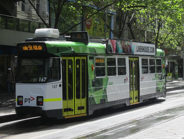
Unlike the Metlink logos, the PTV ones are much more prominent on vehicles, and for the first time will (eventually) result in common branding for buses. This is not a bad thing — it helps inform and remind people that we actually have one network, rather than a bunch of independent, disparate routes… helped of course if network service planning is done properly.
I was watching a documentary on London Underground the other week, and it remarked that they realised common branding was an important thing back in 1933! We almost got there in the days of The Met in the 80s, but back then, it was only trams, trains and government-owned buses that were in green and yellow. Private buses kept their own colours. This time, they’re included. Here’s a bus run by Transdev (formerly Melbourne Bus Link) spotted last week — at first glance, there is no indication at all of the operating company.
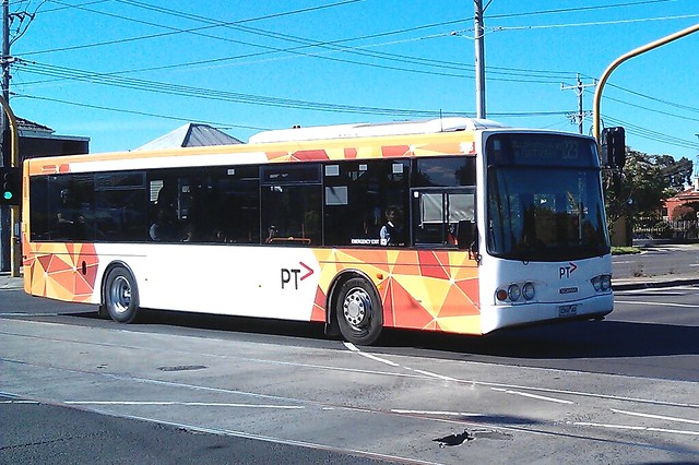
Some people have noted that a lot of passengers use the current differing bus operator colours to easily tell when their bus is coming — unlike trams and trains, buses have for a long time been run by different companies, with different colours.
I suppose passengers will have to start more carefully checking the route number. What would make this easier is if buses consistently had route numbers not just on the front, but also on the side and rear of the vehicle. Some buses have this already, but others don’t. And some front displays are not particularly readable. Improvements can be made.
7 replies on “PTV unified rebranding – pros, cons, and is it the last ever?”
They tried I think in the 90s but where blocked by the private bus operators of whom wanted their own livery, as they wanted to run their buses on their own charter runs too.
I love this idea of one standard livery for all of the PTv buses. It is a symbool of great pride within a franchise, much like all McDonalds have the golden arches, all KFC, Subway, and all other operators of a franchise network.
We almost went the other way with trains and trams when Kennet sell off, as we had two operators of each, and they both went for their own livery.
Today, V/Line seems to have three distinct liveries and colors. Time they took hold of a purple variant of the PTV livery as a standard V/Line livery too.
I always thought it was odd to brand signs around train stations. Especially the ones with ‘Metro’ on them. In my opinion its wasteful of money, because when the operator changes, all the signs need to be changed too. There were Connex branded signs around stations for a long time. Perhaps they do it to leave a ‘lasting’ legacy after they are gone?
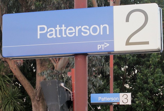
Almost all of the “Metlink’ signs didn’t need to be changed other than the Metlink part – I haven’t seen one in really poor condition. They should never have put the logo on there from the start. Insane waste of money.
I feel really sad because as the picture you’ve linked shows, the ptv logos really don’t look very nice compared to met link. The black provides a nice contrast. I wouldn’t be surprised to hear the ptv branding was done on the cheap.
I like the train and tram design and colour, but not the bus. Maybe I’ll get used to it.
It’s just so unfortunate that the PTV logo looks like it was designed in 5 minutes by a first year graphic design student. And now we’re stuck with it. Ugh.
On the Siemens Nexas trains, they removed the non-branded signs and replaced them with Metro-PTV branded signs sadly.
I think the standardized livery looks fantastic, but just a shame they don’t wrap it around the front of the bus and trams as well. And yes it should be a contractual requirements to have bus route signage on the side and rear of the vehicle.
The colour variation is great and I hope it’s rapidly introduced – a shame they’re not applying it to the Smart Bus service too – that silver and orange is horrid.
I think a purple variant for VLine would be excellent.