While I applaud Yarra Trams’ efforts to put more information on-board trams, this map threw me for a moment.
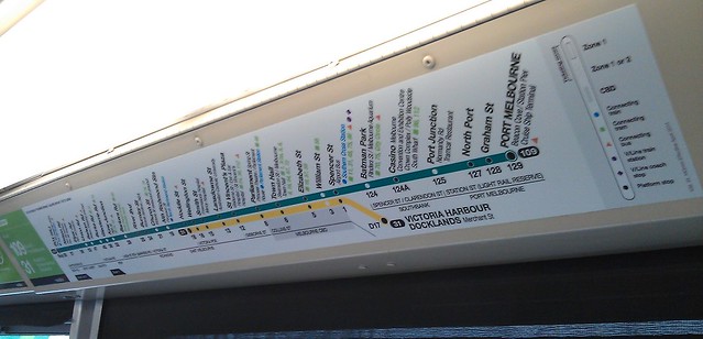
I’m used to seeing east (Box Hill) on the right, and west (Port Melbourne) on the left. This had it the other way around.
And before you say it: it wasn’t designed to match the actual orientation of the tram and the outside world, because there were copies of this map on both sides of the tram, so one was the right way around, and the other wasn’t.
Perhaps I need to just stop being such a map.square.
PS. I suspect the real reason for it being like this is they wanted the major route to be at the top.
4 replies on “Is this tram route map the wrong way round?”
Well spotted. There are many things in the public transport space that show there is a gap between the people who run the system and those who use it. That’s another one. But the people who run the system don’t think there is a problem.
I saw this (or another like it) ona tram a while back and although it was sort of correct for the direction of the tram and the side I was looking at, it is still counter intuitive.
It possibly has something to do with the way we were taught geography and the ways maps are drawn with North always at the top. Given that, then you are correct Daniel, West on the Left and East on the Right is more logical.
I agree with you Daniel. Unless there is a good reason, west towards the left and east towards the right.
Perhaps they are pandering to women who always seem to want to turn maps upside down.
London Underground used to have two mirror-image versions of the maps inside the tube carriages – one for each side of the carriage (only on those lines where the trains were always facing the same direction of course). This means that the maps were always aligned with the physical reality of the stations.
it was a subtle but great feature, but I noticed on my last visit that they don’t seem to do that any more.