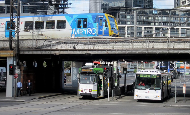
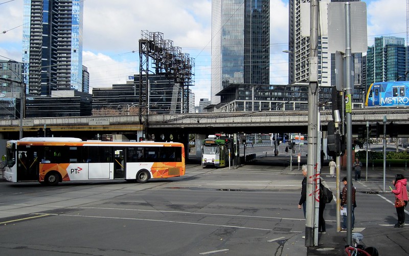
Do I win a prize? Following on from my photos a couple of years ago of a train, tram and bus in one shot, I’ve managed to get another (at the same location) of the three of them in the PTV livery.
Common livery is not the most important thing in a public transport network, but it is important. It’s a reminder that while the system may be run by lots of different companies, it is meant (in theory at least) to be one network.
The tickets and fare system are common, the routes should be designed to connect not compete, the timetables should complement each other and co-ordinate where possible.
The biggest change is in buses, where a myriad of colour schemes are coming together as one, with the operator name/logo reduced in size so it’s no longer significant — reflecting the practice in cities like London, but also closer to home in Adelaide and Perth.
Mind you it can also add to passenger confusion, in areas where passengers are used to differently coloured buses running specific routes.
Edit: This confusion can be reduced if route numbers are clearly displayed, not just on the front of the bus, but also on the side and back. Some buses have this already. It should be standard.
It sounds like only the (multi-company) Smartbus fleet will retain its distinctive bus colours.
I didn’t manage to get one of the few V/Line PTV-branded carriages into this photo. I guess that’s the next challenge (and to show the distinctive side design on a bus more clearly, rather than just the plain white front). You can see it in this snap a few seconds after the above photo… though the exposure was too short to properly show the tram LED number display. (In all honesty, none of the LED display showed in the above photo — I photoshopped it from another snap a moment later.)
Hopefully, having completely branded everything to PTV in the coming months, the powers that be will stick with that for many years to come.
Given some of the trains in particular have gone in the last twenty years through The Met (2 versions), Bayside/Hillside Trains, Connex/M>Train, Connex, Metro, and now PTV, I think everybody’s had enough rebranding for now.


15 replies on “Rebranding number 6 (in 20 years): Can we stick with “PTV” for a while please?”
Different coloured buses are fine by me. It helps distinguish which one I need a considerable distance away. Reading the numbers is more difficult until the bus is closer. It is also informative if you’ve just missed a service as there is no way to tell which bus it was if they’re all the same and driving away from you.
I have to wonder how much they have spent on this re-brand? When a system is less than optimal I would say a new coat of paint is pretty low on your list of spending. What about some analytical work on how to improve actual delivery of services?
This business / marketing trend of launching a re-brand to put your troubles behind you is pretty shallow and mostly ineffective. We’ll the bus is still late but boy does it look great, I can’t be mad at such a food looking bus… said no one ever.
I personally believe in function over aesthetic for things that actually have to function. Having said all of that, a universal colouring scheme is not a bad thing if the services are adequately differentiated by clear and 360 degree visible signage (front, back and flanks) but it’s just not a priority right now. Get your shit together PTV then put on a new shirt.
RE smartbus.
All we need to do is fit a $90 PIDS inside every bus, then non-smartbus would be up to SmartBus standards, and we can go one step further and have one livery for all buses including SmartBus in the PTV orange too.
You forgot 401/601! Those buses will probably be retaining their special livery by the looks of it.
Daniel, you are spot on as usual. Commuters just want a system that works with minimal confusion.
PS In the new movie Still Life, a character catches a bus with the scrambled “Connex” letters on the seat upholstery, just like we still have an some of our trains. Made me chuckle.
Indeed, stripping the Metro branding off the trains (after first replacing all Metlink branding with PTV branding) was one of the weirder changes. I just wish they’d spent some money hiring someone to design the PTV logo before committing to it so widely.
why do vline platform signs have vicklink below instead of ptv
I agree with @misguidedjenni. @Daniel, you touched on the problem when you said
“it can also add to passenger confusion, in areas where passengers are used to differently coloured buses running specific routes”
but it’s more than mere confusion. I’m not confused. I know which bus I want to catch. I just can’t read the damn signs until the bus practically runs me over, so the colours help a lot.
There are three bus routes (one of them a SmartBus), run by three separate companies, that run along a main road not far from my home. I can’t read the numbers or the destinations until the bus is almost at my stop, but the different colours enable me to signal the bus I want while it’s still some distance away, thus giving the driver plenty of time to stop. If PTV gets rid of those different colours, I’ll probably be forced to hail every bus just in case, and then wave it away if it turns out not to be the bus I want. Stopping for no reason is going to annoy the hell out of the bus drivers.
I’m sure someone is going to point out that trams in theory have the same problem: they’re all the same colour, and their numbers/signs are no bigger than the buses’. It’s true, I can’t read those either until the tram is almost upon me, but in practice it’s less of a problem. The streets with multiple tram routes (e.g. Swanston St, Elizabeth St, St Kilda Rd, Collins St) also tend to have a lot of passengers, so each tram has to stop at just about every stop anyway. By the time you get way out in the ‘burbs where the passengers are fewer, the tram line is generally for a single route. Sure, there are exceptions – I hailed what I thought was an 82 tram in Maribyrnong Rd the other day, and only realised as it slowed to a stop that it was a 57 – but mostly the trams I need to catch in the suburbs are on single-route lines. That’s not the case for most of the buses I catch.
It wouldn’t be as much of a problem if every bus stop had a PID, but on the main road I referred to, only the major stops do, and only for the SmartBus.
I agree with @Daniel’s point that common livery is “a reminder that while the system may be run by lots of different companies, it is meant (in theory at least) to be one network.” But I think that aspect pales in comparison with disability access, and there’s no question that common livery for different routes makes access harder for vision impaired people.
It would be awesome if Google could come up with an international symbol for Metro Train. It would come in very handy for maps.
BONNIE, perhaps you need to get an A2 size paper, and write on it the route number.
As each bus approaches, just hold that up. If the bus driver sees that it is not his/her bus route, then they can just go on past.
On the issue of different liveries, that is only an advantage at certain locations, such as where you do have two or more buses at the same location, and where both those routes are done by different bus operators.
Having said that, I do feel that all buses should benefit from the PIDS at stops, not just the premium SmartBus.
@Thomas – the ‘Viclink’ branding was the country Victoria version of ‘Metlink’. As part of the rollout of PTV across Victoria, both are getting replaced with the new stickers.
Marcus wongm rail Geelong thanks for replying I now bendigo has ptv sign but gisborne dosent rather if you go to sunbury there ptv stickers they seem to metro faster than vline but gisbus (gisborne bus service) had an upgrade to route 473 and 474 and the bus stops have the word ptv (I hate the vicklink and metlink logos public transport Victorias looks better)
do you agree.
Daniel or Marcus how much do new stickers cost and when will the new ptv stickers will be put at gisborne
update ptv stickers are on train station platform signs at gisborne now
@daniel when have ptv stickers been at bentleigh and also have you visited gisborne station
Thomas