Update October 2014: There’s a later draft
PTV are trialling a new train network map. They’re seeking feedback on it, and you’ll see it at some stations now (Bentleigh, Malvern and Moorabbin, I think).
Note, just to remove all doubt: unlike the PTV network plan, it’s not a concept for new rail lines; it’s a prototype of a map of the existing network.
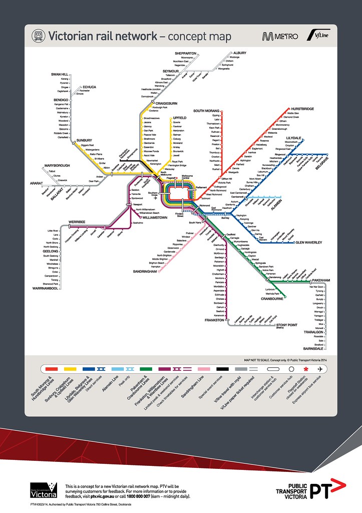
View the map larger, in a new window
My initial impression: I quite like this.
Colour-coding the lines helps make sense of the way the network actually runs (or will run in the near future). It allows them to add detail such as the stations usually skipped by expresses on particular lines, which lines run via the City Loop, and which sections run as shuttles. This helps people navigate — for instance if you’re coming from the Dandenong line going to Armadale, you’ll probably have to change trains at Caulfield.
The caveat here is that the train network is not currently operated consistently. Loop operations (even leaving direction aside) are very confusing. Express stopping patterns are all over the place on some lines. The Frankston and Newport lines are connected… but only on weekdays.
The operational variations on the various lines might need some work. See the difference between Williamstown and Alamein, for instance; potentially confusing.
A big difference is this map also adds V/Line services. With Myki now phased-in for short-distance (commuter-belt) V/Line services, one barrier to city people using them (the need to buy a separate ticket) is gone. This is an interesting move. It does take extra space, thus makes everything smaller — is the benefit worth it?
The part-time Flemington Racecourse line is shown prominently in black. I suppose that’s a good (for occasional users) and bad (implies it’s fulltime). I’m told it’s showing terminating at Southern Cross because that’s how it’s likely to be (at least on weekdays) in the near future, due to rail viaduct capacity issues, so they’d rather encourage people to change there instead of Flinders Street.
Somehow the order of lines shown at Flinders Street seems wrong, but I think that’s because I know Glen Waverley direct services don’t actually terminate next to Sandringham services.
The Skybus connection is shown, but the Broadmeadows to Airport Smartbus connection isn’t. Neither are the 401 and 601 university weekday high-frequency shuttles, specifically designed to connect to the rail network.
In the first version of the map that got out in the wild over the weekend, there were at least two errors: Violet Town and Euroa had been transposed, as had Ballan and Bacchus Marsh, and the colours indicating Myki validity had crept beyond where they should have. The stations have now been corrected (though Myki still creeps beyond Wendouree, Eaglehawk, Marshall and Traralgon) and PTV expect to do quite a few more tweaks over coming months as a result of feedback.
They don’t expect a more general rollout of the map until Regional Rail Link opens next year. It costs a small fortune apparently.
But what’s wrong with the current train map?
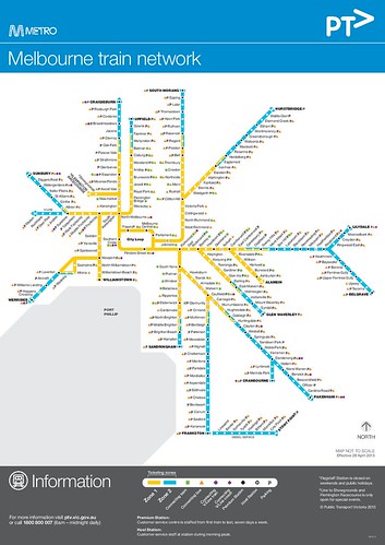 Everyone will have their own views, but the current train map (below) has a few problems. For instance:
It doesn’t show where the lines go. Someone unfamiliar with Melbourne might assume there’s a line from Sunbury to Upfield, for instance. And it doesn’t show any operational detail; the map implies all trains run via the Loop, for instance. It gives little hint as to where the best places to change trains are.
Meanwhile, we’re losing two-zone trips next year, so there won’t be a huge need to show zones as at present. The new map started being designed well before this, but it’s good to be able to take advantage of it to show other useful detail.
What about multi-modal?
I think the new map is a good step in the right direction.
But if they’re starting to mix things up on a map (Metro and V/Line), I think another thing they should be looking at is showing the network frequent trams and buses that back up the train network… though of course, that would be a much more complicated and difficult visualisation to get right.
But other cities are moving into this, and you can see the benefits from it, as described by Vancouver’s Translink:
People traveling along FTN (Frequent Transit Network) corridors can expect convenient, reliable, easy-to-use services that are frequent enough that they do not need to refer to a schedule. For municipalities and the development community, the FTN provides a strong organizing framework around which to focus growth and development.
(My emphasis. That’s the most important point. For public transport to be competitive with cars, this is essential. It’s not like, as Jarrett Walker describes, you can only drive out of your driveway every half-an-hour — but that’s what most PT users face.)
The train-only network map is still useful — good for showing the mass transit, backbone of the public transport network. But a frequent network map would be great for showing all the places you can easily get to in Melbourne on public transport — which is a lot more than just the rail network.
Also: the status board, and the bigger picture
Are maps even in important?
Sure they are. Good maps mean people can navigate their way around more easily, so they’re more likely to use the system. More passengers means more impetus to keep upgrading services.
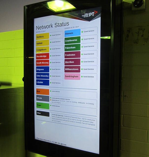
But this is about more than just a map. Related is the trial rollout of “rainbow” network status boards, installed this week at Moorabbin, Bentleigh, Malvern, and in the PTV Hub at Southern Cross. The colours on the board match those on the new map… including Alamein, which has a distinctive colour on the map to draw attention to the fact that you usually have to change at Camberwell.
It’s a little early to judge these, though I note that they don’t show next train departures — this is present on other displays at Malvern, but not at Moorabbin and Bentleigh and most other stations.
I’m told they can modify the design based on feedback, so it’ll be interesting to see how this evolves. One issue I think is that line-specific info is shown at the bottom — only a “traffic light” indicator is shown at the top, which means the information you need may not be easy to find.
I’d hope that once these boards are running well, they roll them out quickly to the bigger interchange stations, where they’re likely to be most useful.
Both the map and the status board are part of measures to standardise train operations: the slow move towards more predictable routes, consistent stopping patterns, consistent platforms at the larger stations, and “metro”-like frequent operation on dedicated tracks. And there are also moves to improve the flow of information from operators (on all modes) through to PTV so a better view of the overall network is available, including online.
Clearly they’ve got a long way to go, but this is a step forward.
Other maps:
- PTV map from their rail network development plan
- City Loop, excerpt from a 1981 map
- Campbell Wright’s frequent service map
See also:
97 replies on “A new train map is coming (and: network status boards)”
I know these things are needed, but I find it irritating that they’re rolling out these new status board when there are plenty of stations on the network that don’t even have an electronic display, showing how many minutes away the next train is.
These things are especially important on lines that have low frequency.
Neither the old nor the new map bear any resemblance to the actual geography of greater Melbourne. Not an issue for locals, but challenging for visitors. I discovered this challenge when I visited San Francisco – I ‘knew’ the geography of SF from maps, but I struggled to match BART destinations to their actual locations because the stylised network map didn’t match geographic reality. Not sure how to solve this problem, as the global preference seems to be stylised PT maps.
— The network map —
I like the idea of some of the changes in that map, and agree that it is time to ditch the zones.
The only issue is, there needs to be some clarification as to which V/Line services are MyKi and which are not.
Each V/Line line should be given their own color, much like with Metro lines.
The more detail you put onto a map, the more difficult it is to use. Therefore, I would not support there being only one map with all services listed. Rather, there should be different maps with different combinations of services on them.
— The status board —
I like the idea. Although I am not a fan of a plasma screen doing the whole lot. The only electronic part of the display needs to be only where the status is shown for each line.
V/Line should be done line-by-line as well as Metro.
— Other —
There needs to be a split up of V/Line into two distinct brands. One being the MyKi portion, and the other doing the long distance Non-MyKi portion of the network
Where are the tram and bus connection logos?
@Paul
Thank God someone else said “there are plenty of stations on the network that don’t even have an electronic display, showing how many minutes away the next train is.” I’ve been wanting this done for years at Narre Warren. Also the Large Screens are only really needed at the larger stations like Dandenong, Ringwood, Boxhill so on…
Also, I wish the Cranbourne Line was the same as the Alamein in regards to being a shuttle service when not in peak, because quite Frankly, there are definitely not as meany people on Cranbourne As there is Pakenham, They should have a 15 or 10 minute Pakenham line frequency with 3 carriages during the middle of the day (allows more trains to run) with a high frequency shuttle service to Cranbourne.
I like the map, but noticed that premium and limited stations have been redesignated as ‘customer service hubs’. Is this an actual change across the network or are they just rebranding them?
Here’s one thing that IS missing from this new network map: Something that identifies where a train might be indicated as traveling to.
I’ll give an example. The other week I had to catch a V/Line service to Geelong. That’s fine – it was easy to find on the timetables. But when I got to Southern Cross, it wasn’t so simple. Why? Because the train was listed as traveling to ‘Marshall’, not ‘Geelong’, a place I’ve frankly never heard of.
This map could be improved if somehow the stations which a service might be listed as traveling to were indicated somehow – maybe in bold. So Marshall, as a station on the map, would be bold compared to other stations on the line, because this is the actual train you’re looking for when hunting for a service on a particular platform.
Another example might be trains that stop at Broadmeadows (versus Craigieburn), Upper Ferntree Gully (versus Belgrave), Blackburn or Ringwood.
While they are at it, “Metlink” (that shows how old it is!!) Android app could REALLY do with an update. Such a hard app to use with all those tiny buttons. I’m using TrainTrapper and Offi to avoid the Metlink app
why haven’t they included RRL if it’s going to be rolled out when it starts next year?
They seem to have made no attempt to make at least some of the colours the same as the ones in The Plan. So, instead of being yellow like the Baxter–Parliament–Craigieburn line in the final metro, Frankston is maroon. (I don’t know whether it’s a grim in-joke that this is the same colour used for the Metropolitan Line on the famous Tube map; like Franston, that line was designed with complex stopping patterns that have been simplified to the detriment of commuters, and like Frankston the timetable padded to “improve” reliability.)
A proportion of the population is colour-blind, so names for the lines will always be needed, but when you’re shovelling tens of thousands through interchanges it’s a big win to be able to consistently indicate lines by colour. And another big win not to have to change too many of them as you rearrange lines later.
As for the lack of geographical accuracy, this type of map is known as a Beck map after its inventor. When his map for the London Tube was first shown, in the 1930s. it was considered radical and shocking because of this lack of accuracy. To this day visitors to the city undertake half-hour train journeys when they could have walked 400m on the surface – because the map doesn’t tell them. I hate these maps and wish Melbourne would have the courage to revert to something more geographically accurate like the one for the NY subway.
Whoops, they did actually use yellow for Craigieburn, so at least one line is the same. I’m always mixing Upfield and Craigieburn up.
Perhaps a little off-topic, but since most trains from Frankston go to Werribee (or another destination in that direction) on weekdays (and they’re apparently going to be colour-coded on the map accordingly), why don’t the displays on the front of the trains and at stations such as Richmond, South Yarra etc actually say so (instead of just Flinders St)?
Great comments, all. I’ll make sure these are passed on. Some replies from me:
@Paul, I agree. The LED displays are now “the standard” at new stations (see: Lynbrook, West Footscray etc), but no news of rolling them out to existing stations.
@Michael Bell (and @Francis E), since about the 1930s, increasing numbers of PT systems have prioritised mapping their (often complex) networks instead of the city geography. Perhaps they’ve pushed it a little too far — the old one at least shows the bay, which perhaps is help as an anchor (no pun intended).
There’s a problem with to-scale maps (see Wikipedia’s rail network map — Pakenham alone means the map is far bigger than it needs to be otherwise), but entirely abstract can be problematic too.
@tranzitjim, the V/Line services which take Myki are shaded grey. Those which don’t are not shaded.
@No Need To Know, yeah I’m torn on this. The connection logos add a lot of noise to the old map, and I’m not sure they’re really that useful, since you don’t know where any of the routes go to. Plus almost all stations have a bus or tram connection, so is there any point? Perhaps the idea is to use the Journey Planner and other such tools to determine your interchange point instead.
@Phil, “Premium station” to “Customer service hub” seems to be a rebranding.
@Tim, perhaps an alternative is to use an indicator on each train of which line it’s on? Geelong line / Marshall in this case. I don’t know. To an extent it becomes an issue of what our lines are called, particularly the regional lines which are mostly no longer named after their terminus stations.
@Tim (2), I think they want the draft map to reflect the network as it is now, to get comments but also not cause mass confusion over ghost lines appearing on the map.
@gxh, yeah, once upon a time a train from Sandringham through-routed to St Kilda would say St Kilda on the front. I think it might be confusing to say Werribee for the entire trip from Frankston, but agree it might make sense to change it over when the train gets to South Yarra. But I expect that has implications for the software systems they use, as well as operational practice at present, which is that trips start and end at Flinders Street. Might be a need for reform on that!
I really like the inclusion of regional lines on the map; there is a clear interconnection with their routes in reality, so might as well have it on the map. I bet it’d be subtly helpful for increasing leisure travel on Vline too, by hinting to people they could go further afield via Myki on weekends.
I agree with Michael Bell and Francis E re: problem with lack of resemblance to the actual geography of Greater Melbourne. Sandringham, for example, is shown on the map as southwest of the loop and in the middle of Port Phillip Bay. While such inaccuracy is amusing this will be an issue for intrastate, interstate and international visitors. Readers, put yourself in the shoes of a visitor and recall your feelings anxiety when you visited a big city for the first time and travelled on public transport. Remember your feelings of annoyance and anger when you were told incorrect information and wasted valuable time and money. MC
I agree with others that the bay should be shown as an important “anchor” point, just like the River Thames is shown on the Tube maps in London.
Another bit of feedback is that the station blob at North Melbourne is ambiguous – do V/Line trains stop there or not?
And, because we all like to dabble and think we can do it better – here’s a shameless plug for my attempt at a semi-geographically accurate map that still aims to show things clearly (although it is biased towards trams as I figured the geography is more important for that mode) http://mikealex.com/images/metmap.pdf
To address a comment above, new next train screens are being rolled out to stations. 8 stations got some in December (and a 9th this week).
Flinders St (additional)
Hoppers Crossing
Footscray (additional, this week)
Glenroy
Gowrie
Northcote
Berwick
Prahran
Windsor
No doubt there will be more to come
@Tim: the usual solution in metros is to use numbers or letters for the lines, because that only takes one character position on the destination board. Hence, “Take the A train”. If you have a colour-coded Beck or subway map, you can attach a matching colour-coded metal plate to the front of the train. If you have stable platform assignments you can colour-code directional signage and platform signs. That’s why it’s expensive to change the colours with versions of the map.
I am not a fan of stylised maps, having caught a Tube train to travel one station when it would have been quicker to walk. However, they seem to be a necessary evil.
I don’t really understand why Alamein is not dark blue. You have to change trains on other lines too at times. Why single Alamein out?
Hi everyone,
I’m the Product Development Manager for PTV and I’ve been working on the new map. Thanks for the feedback and I’ve taken the liberty of outlining some of the logic behind each decision. The map will go through multiple drafts and we have six months before we need to lock it down before we start designing things for the launch of RRL in 2015. So lots of time to get comments. The following comments outline the logic of why certain decisions were made – not expecting everyone to necessarily agreed with the logic, but I thought you’d like some insight into the thought process that went into the map. Just remember – you might not be the target audience for the map! ;) Remember to think like a tourist or occasional network with limited knowledge.
Thanks and I look forward to reading more comments. Expect more drafts to be released progressively as we refine it.
Paul on Wed 16 April 2014 at 9:10 am said: I know these things are needed, but I find it irritating that they’re rolling out these new status board when there are plenty of stations on the network that don’t even have an electronic display, showing how many minutes away the next train is. These things are especially important on lines that have low frequency.
The boards are being rolled out on the Frankston Line which now has services every ten minutes during the day, seven day a week. All stations on the Frankston Line have ‘green buttons’ which tell passengers how long until the next train. So that information is available at the stations – but you are of course correct that it isn’t available in a visual format. The real time boards are unfortunately quite expensive (even more expensive than the Network Status Boards!). More stations on the Frankston Line (and across the network generally) will be getting real time screens that show number of minutes until departure but for many stations with lower patronage, the green buttons will remain the primary way to know how many minutes until the next train. Interestingly, I was in NYC last month and they only have real time information on a few lines – you really forget how valuable the green buttons are until you’re waiting on a NYC subway platform at 11pm wondering when the next train is. So probably worth remembering we are already ahead of many cities in that respect.
Michael Bell on Wed 16 April 2014 at 9:13 am said: Neither the old nor the new map bear any resemblance to the actual geography of greater Melbourne. Not an issue for locals, but challenging for visitors. I discovered this challenge when I visited San Francisco – I ‘knew’ the geography of SF from maps, but I struggled to match BART destinations to their actual locations because the stylised network map didn’t match geographic reality. Not sure how to solve this problem, as the global preference seems to be stylised PT maps.
There is a strong argument for more multi-modal, geographically accurate local area maps that show all modes. But I think we are talking about a different product – the purpose of this map which is designed to let customers find their way through the rail system, so they can find out where to change, etc. The new map is just one of a suite of products provided to customers, some of which may need to be revised. The new map certainly doesn’t remove the requirement for other kinds of maps. The market research into this map provided some interesting findings in terms of how people use the train map in conjunction with other maps on their mobile devices and local area maps at stations. In other words, generally people use the train map to get to a station, and then use their phone to navigate to their final destination.
tranzitjim on Wed 16 April 2014 at 9:35 am said: Each V/Line line should be given their own color, much like with Metro lines.
We tried a number of designs and giving V/Line services their own colours simply ended up looking too complex for passengers and reducing utility. Options examined included colouring the stations on each V/Line service (eg. green dots on the Traralgon Line), but it just confuses things without actually giving any benefits to customers. Unfortunately adding V/Line colours to the map makes the end product more complex without giving passengers any real benefits.
tranzitjim on Wed 16 April 2014 at 9:35 am said: Each : I am not a fan of a plasma screen doing the whole lot. The only electronic part of the display needs to be only where the status is shown for each line.
It is actually cheaper to do it this way – and it means we can change the designs to reflect customer feedback and changes. It means we can add and delete information more easily.
tranzitjim on Wed 16 April 2014 at 9:35 am said: Each V/Line should be done line-by-line as well as Metro.
So far the boards have been representing V/Line pretty well. We have the ability to split out the V/Line information by line if we need to. But that’s something we will be testing and evaluating.
No need to know :) on Wed 16 April 2014 at 12:00 pm said: Where are the tram and bus connection logos?
In market testing we found that this added no value to customers. However, electronic versions of the map can include this information (eg. when you touch a station it can give you a list of connecting services, etc..). On a static map it isn’t useful, but it will be VERY useful on other mediums.
Aidan on Wed 16 April 2014 at 1:06 pm said: Thank God someone else said “there are plenty of stations on the network that don’t even have an electronic display, showing how many minutes away the next train is.” I’ve been wanting this done for years at Narre Warren.
As discussed above, this information is available at stations via the green buttons. Obviously the real time screens are expensive so these have only been rolled out selectively – but more stations will be getting them.
Aidan on Wed 16 April 2014 at 1:06 pm said: Also, I wish the Cranbourne Line was the same as the Alamein in regards to being a shuttle service when not in peak, because quite Frankly, there are definitely not as meany people on Cranbourne As there is Pakenham, They should have a 15 or 10 minute Pakenham line frequency with 3 carriages during the middle of the day (allows more trains to run) with a high frequency shuttle service to Cranbourne.
The long term plan is to eliminate all shuttle services from Dandenong with trains operating either to Pakenham or Cranbourne. For this reason, we haven’t shown shuttle service at Cranbourne. Same logic for shuttle services from Ringwood.
Phil on Wed 16 April 2014 at 1:36 pm said: I like the map, but noticed that premium and limited stations have been redesignated as ‘customer service hubs’. Is this an actual change across the network or are they just rebranding them?
We are considering rebranding them – what do you think of the new term? We are considering a consistent term across Metro, V/Line and PTV and that’s one of the things we are testing with the new map.
Tim on Wed 16 April 2014 at 3:43 pm said: Here’s one thing that IS missing from this new network map: Something that identifies where a train might be indicated as traveling to. I’ll give an example. The other week I had to catch a V/Line service to Geelong. That’s fine – it was easy to find on the timetables. But when I got to Southern Cross, it wasn’t so simple. Why? Because the train was listed as traveling to ‘Marshall’, not ‘Geelong’, a place I’ve frankly never heard of.
The benefit of having line colours is that you can start to promote services via these rather than the end destination of the line. Ideally, in a few years we would have line names (eg. like London). E.g. this is the X line service to Y. But that’s quite some time off. Due to the large number of places we terminate trains on the network it isn’t feasible to include them all (eg. on the Hurstbridge Line we terminate trains at Macleod, Greensborough, Eltham and Hustbridge). If we ever get more consistent operating patterns and starting points we might be able to consider that in the future.
Tim on Wed 16 April 2014 at 9:52 pm said: why haven’t they included RRL if it’s going to be rolled out when it starts next year?
We haven’t included RRL or the new stations being opened on the map – but they will be included. Don’t forget, this map is only on display at three stations and the PTV Hub at Southern Cross! The map is designed to accommodate RRL – the line at Deer Park will continue down to Little River (so two more stations in that space).
Francis E on Wed 16 April 2014 at 10:43 pm said: They seem to have made no attempt to make at least some of the colours the same as the ones in The Plan.
The Plan was designed by engineers and there wasn’t any market testing of the colours – which were just to show concepts. The map is designed to be more user friendly. The map has been tested for people who are colour blind and we are already consulting with various vision groups for their comments and feedback. For example, we have designed the map so that the Red and Green Lines are not next to each other.
Francis E on Wed 16 April 2014 at 10:43 pm said: As for the lack of geographical accuracy, this type of map is known as a Beck map after its inventor. When his map for the London Tube was first shown, in the 1930s. it was considered radical and shocking because of this lack of accuracy. To this day visitors to the city undertake half-hour train journeys when they could have walked 400m on the surface – because the map doesn’t tell them. I hate these maps and wish Melbourne would have the courage to revert to something more geographically accurate like the one for the NY subway.
It isn’t possible to have a network map that is geographically accurate for a city as large as Melbourne. However, that doesn’t mean we can’t have geographically accurate maps on a local level. London has invested significant money recently in developing a suite of maps at stations and on streets to show walking distances. PTV is working with the City of Melbourne and other groups on a similar project. However, the use of mobile phones is changing this significantly – people are now using products like Google Maps to estimate walking time. The problem of people doing long tube journeys for short distances has largely been eliminated in London with a combination of mobile devices and local area maps. In the focus groups we held for the new map it was interesting that people said that they would often use Google Maps in conjunction with the map (eg. see how long it would take to walk all the way, use the train map to get to the nearest stop and then use Google Maps, etc.). Our research really helped to position this map in relation to the other information sources that customers use.
Francis E on Wed 16 April 2014 at 10:53 pm said: Perhaps a little off-topic, but since most trains from Frankston go to Werribee (or another destination in that direction) on weekdays (and they’re apparently going to be colour-coded on the map accordingly), why don’t the displays on the front of the trains and at stations such as Richmond, South Yarra etc actually say so (instead of just Flinders St)?
We are working towards this – there are some technical issues to resolve. This is highly desirable to reduce the number of transfers made by passengers.
Tim Richards on Thu 17 April 2014 at 8:12 am said: I really like the inclusion of regional lines on the map; there is a clear interconnection with their routes in reality, so might as well have it on the map. I bet it’d be subtly helpful for increasing leisure travel on Vline too, by hinting to people they could go further afield via Myki on weekends.
Yes, we hope the new map will encourage Melbournians to know they can travel more easily to regional Victoria. People tend to forget that you can travel around Melbourne, jump on the train to Ballarat and then travel around local buses in Ballarat all on the one myki and get information for your entire trip via the same website and call centre. Now that there is greater integration in terms of ticketing, services and information, it is time to start promoting it. The map helps with this.
Matthew Coote on Thu 17 April 2014 at 8:18 am said: I agree with Michael Bell and Francis E re: problem with lack of resemblance to the actual geography of Greater Melbourne. Sandringham, for example, is shown on the map as southwest of the loop and in the middle of Port Phillip Bay. While such inaccuracy is amusing this will be an issue for intrastate, interstate and international visitors. Readers, put yourself in the shoes of a visitor and recall your feelings anxiety when you visited a big city for the first time and travelled on public transport. Remember your feelings of annoyance and anger when you were told incorrect information and wasted valuable time and money.
We considered including the bay on the map, but it actually ending up being misleading for people as it implies the map is geographically accurate, which it isn’t. I understand your concern, but it was considered to be far more misleading for tourists to imply any level of geographic consistency by including landmarks. By putting the Bay on a schematic map, you actually make the problem worse.
Mike on Thu 17 April 2014 at 9:19 am said: Another bit of feedback is that the station blob at North Melbourne is ambiguous – do V/Line trains stop there or not?
V/Line trains will not stop at North Melbourne once Regional Rail Link is opened. There are a couple of reasons for this, but the main one is that with the network becoming more congested, V/Line passengers wouldn’t necessarily be able to board Metro trains at that station easily. By running express to Southern Cross the passengers can transfer to Platform 9 and pick up trains to Flagstaff, Melbourne Central and Parliament that have already dropped off most of their passengers at Flinders Street. That is one of the reasons why the South Morang and Hurstbridge Lines were altered to always operate clockwise around the loop – any V/Line passenger arriving at Southern Cross can be sure that there will be a service to the underground loop stations departing from Platform 9, seven days a week.
Andrew on Thu 17 April 2014 at 1:27 pm said: I am not a fan of stylised maps, having caught a Tube train to travel one station when it would have been quicker to walk. However, they seem to be a necessary evil. I don’t really understand why Alamein is not dark blue. You have to change trains on other lines too at times. Why single Alamein out?
Hi Andrew – when was this? Lots of people used to have this experience in London but it doesn’t happen much these days as people are using mobile phones to check walking times and distances.
The number of shuttle services on other lines have been reducing towards eliminating them (eg. far fewer shuttles from Dandenong or Ringwood). They haven’t been included for this reason. In market testing we tried having Alamein as dark blue but less than 5% of the participants worked out that they needed to change at Camberwell. Having Alamein as light blue has been driven by the research that clearly indicated if it was the same colour then you would end up with people waiting for Alamein trains at places like Hawthorn, not realizing they needed to go to Camberwell and change.
I still think that trams and busses should be listed. It can help a little bit sometimes, and as for the sandringham line, I think it should not fan out like that. This is just a bit of a small petty opinion, but it implies that the Frankston line is further away from the bay than it actually is. But that dosent really matter, :D
I’d rather that the smartphone apps were sorted than print based maps or information displays. Would go a long way to contribute towards user friendliness. When I travel overseas, I don’t look for printed network maps at stations, I download the appropriate phone app and use that.
@Mike wrote:
“And, because we all like to dabble and think we can do it better – here’s a shameless plug for my attempt at a semi-geographically accurate map that still aims to show things clearly (although it is biased towards trams as I figured the geography is more important for that mode) http://mikealex.com/images/metmap.pdf ”
Can I be the first to say that I really like Mike’s map? I’ve seen countless train maps and tram maps, but I don’t recall ever seeing an integration of the two, let alone such a good one.
@AdrianW wrote:
“All stations on the Frankston Line have ‘green buttons’ which tell passengers how long until the next train. So that information is available at the stations – but you are of course correct that it isn’t available in a visual format.”
Adrian, please don’t forget people who are hearing impaired. Green buttons with audio messages don’t help them much. Ideally all real-time running information should be available in both audio and visual formats. I’m not deaf, but I regularly chat on social media with people who are, and the lack of real-time visual information is a constant source of frustration for them. This is annoying enough when trains are merely running a bit late, but becomes a real problem when there are serious disruptions to service, such as trains terminating short of their destination, or trains replaced by buses. Announcements of these disruptions are often made only over the PA system, and not backed up by anything visual. This is completely useless if you are deaf.
Thank you AdrianW for your replies. I don’t recall ever before seeing such direct and well-reasoned dialogue with a PTV representative – it’s refreshing and very welcome.
It looks OK.
The only change I’d make, is to bend Alamein down at a 45 degree angle, and label it’s stations horizontally on the right of the track. Easier to read the names and a better representation of the actual direction.
@AdrianW – thank you for your detailed responses. And it’s particularly good to hear that solid professional UI design is being done on this (colour blindness, test studies).
I would say that if Google Maps were to be supplied with the line and station information as they are for the Tube in London, I would have the geographically correct map I like, scalable with a pinch on my phone. Try it for Oxford Circus and you will see the stations marked with roundels and the lines marked in their Tube Map colours. Try it for Parliament Station and you get the Yarra Trams stop and no Metro Trains or stations.
@AdrianW – PTV is working with the City of Melbourne and other groups on a similar project. However, the use of mobile phones is changing this significantly – people are now using products like Google Maps to estimate walking time.
Not meaning to be rude, but given the opportunity I’d much rather use Google Maps to work out my entire journey; it worked beautifully for me travelling around North America in 2012. PTV did promise to realise the necessary data in a suitable API, but it seems your (well not you personally, but the company) has a different idea of what makes a suitable API to Google and most app developers. Given that Google is, well… Google, it seems like if you are going to release the data, it would be sensible to comply with GTFS. If PTV are not going to fix the API, then it would at least be nice if Android got a software update! Android does currently have a larger market share than IOS.
Declan Martin on Thu 17 April 2014 at 5:20 pm said: I still think that trams and busses should be listed. It can help a little bit sometimes, and as for the sandringham line, I think it should not fan out like that. This is just a bit of a small petty opinion, but it implies that the Frankston line is further away from the bay than it actually is. But that dosent really matter, :D
I agree that bus and tram information should be linked to the map, but not necessarily in the poster version. There’s already a lot of information presented. The problem is that the little triangles and squares that represent buses and trams on the current map don’t add any value for customers (eg. they’re pretty useless). If you try and add more information then the map becomes crowded. But there are lots of opportunities to include more information on electronic versions (eg. click the station for more information). So my question for everyone is: if you had a clickable map – what information would you want to see? Presumably the next five train services in each direction, connecting buses, whether the station was premium, host or had PSOs, number of car parking spaces? Anything else? Which of those would be more useful? Also, don’t forget that we have line specific maps in various publications – that might be a more appropriate place to include information on connecting services. Remember, the map needs to fit within a suite of information – not everything needs to go on the map. When we release the new map we will need to release new line specific maps in the new colours. It may be more appropriate to include multi-modal information on there (for example).
John on Thu 17 April 2014 at 5:30 pm said: I’d rather that the smartphone apps were sorted than print based maps or information displays. Would go a long way to contribute towards user friendliness. When I travel overseas, I don’t look for printed network maps at stations, I download the appropriate phone app and use that.
We can do more than one thing at a time! :) We have to replace all the maps when RRL comes in, which is a very expensive exercise, so this program of releasing the map and seeking feedback and comments should be really useful in ensuring that we end up with a good product. However, making the train network more consistent helps make it easier understand no matter what information channel you are using.
Bonnie on Thu 17 April 2014 at 6:54 pm said: Adrian, please don’t forget people who are hearing impaired. Green buttons with audio messages don’t help them much. Ideally all real-time running information should be available in both audio and visual formats. I’m not deaf, but I regularly chat on social media with people who are, and the lack of real-time visual information is a constant source of frustration for them. This is annoying enough when trains are merely running a bit late, but becomes a real problem when there are serious disruptions to service, such as trains terminating short of their destination, or trains replaced by buses. Announcements of these disruptions are often made only over the PA system, and not backed up by anything visual. This is completely useless if you are deaf.
That’s precisely one of the reasons we are rolling out rainbow boards. :) They display information on disruptions that cannot be easily be displayed on ‘next train’ displays. It means that people will be able to access information on what is happening on the network much more easily if they have a hearing impairment – or indeed particular types of visual impairment. In addition to the screens at stations, the same information will also be available online (so if a person with a hearing impairment is at a station without a rainbow board or they’re on a train then they’ll be able to get higher quality information via their phone). Many people have a visual impairment that prevents them from seeing displays but can see their phone – so it’s also an advantage for them too. We’re expecting many more people to access the rainbow boards via their phones than by looking at screens at stations. Like London and other cities, we want people to just quickly check the status of the network before they travel to make sure everything is ok. The sooner we can intercept customers during their journey the better! We have a rainbow board in the office and the other day services were cancelled between the city and Clifton Hill. The rainbow boards displayed the message that buses were operating between Parliament and Clifton Hill – if this information had been available online then many passengers would have known to head straight to Parliament rather than heading to Flinders Street and then finding out they needed to get to Parliament. It is hoped that rainbow boards will give us more options to deal with disruptions. For example, Coolaroo and Upfield Railway Stations are about three kms apart. If there was an incident on the Craigieburn Line at, say, Essendon, then it might be useful to assign one bus to shuttle backwards and forwards from Coolaroo to Upfield. The problem is that it is quite hard to inform passengers and staff of replacement bus services if they are operating between lines rather than along lines. Rainbow boards start to give us significant opportunities during disruptions to let people know about alternative services. The online version of the rainbow boards will be available soon.
enno on Thu 17 April 2014 at 9:55 pm said: The only change I’d make, is to bend Alamein down at a 45 degree angle, and label it’s stations horizontally on the right of the track. Easier to read the names and a better representation of the actual direction.
In many of the drafts of the map we did bend down the Alamein train line – but it looked a little weird. Happy to release the old draft so people can see what it would look like. It ends up looking like it is too close to the Frankston line when you have so much space.
Francis E on Thu 17 April 2014 at 10:35 pm said: @AdrianW – thank you for your detailed responses. And it’s particularly good to hear that solid professional UI design is being done on this (colour blindness, test studies). I would say that if Google Maps were to be supplied with the line and station information as they are for the Tube in London, I would have the geographically correct map I like, scalable with a pinch on my phone. Try it for Oxford Circus and you will see the stations marked with roundels and the lines marked in their Tube Map colours. Try it for Parliament Station and you get the Yarra Trams stop and no Metro Trains or stations.
One of the problems we have had with open data in the past is that outside organisations have not been prepared to guarantee to keep it up to date. Not so much of a problem in some networks with turn up and go services (eg. London operates almost all of their lines every ten minutes). We will be releasing a lot more data in the future – but there needs to be a balance between letting the market develop apps or including our data in other product offerings, and making sure that the data is correct. So not quite as easy as it sounds to get the right customer outcome. Having said that, the use of line colours will make it easier to include information on google maps, etc. If you can develop a train network that is more consistent and legible in operation then it is easier to present information and data online. For example, the fact that South Morang and Hurstbridge Lines now operate the same direction around the loop seven days a week makes it much easier to present this information online in number of formats.
But Adrian, why has the “Metlink” Android app not been updated since 2011? It really is a hideous app for usability and general viewing of the network particulars. Most of the reviews on google play are negative.. why not port the iphone app to android?
@John, it’s notable that PTV recently released a data API, so anybody can develop apps that look up an official source of timetable and journey planner info. The down side is the way they’ve structured it means for an app to work, it must have a working connection at the time of use. This means that, say, an official source of data for something like the popular Train Trapper app (which works offline, eg in a Loop tunnel!) would be impossible.
More info:
http://ptv.vic.gov.au/news-and-events/news/ptv-releases-timetable-data/
http://www.data.vic.gov.au/raw_data/ptv-timetable-api/6056
Note the comment on the second link from “Data Vic Admin”:
This initial release of timetable data via API allows for content to be created, updated and automatically released across multiple channels. Other popular formats will follow. A major upgrade to the PTV timetable management platform is underway to improve efficiencies and data administration. This will result in further data formats being made available, including GTFS. Developers have started sharing their format conversions . For example on GitHub https://github.com/andybotting/ptv2gtfs.Please note that all your comments and requests are provided to PTV on a daily basis.
It’s absolutely fantastic to see this project underway. About time!
The drafts look very promising.
I have to point out of course that our Melbourne Rail and Tram Map has been online continuously since 1996.
http://www.railmaps.com.au/melbourn.htm
Our map has been oft copied – Mike’s map (above) is but one whose work is based on our map (don’t worry we consider it a compliment), There have even been international companies who have printed commercial maps that have copied ours (we’re not quite so OK with them).
We developed our map principally because the ‘official’ Melbourne rail and tram maps of the time were so hopelessly inadequate that they did an injustice to the network. In the 18 years since we first published our Melbourne map the official maps have barely improved at all. However I have to say that I am extremely encouraged by what I’m seeing here and it seems likely that for the first time ever Melbourne could be about to get a quality network map that does justice to the great system.
Andrew W – we wish you all the best with your project. We’ll be looking at your drafts a bit more closely and commenting. If there’s anything you’d like from us here at Australian Rail Maps – we’d be very happy to help.
We’ve spent the afternoon looking over the draft map, and have a number of observations and suggestions that we hope will be helpful.
1. The station Names are very dominant. If they were less dark – for example a mid to dark grey rather than black, they would distract less from the flow of the route lines. Obviously you can go only so far before they become less readable for low vision users.
2. Station names written diagonally are jarring on the eye. As far as possible I would recommend trying to keep them horizontal. I understand the challenge here – but in many of the places you currently have diagonal station names there are easy solutions. For example Altona to Hoppers Crossing could be achieved by running the route line diagonally to the bottom left of the map rather than having the horizontal section to Werribee. On the Ararat, Alamein and Glen Waverley lines, by extending the length of the route you would have room to alternate station names above and below the horizontal route line. You could push Sunshine a bit further West making room for the stations between Footscray and Sunshine to be written horizontally. You could make room in the East to write the Ringwood line station names horizontally by turning the Belgrave line South and the Lilydale line North after leaving Ringwood.
3. I would suggest you could better use the full bounds of the map frame by extending the longer distance routes to the border – giving a better distinction between metropolitan and country lines. For example the Warrnambool, Maryborough, Swan Hill and Echuca lines in particular could be extended and the stations spaced further apart. You also have some room up your sleeve to take the Stony Point line down to the bottom of the page. You can partly overcoming the objections of those who prefer geographic maps whilst retaining the geographic simplicity by changing just a few things: Turn the Sandringham line due South after Prahran; extend the Williamstown line further South-East, turn the Cranbourne line South after leaving Dandenong.
4. Your ‘dashed line’ and ‘hollow line’ notation is inconsistent. On the Eastern line it means ‘peak hours only’ or ‘direct services’, on the South-East it means limited peak and weekends, but a similar notation in the country means ‘paper tickets required’. You also have hollow lines at Newport and Laverton meaning ‘check timetables’. In my opinion you would be better off having a consistent definition with three tiers of service – solid= full time service, dashed = part time, hollow= peak only. A different notation would be better to illustrate the boundary of the myki zone – maybe a grey or other type of background for those lines outside the myki zone (wheat or forest coloured/patterned maybe?).
5. The Flemo Racecourse line should be shown as a part time line only – using whatever notation as suggested above.
6. The city loop is a bit too ‘chunky. Perhaps you could increase its size a bit – that would make the lines appear less ‘thick’ compared to its dimensions. Also the curve between Flinders Street and Southern Cross is very large radius – and it contrasts heavily with the corners elsewhere which seem to be constant radius. I think you need to look at a different technique there.
7. Your ‘change of colour’ notation for the Alamein line doesn’t sit well with me as it’s the only place where trains change colour en-route. However, if you consider this acceptable, then you could use that technique to thin down the chunky city loop by removing the fifth line (the dashed crimson colour), and using the green loop and yellow loop to show that some trains from Frankston and Werribee travel via the loop.
8. I believe that horizontals and verticals create a stronger map than diagonals. You could so this easily by making the Shepparton line a strict vertical, and you could also make the line to Ringwood more horizontal by turning the lines east of Ringwood into verticals.
9. The colouring of the Stony Point line is inappropriate – a casual reader would assume it’s a Vline service. It’s probably not so important really, but it would be worth indicating by some sort of colour co-ordination with the Frankston line that trains are timed to connect at Frankston. The notation ‘Metro’ at Stony Point would be mystifying to a visitor (Metro as opposed to rural – is there another Stony Point)?
10. An item of added value would be to somehow illustrate the mapping of line colours to station platforms in city stations. For example the red line runs through platform 1 in loop stations, and Flinders Street and platform 9 at Southern Cross. Etc for other lines. Maybe a text note near the stations themselves. This could also work for other major stations like Richmond, Caulfield, South Yarra, North Melbourne and Footscray.
11. You’ve omitted Vline stops at Clayton, Berwick, Ginifer, St Albans, Watergardens, Essendon and Broadmeadows.
12. You’ve omitted the Overland to Adelaide and the Sydney XPT services. Timetable for these services are included in the Vline timetables and some Vline fares are available on these trains – so the probably should be included.
13. You don’t show the correct route for the Albury Line trains – they in fact run via Albion but you don’t show the route on your map.
14. Do you think it might be worthwhile showing Puffing Billy? It’s something I would expect tourists to try to locate on such a map – and it’s easily accessible by train, and indeed there are specifically scheduled express Belgrave trains timed to get tourists to the morning Puffing Billy train.
15. You have an unusual station indicator at Ballarat, Bendigo and Seymour (but not Geelong or Traralgon). Its not clear why these are different and there’s no notation as to what an elongated station blob means.
16. Some of the Vline stations are staffed but your map would suggest not – for instance Echuca, Albury, Swan Hill, Shepparton etc.
I would like to say that I really like where this concept map is heading. It is the map Melbourne has needed for a long time.
As someone who has lived in London and travelled the world, I can safely say that Melbourne is one of the hardest networks I have had the privilege to navigate. Only locals get it after years of figuring it out.
We need a more navigation friendly network map. But not just one. I understand the focus here is on rail, but the continued focus of lets fix this single part first, compared to, let’s have an overall rethink of the whole system to see how we can make this better, drives me bonkers.
For physical maps (digital can have multiple user toggled layers) I would like to see the London model of mapping:
– At the station forecourt, an oversized network map. A map that people can walk up to and spend time figuring out a journey on all available modes. This map would be the frequency map for all modes and lots of secondary/supplemental info map all in one. Hence the oversized condition.
– On the station platform (inside the ticket gates) and on board the train would be two maps:
1. The metro network map. Suburban rail services only showing interchanges, no secondary information or connecting modes.
2. The line guide. A horizontal line of the train route you are on.
These maps would have a unified design language that is also used on all other modes of PT.
To the concept map…
I really do like it in this early stage. Some notes:
– The station marker spacing is inconsistent (e.g Glen Waverley branch vs Pakenham branch)
– Station labels don’t align consistently with the station markers (e.g. Victoria Park v Westgarth)
– For readability, I prefer station labels to be always on one side of the route line and horizontal. The new Moscow map does this very well. (http://ilyabirman.net/projects/moscow-metro/)
– Station markers AND Customer Hubs. Why not just the customer hub symbol?
– The Altona/Newport/Werribee area of the map looks a bit messy compared to the rest of the map. Could the “loop” be removed so that a line just runs parallel to the Werribee line?
What is great is @AdrianW communicating the design processes to the community. I want to meet with you to shake your hand and then have a coffee to discuss in detail!
Look forward to future versions and I have too many ideas to mention in one comment.
Australian Rail Maps on Fri 18 April 2014 at 2:42 pm said: We’ve spent the afternoon looking over the draft map, and have a number of observations and suggestions that we hope will be helpful.
Thank you for your detailed and insightful feedback. :) Some of the points you have raised were considered in the development of the map – but let’s go through them one at a time.. Sorry for my brevity – but we have a lot of comments to get through! :) (and not just here – but lots of other places!).
1. The station Names are very dominant. If they were less dark – for example a mid to dark grey rather than black, they would distract less from the flow of the route lines. Obviously you can go only so far before they become less readable for low vision users.
I’m happy to test this but I suspect that as you identified we might end up with issues from low vision users. But it’s certainly something we can mock up on one line and see how it goes.
2. Station names written diagonally are jarring on the eye. As far as possible I would recommend trying to keep them horizontal. I understand the challenge here – but in many of the places you currently have diagonal station names there are easy solutions. For example Altona to Hoppers Crossing could be achieved by running the route line diagonally to the bottom left of the map rather than having the horizontal section to Werribee. On the Ararat, Alamein and Glen Waverley lines, by extending the length of the route you would have room to alternate station names above and below the horizontal route line. You could push Sunshine a bit further West making room for the stations between Footscray and Sunshine to be written horizontally. You could make room in the East to write the Ringwood line station names horizontally by turning the Belgrave line South and the Lilydale line North after leaving Ringwood.
I agree with the principle of trying to keep names horizontal – in fact we worked on quite a few drafts that adopted this logic. We really wanted to have a map with 100% horizontal names! The London map uses that approach and I really wanted to try and replicate that here but it doesn’t really work with our network. Will see if there are any more opportunities to reduce the number of names on an angle (as you suggest).
3. I would suggest you could better use the full bounds of the map frame by extending the longer distance routes to the border – giving a better distinction between metropolitan and country lines. For example the Warrnambool, Maryborough, Swan Hill and Echuca lines in particular could be extended and the stations spaced further apart. You also have some room up your sleeve to take the Stony Point line down to the bottom of the page. You can partly overcoming the objections of those who prefer geographic maps whilst retaining the geographic simplicity by changing just a few things: Turn the Sandringham line due South after Prahran; extend the Williamstown line further South-East, turn the Cranbourne line South after leaving Dandenong.
We are definitely going to try and improve the spacing of regional lines. The problem with moving the Sandringham Line down is that it leaves a lot of white space in the centre of the map which makes it look a little odd. One of the objectives of the map is to provide a positive impression for users and potential users. The map needs to work on 2 DL (that’s a two panel brochure) so we need to do some work to make sure its legible in a small size.
4. Your ‘dashed line’ and ‘hollow line’ notation is inconsistent. On the Eastern line it means ‘peak hours only’ or ‘direct services’, on the South-East it means limited peak and weekends, but a similar notation in the country means ‘paper tickets required’. You also have hollow lines at Newport and Laverton meaning ‘check timetables’. In my opinion you would be better off having a consistent definition with three tiers of service – solid= full time service, dashed = part time, hollow= peak only. A different notation would be better to illustrate the boundary of the myki zone – maybe a grey or other type of background for those lines outside the myki zone (wheat or forest coloured/patterned maybe?).
I think probably reality is to blame here. ;) As the operation of the network becomes more consistent then we will have more opportunities to have consistent line format for part time, peak and occasional lines. For the moment, there is inconsistency for a range of good reasons. But I agree with your objective – but it’s more a problem with the rail network than the map. ;)
5. The Flemo Racecourse line should be shown as a part time line only – using whatever notation as suggested above.
Agree that the black hasn’t worked well. The logic was that by using black (as opposed to a colour – and yes black is a colour but you know what I mean) we could create a distinction between this special event line and more frequent services. We looked at a number of options – including a notation next to the two special event stations. We don’t have it right and will re-examine some of the previous options. We original had it as an outline line, in black, but it too closely resembled the V/Line non myki services which are in dark grey outline.
6. The city loop is a bit too ‘chunky. Perhaps you could increase its size a bit – that would make the lines appear less ‘thick’ compared to its dimensions. Also the curve between Flinders Street and Southern Cross is very large radius – and it contrasts heavily with the corners elsewhere which seem to be constant radius. I think you need to look at a different technique there.
Melbournians have become used to having the loop presented in a particular way – and we’re comfortable that this fits their mental image of the loop. We looked at a vast number of options for the central core – and this one tested the best. For the record, we tried circle, hexagon and square. :) The hexagon really freaked some people out. ;)
7. Your ‘change of colour’ notation for the Alamein line doesn’t sit well with me as it’s the only place where trains change colour en-route. However, if you consider this acceptable, then you could use that technique to thin down the chunky city loop by removing the fifth line (the dashed crimson colour), and using the green loop and yellow loop to show that some trains from Frankston and Werribee travel via the loop.
Alamein is quite hard. The different line colour has successfully let people know they normally have to change trains, but the dotted line rejoining the main line hasn’t been well understood by some people.. People just don’t like to read the key (and so we must assume that people won’t read the instructions). An alternative would be to remove the dotted line and include in the key a notation that some people hour services continue to the city. I’m not sure on this one – we need further feedback. Because one of the main audiences for the map are occasional users, it might be worth just having the blue line terminating at Camberwell and then including a note with the line in the key of “During peak times Alamein services travel to & from the city”, or something similar. This approach makes it clear people have to change – and if they happen to get a service on the Alamein all the way into town then that becomes a ‘bonus’. In the opposite direction, if the passenger catches the next train to Camberwell and changes, then they probably haven’t been disadvantaged. Even if they end up changing at Camberwelll to the same train they caught from the city then they might have been advantaged by catching an express (eg. you might miss an Alamein, catch the next train to Camberwell, pass the stopping all stations Alamein and then be waiting for it at Camberwell).
8. I believe that horizontals and verticals create a stronger map than diagonals. You could so this easily by making the Shepparton line a strict vertical, and you could also make the line to Ringwood more horizontal by turning the lines east of Ringwood into verticals.
Yes, definitely worth exploring.
9. The colouring of the Stony Point line is inappropriate – a casual reader would assume it’s a Vline service. It’s probably not so important really, but it would be worth indicating by some sort of colour co-ordination with the Frankston line that trains are timed to connect at Frankston. The notation ‘Metro’ at Stony Point would be mystifying to a visitor (Metro as opposed to rural – is there another Stony Point)?
We are trying to show that the service proposition for Stony Point is more similar to a V/Line service, than a high frequency Metro service. We don’t want customers using the map without a timetable to travel to/from Stony Point – whereas on the Frankston Line with ten minute services seven days a week, we want to progressively establish the expectation of a ‘turn up and go’ service during the day. There is a broader question about how the Stony Point Line is positioned. It uses V/Line rolling stock – and even though it is operated by Metro, the perception of many users on that line is that it is a V/Line service. Giving it its own line colour may imply a higher level of service and I want to avoid that. More work required, but I think we need a solution that doesn’t imply it is a metro style service.
10. An item of added value would be to somehow illustrate the mapping of line colours to station platforms in city stations. For example the red line runs through platform 1 in loop stations, and Flinders Street and platform 9 at Southern Cross. Etc for other lines. Maybe a text note near the stations themselves. This could also work for other major stations like Richmond, Caulfield, South Yarra, North Melbourne and Footscray.
If we can get the map right then we can use the colours for directional signage at stations (like London). The London map isn’t used by passengers work out platforms – it is used to help customers to work out which stations to use and where to change. Once they’re in the station – THEN you use colour to help direct people. The best end point for passengers is that someone arriving at a loop station would follow the red signs to the red platform (eg. platform 1 at Melbourne Central, platform 9 at Flinders Street). etc.
11. You’ve omitted Vline stops at Clayton, Berwick, Ginifer, St Albans, Watergardens, Essendon and Broadmeadows.
V/Line stopping patterns in the metropolitan area are inconsistent – our objective will be to standardise these and then represent them on the map. We would only want to show V/Line interchange points where the vast majority of V/Line services stop (eg. yes to Broadmeadows, probably no to Essendon). Yes, we will be changing these in the next draft.
12. You’ve omitted the Overland to Adelaide and the Sydney XPT services. Timetable for these services are included in the Vline timetables and some Vline fares are available on these trains – so the probably should be included.
After considerable discussion we didn’t feel it is appropriate to include these stations that have less than one service per day. Ticketing arrangements for these services have been revised. Quiz masters take note: “Which three operating railway stations, not on tourist railways, do not appear on the new map?”.
13. You don’t show the correct route for the Albury Line trains – they in fact run via Albion but you don’t show the route on your map.
Yes, but we think this would add complexity for no real benefit. The tickets for these trains are reserved, so passengers are generally planning their service in advance and know their departure and arrival times – we don’t think showing how the train leaves Melbourne provides value for passengers – as they can’t get on/off before Melbourne as we don’t have standard gauge platforms for these services.
14. Do you think it might be worthwhile showing Puffing Billy? It’s something I would expect tourists to try to locate on such a map – and it’s easily accessible by train, and indeed there are specifically scheduled express Belgrave trains timed to get tourists to the morning Puffing Billy train.]
We had a draft that showed it and we felt it added complexity without adding significant benefits. We tried showing the entire Puffing Billy Line and we also tried including a notation at Belgrave. Ultimately, Puffing Billy is a tourist service not public transport and we didn’t feel it was appropriate to include it (or else we would have to include other more popular tourist attractions). Trying hard to keep it simple. It’s really hard to keep it simple! :)
15. You have an unusual station indicator at Ballarat, Bendigo and Seymour (but not Geelong or Traralgon). Its not clear why these are different and there’s no notation as to what an elongated station blob means.
It means that these are interchange stations between lines (eg. at Ballarat, Bendigo, Seymour the lines split). We have a number of services at these stations that divide (or will divide) so we wanted to give them something that gave that indication. Perhaps the solution is actually to bring the divide between the lines closer to the station to make it more obvious that we are referring to the split.
16. Some of the Vline stations are staffed but your map would suggest not – for instance Echuca, Albury, Swan Hill, Shepparton etc.
This will be an interesting debate. The concept of customer service hubs should ideally be based around a concept of what you can do at these locations. For example: at all the customer service hubs you can purchase a myki, get a defective myki replaced, top up, etc… So the idea was using the term to define a scope of services that could be delivered – in addition to just whether the station was staffed. One of the challenges is that there is a consistency with Metro (eg. premium stations staffed first to last) that is missing with V/Line (different staffing hours). An interesting problem and we will have to see what we do. Personally, I would prefer to have a smaller number of V/Line stations listed as hubs, but to be sure that they could provide a high level of service from first to last train. It is worth remember that Metro and V/Line have a key role to play at these stations to offer customer service across all operators. Eg. if you have a defective myki in Geelong and you are regular bus user, then this map should be able to reassure you that you can go to Geelong Station which is a hub to have the balance transferred from your defective card to your new card, or apply for your yearly student pass, etc.. PTV doesn’t regard these locations as customer service hubs for just Metro and V/Line customers, but rather the entire network.
James Miller on Sat 19 April 2014 at 1:48 pm said: I would like to say that I really like where this concept map is heading. It is the map Melbourne has needed for a long time.
Thanks. Although I think we agree that it is one map in a suite of maps and products that we need – but it’s the first step. :)
As someone who has lived in London and travelled the world, I can safely say that Melbourne is one of the hardest networks I have had the privilege to navigate. Only locals get it after years of figuring it out.
True – but the problem hasn’t necessarily just been the map, but rather the services have been too complex to represent on a map. This project is a mixture of mapping and also working with service planning to provide more consistent operation. Overall the goal is to have a more legible and customer friendly transport network, but there are a lot of elements that will have to go into that. As an example, I pushed really hard to ensure the South Morang and Hurstbridge Lines operated around the loop in a clockwise direction seven days a week. As some of you may recall we had clockwise operation on weekdays and anti-clockwise on weekends. The reason for this was that some people wanted to keep anti-clockwise operation so that drivers remained current on anti-clockwise operation (believe it or not, if we wanted to go back to anti-clockwise we would need to retrain them). The problem is that without consistent operation seven days a week we can’t effectively promote the service. Consistent operation of this loop in a clockwise direction provides a number of key messages for passengers:
– If you live on the South Morang and Hurstbridge Lines then you will always go clockwise around the loop (I know it’s obvious but not being able to predict loop direction really annoys many passengers)
– V/Line passengers arriving at Southern Cross now know that they can catch a train to Melbourne Central, Parliament and Jolimont MCG seven days a week from Platform 9 (and Flagstaff on weekdays).
– If you want to go to Southern Cross from Flinders Street you can always get a train from Platform 1
We need a more navigation friendly network map. But not just one. I understand the focus here is on rail, but the continued focus of lets fix this single part first, compared to, let’s have an overall rethink of the whole system to see how we can make this better, drives me bonkers.
Couldn’t agree more. If we get the map right then we can change the line specific maps, we can then look at signage at station platforms so that customer at Flinders Street has a better idea of where to go, etc.. We are working on the total suite. :)
For physical maps (digital can have multiple user toggled layers) I would like to see the London model of mapping:
– At the station forecourt, an oversized network map. A map that people can walk up to and spend time figuring out a journey on all available modes. This map would be the frequency map for all modes and lots of secondary/supplemental info map all in one. Hence the oversized condition.
– On the station platform (inside the ticket gates) and on board the train would be two maps:
1. The metro network map. Suburban rail services only showing interchanges, no secondary information or connecting modes.
2. The line guide. A horizontal line of the train route you are on.
These maps would have a unified design language that is also used on all other modes of PT.
Yes, all things we are looking at. :)
To the concept map…
I really do like it in this early stage. Some notes:
– The station marker spacing is inconsistent (e.g Glen Waverley branch vs Pakenham branch)
– Station labels don’t align consistently with the station markers (e.g. Victoria Park v Westgarth)
– For readability, I prefer station labels to be always on one side of the route line and horizontal. The new Moscow map does this very well. (http://ilyabirman.net/projects/moscow-metro/)
– Station markers AND Customer Hubs. Why not just the customer hub symbol?
– The Altona/Newport/Werribee area of the map looks a bit messy compared to the rest of the map. Could the “loop” be removed so that a line just runs parallel to the Werribee line?
Station spacing is always going to be complex. We have used a number of subtle things – such as where some lines go from being Metro to V/Line we switch the side of the line that the station names appear. We do want the map to provide a visually pleasing experience, and that’s one of the reasons that we have played with geography. Having a map that looks balanced and visually appealing does have a patronage benefit – and that’s a key objective. Have a map that people like, want to use, and helps grow patronage. Maps particularly target off-peak occasional users so that’s good for everyone. :)
The Werribee Loop is a little complex in terms of operation. As many of you know, we have single track on the loop which limits the number of services that can be operated and reduces the performance of the line. These stations have relatively low patronage compared to Werribee, Hoppers Crossing, etc. which have massive patronage levels and are growing fast. With RRL removing V/Line trains from the Werribee line we will have a lot more flexibility and capacity on the line (which was one of the main points of RRL). When RRL is introduced, of course the grey line via Newport will disappear which will make the Werribee line look a bit clearer and provides the opportunity to add extra information (eg. when you eliminate the grey line to the north of the Werribee Line then you can put information on the line both above and below).
@AdrianW – Any word on whether the timetable API will be released in GTFS-Realtime?
Thanks for the detailed reply, Adrian :)
My eyes popped out when you mentioned you campaigned for the clockwise loop of the Clifton Hill group! So not only are you a map builder, wayfinder and public spokesperson, but also transport planner!? You need far more people working for you by the sounds of it.
Just a quick clarification about my Werribee/Altona map region:
I’m studying digital media design in my spare time so the design aspect was really my focus as plenty of others on here can go for gold in regards to operations and tph etc.
What I was referring to was the eastern network is highly stylised with the 45° lines and nice clean spacing.
The western side of the network appears to attempt to hold onto reality by representing the geography/real world.
Most lines after leaving the loop only have one bend/angle change. The Werribee line has 4! My suggestion would be that the line run 135° from footscray with the Williamstown branch coming off at 45°. The Altona line and Werribee lines run alongside each other (I.e. Not showing the actual loop on the map), with the Werribee line represented by your “direct services” line style and the Altona line displaying the 3 stations. The same style tithe way the routes are displayed around Burnely & East Richmond.
Hard to explain but hopefully you get what I am trying to convey. A cleaner line style for the west.
Julian on Sun 20 April 2014 at 10:26 am said:
@AdrianW – Any word on whether the timetable API will be released in GTFS-Realtime?
I’m sorry but this is outside my area of expertise. Fill out the online feedback form on the PTV website and it will be passed to the right person for their response.
James Miller on Sun 20 April 2014 at 11:54 am said:
Thanks for the detailed reply, Adrian :)
My eyes popped out when you mentioned you campaigned for the clockwise loop of the Clifton Hill group! So not only are you a map builder, wayfinder and public spokesperson, but also transport planner!? You need far more people working for you by the sounds of it.
You pick up a few things after working in public transport for nineteen years. ;) My role is to work with other areas to create products that resonate with passengers. This involves collaboration between marketing, signage, data analysis, planning, operations and customer service. I’m effective because I don’t have lots of people working for me. ;) There are lots of extremely smart and dedicated people in PTV and I’m proud to work there. Many people have technical expertise well beyond my own in particular areas – but my skill is knowing who knows what. I’ve turned being the little kid who asked why into a career. ;) Some of my previous projects include the 601 bus from Huntingdale to Monash (which during semester are now the busiest buses in Melbourne carrying more than 1400 passengers per day per bus), the discount weekend fares that doubled Sunday patronage on the rail network and reduced the government subsidy per weekend traveller by around half (cost of running the network was spread over significantly more people), the rainbow boards (development of concept and then handed it over to smart people to implement). I have an awesome job. ;)
I think you’ve made some good points about the Altona loop. Of course half the comments above are asking for more geographic consistency and half are asking for less. ;) So either way I can’t make everyone happy. With the removal of the V/Line services along Werribee your suggestion becomes more viable – but give me the argument in twenty words or less – that we can use for people in that area when they complain about it not looking like real life. :) I’m serious – tell me how to sell it and I will seriously consider it. ;)
@AdrianW, thanks for the ongoing replies!
Some more thoughts from me…
Stony Point — it looks like a V/Line service, runs like a V/Line service (apart from ticketing?). The fact that it’s technically a Metro service is irrelevant for passengers. It’s quite proper that it be marked on the map like a V/Line service (that accepts Myki). Even putting the (Metro) on the map is probably not necessary.
Airport links — I don’t have a problem with showing the icon next to Southern Cross, but I’d like to see the Smartbus connection at Broadmeadows shown in a similar manner. Similarly, as I mentioned in the post, I’d like to see some kind of indicator for the uni shuttles.
Puffing Billy — no, don’t show it. It’s a tourist attraction, not public transport. Likewise Mornington, Yarra Valley Railway etc.
XPT — no big issue, as it doesn’t serve any stations in Victoria that aren’t on the map. The Overland is perhaps a trickier one.
The maps from Mike and Australian Rail Maps — are great efforts, but in my opinion, too busy, too complex. They also both emphasise the trams, when it’s metropolitan trains which are the real backbone of the network — much larger capacity, higher speeds, and serving more of the city. (And they still don’t show the high frequency buses, which run more frequently than most trams on weekdays).
Stony Point — it looks like a V/Line service, runs like a V/Line service (apart from ticketing?). The fact that it’s technically a Metro service is irrelevant for passengers. It’s quite proper that it be marked on the map like a V/Line service (that accepts Myki). Even putting the (Metro) on the map is probably not necessary.
No real difference in ticketing between Stony Point and V/Line – both Myki services. I think there is a broader question here about how Stony Point is explained to customers more generally (outside the map). If we put it as V/Line then people will expect to be able to get information from the V/Line website. If we position it as Metro it implies a level of service that isn’t appropriate. I guess one potential outcome is to co-brand timetables with Metro and V/Line or maybe just brand everything connected with Stony Point as PTV. Either way, it’s something we should address – even though of course patronage on that line is pretty small! It is certainly a line that in decades to come will be important as development occurs down there.
http://tt.ptv.vic.gov.au/tt/TTB/20140416-162446/vic/02SPTF_ttb_TP.pdf
In relation to the Overland, I think that given the service isn’t included on Myki and that it only operates twice a week, it shouldn’t be included on the map. I guess it could be included as a note in the key. Again, I’m worried about setting expectations that are inconsistent with the product being provided to passengers. The other problem is the route taken by the Overland – you would need a line via North Geelong and Ararat which again would make the map harder to use. For me the key thing is that the Overland is a service with compulsory reservations – it is a very different product to the other regional services. The compromise would be to include the additional stations at the end of the Ararat line but not show the line down to North Geelong. The problem is that you then need another line type and information in the key. The primary form of travel from the Victorian towns served by the Overland to Melbourne is actually coach connecting at Ararat – which is faster than the Overland (eg. Coach to Ararat and then train to Melbourne). So options are: not include, include in the key, include as an extension to Ararat (but not show route via Geelong).
https://www.greatsouthernrail.com.au/site/the_overland/timetables_schedules.jsp
I have to say I very strongly disagree with the suggestion to use dark or mid-grey for the station names. I don’t have low vision, but this design fad is one of my pet hates, and I’m not the only one.
If the station names are “too distracting” the appropriate response is to keep them at (0,0,0) black but to use a lighter weight font. The font used in the PTV draft map appears to be Helvetica bold. Moving to Helvetica Regular or Helvetica Light would make it less “dominant” and also improve legibility. Those with access to a Mac can compare the weights in Font Book. A well known use of light weight sans-serif in UI is the latest iOS.
(I think it might be Helvetica and not Arial because of the lower-case “a” and “g”, but I can’t be completely sure because of the low res on the sample. If it *is* Arial, please make it not so. Neither Helvetica nor Arial are the best available for legibility, but Helvetica is by far the more legible and pleasing of the two.)
Consider also a Univers or Futura font.
And, I hadn’t noticed that some names were written diagonally, but that’s a bad idea for a couple of reasons:
– some people have trouble mentally rotating the writing. This is an accessibility issue.
– some devices can’t antialias text which is at an angle.
1. Given that the Clifton Hill loop is now permanently clockwise, why not have white arrows in the line?
2. Easiest solution for Ballarat and Bendigo splits would be to use the same design as at Newport and Camberwell, with two lines through station merging at the far end. Onboard conductors and announcements should take care of the rest.
3. Re Albury line running via Sunshine, does the map allow for the future change if it is decided later on to restore the Sunshine standard gauge platform?
4. Adelaide trains are only a few per week, but the Sydney XPT is daily. Easiest solution for the latter is to just have an arrow at the end of the Albury route. Also, does this mean the V/Line extension to Wagga Wagga has been canned? As for the stations served by the Overland only, those routes are supplemented with V/Line buses on other days. Still, if sticking to rail, how about this?
https://farm4.staticflickr.com/3809/13949117775_b6b548dfb1_b.jpg – left image
5. Given that any customer complaints/etc are now directed through PTV, why does it matter who operates the Stony Point line? So marking as a V/Line (i.e. reduced service) route should be fine.
6. I really want to see the Hexagon City Loop design :P
7. Did the market research indicate why interchange indicating was a problem at Camberwell (blue), but not at Newport (purple)?
8. Re North Melbourne and the express V/Line services, why not slew the grey line around the station bubble to give some white between the black border and the white line? https://farm4.staticflickr.com/3809/13949117775_b6b548dfb1_b.jpg – right image.
9. When it comes time to name the lines, why not make it a community consultation project? i.e. years back Ricc suggested a Hurstbridge line shuttle named the “Nillumbik Numbat”. Alternatively, the names could come from the local government areas.
10. Adrian commented above that bus/tram interchange information was mostly useless at this scale. What about other station facilities, i.e. toilets, carparking, PSOs?
11. Also, will Customer Service Hubs all have the same first-to-last train staffing hours?
12. Was an experiment done including the 401, 601 and 896 Trainlink services? Other primary routes might be the Smartbus network, and maybe one or two of the tram routes with the highest average trip lengths.
13. Are the status boards standalone with network update functionality, or do they require a constant network connection? I’m guessing the latter; in that case, what happens if the network drops out for half an hour?
14. Relative positioning – on the current map, a useful but little-known feature is that the Craigieburn/Upfield/South Morang line stations, at least, match distances from the city – indicating, for example, that Bell and Coburg stations are on the same east-west axis (Bell St). I suppose with no geographic reference this is moot?
15. What was behind the decision to not indicate zones? If shaded backgrounds aren’t warranted, another option would be to have a thin line perpendicular to the track at zone-change stations, with text indicating the change from Zone X to Zone Y. Result could be similar to the existing tram route maps (showing streets) and the train route maps (showing section times in peak hours). Of course this is a lot harder with Myki covering all 73 zones, but still worth considering?
16. Routing in the inner area:
a. Indicating that the Glen Waverley trains terminate at Flinders Street adjacent to the Sandringham line is useful from an artistic perspective, but may be confusing to some travellers. I don’t know if this is an actual problem, but was the question asked in development?
b. When was the last time a train stopped at both Showgrounds and Racecourse? Maybe the line should be redrawn with two tracks through Showgrounds, but the station only indicated on one of them?
c. The same issue could be applicable to East Richmond – relatively few Ringwood trains stop there; probably the same number as Dandenong trains stopping at Armadale/Toorak/Hawksburn.
d. Suggest altering the Bairnsdale line to the outside of the Flinders St – Southern Cross curve, so that it can’t be mistaken for a Bairnsdale-Flemington route if printed in black & white.
“enno on Thu 17 April 2014 at 9:55 pm said: The only change I’d make, is to bend Alamein down at a 45 degree angle, and label it’s stations horizontally on the right of the track. Easier to read the names and a better representation of the actual direction.
In many of the drafts of the map we did bend down the Alamein train line – but it looked a little weird. Happy to release the old draft so people can see what it would look like. It ends up looking like it is too close to the Frankston line when you have so much space. “
Too close to the Frankston line, in what way ?
Writing the names diagonally is burdensome to the viewer, to some more than others. In some cases, the rail line is depicted horizontally and therefore showing the station name at an unhelpful angle is almost unavoidable.
Adrian W wrote: – Quiz masters take note: “Which three operating railway stations, not on tourist railways, do not appear on the new map?”.
Hmm – Stawell, Horsham, Dimboola and Nhill?
Thanks for your very detailed reply and consideration of suggestions. It’s refreshing to know that you value suggestions, care about what you’re doing and have obviously put a lot of thought into the job.
1. Given that the Clifton Hill loop is now permanently clockwise, why not have white arrows in the line?
Because when we tested this it made people think that the loop direction for the Clifton Hill Line also applied to the other lines as well. This happened even when the loop direction was clearly contained within the red line. We really wanted to show that but it ended up being confusing for customers. We will have to wait until we have more consistency in loop operation. We have one loop operating consistently – three to go.
2. Easiest solution for Ballarat and Bendigo splits would be to use the same design as at Newport and Camberwell, with two lines through station merging at the far end. Onboard conductors and announcements should take care of the rest.
Well they have the same design as Clifton Hill and Ringwood at present. Does it also not work for those?
3. Re Albury line running via Sunshine, does the map allow for the future change if it is decided later on to restore the Sunshine standard gauge platform?
There are no plans for this to occur.
4. Adelaide trains are only a few per week, but the Sydney XPT is daily. Easiest solution for the latter is to just have an arrow at the end of the Albury route. Also, does this mean the V/Line extension to Wagga Wagga has been canned? As for the stations served by the Overland only, those routes are supplemented with V/Line buses on other days. Still, if sticking to rail, how about this?
https://farm4.staticflickr.com/3809/13949117775_b6b548dfb1_b.jpg – left image
These are all good suggestions but they add complexity – does each bit of complexity significantly add to the utility of the map for users? I think you might be trying to represent the rail network more accurately but is that actually what passengers want? There does need to a threshold for complexity – if it isn’t going to benefit a few hundred people a week then it shouldn’t been included. I don’t think people need to know the extra info you are presenting.
5. Given that any customer complaints/etc are now directed through PTV, why does it matter who operates the Stony Point line? So marking as a V/Line (i.e. reduced service) route should be fine.
That is my view but V/Line and Metro would probably argue against that. ;)
6. I really want to see the Hexagon City Loop design :P
I will post it later.
7. Did the market research indicate why interchange indicating was a problem at Camberwell (blue), but not at Newport (purple)?
We trialled a different line colour for the Altona Loop but given the large number of services that continue to the city we felt it wasn’t appropriate.
8. Re North Melbourne and the express V/Line services, why not slew the grey line around the station bubble to give some white between the black border and the white line? https://farm4.staticflickr.com/3809/13949117775_b6b548dfb1_b.jpg – right image.
Aesthetic choice. :)
9. When it comes time to name the lines, why not make it a community consultation project? i.e. years back Ricc suggested a Hurstbridge line shuttle named the “Nillumbik Numbat”. Alternatively, the names could come from the local government areas.
One step at a time. We have to get people at Frankston to understand they’re on the same line as Werribee first – then we can name it. If we started suggesting names then all hell would break loose. “But I don’t want to be on the Dame Edna Line”.
10. Adrian commented above that bus/tram interchange information was mostly useless at this scale. What about other station facilities, i.e. toilets, carparking, PSOs?
Same logic – but as explained this can be made available and useful via electronic versions of the map.
11. Also, will Customer Service Hubs all have the same first-to-last train staffing hours?
Well Metro does obviously, but V/Line hours can be inconsistent.
12. Was an experiment done including the 401, 601 and 896 Trainlink services? Other primary routes might be the Smartbus network, and maybe one or two of the tram routes with the highest average trip lengths.
Again, all adding complexity. Even for routes like the 401 and 601 passengers need more info (eg. they only operate on weekdays). So the map alone can’t be used to plan these journeys. So if they have to use the journey planner or other tool anyway, then you probably don’t get as much value from putting them on the map as you might think. Plus you’d have to add notes so that people don’t assume they had the same operating hours as trains.
13. Are the status boards standalone with network update functionality, or do they require a constant network connection? I’m guessing the latter; in that case, what happens if the network drops out for half an hour?
They refresh every twenty seconds. If they loose connection with the central server for more than a few minutes (not sure how long exactly) then they automatically display an offline message.
14. Relative positioning – on the current map, a useful but little-known feature is that the Craigieburn/Upfield/South Morang line stations, at least, match distances from the city – indicating, for example, that Bell and Coburg stations are on the same east-west axis (Bell St). I suppose with no geographic reference this is moot?
That’s my view – we need to make sure people know it is schematic – Swan Hill is quite a bit further than Stony Point. ;)
15. What was behind the decision to not indicate zones? If shaded backgrounds aren’t warranted, another option would be to have a thin line perpendicular to the track at zone-change stations, with text indicating the change from Zone X to Zone Y. Result could be similar to the existing tram route maps (showing streets) and the train route maps (showing section times in peak hours). Of course this is a lot harder with Myki covering all 73 zones, but still worth considering?
We tried it about ten different ways – all of them looked pretty bad. There will be other ways to find out zone information – remember, the map didn’t include fares so either way passengers needed to consult two forms of information to calculate their fares,
16. Routing in the inner area:
a. Indicating that the Glen Waverley trains terminate at Flinders Street adjacent to the Sandringham line is useful from an artistic perspective, but may be confusing to some travellers. I don’t know if this is an actual problem, but was the question asked in development?
We don’t have any feedback that people correlate the lines at FSS with platform order. If you know they’re out of order, this map isn’t for you. ;) you already know enough.
b. When was the last time a train stopped at both Showgrounds and Racecourse? Maybe the line should be redrawn with two tracks through Showgrounds, but the station only indicated on one of them?
Every station these trains depart from have PIDS – I don’t think it will be an issue. Doesn’t add value.
c. The same issue could be applicable to East Richmond – relatively few Ringwood trains stop there; probably the same number as Dandenong trains stopping at Armadale/Toorak/Hawksburn.
Yes, that’s been a point of discussion. We need to fix Burnley Junction to introduce more consistent stopping at East Richmond.
d. Suggest altering the Bairnsdale line to the outside of the Flinders St – Southern Cross curve, so that it can’t be mistaken for a Bairnsdale-Flemington route if printed in black & white.
Can’t foresee a situation where the map would appear in black and white.
AdrianW, it is good to see you are now back online in the various forums.
The issue of City loop, why do we not have City Circle trains?
What the city loop needs, is CityCircle trains. It does not matter which direction they go, city circle trains would benefit almost everyone.
Now with the City Circle trams not running via Southern Cross, and with #75 also no longer linking Southern Cross and Flinders Street stations, I would say that a city circle train would be great again now.
Further to knowing which way for what, you need a display showing where to catch the next trains for which stations. It really does not matter which direction is taken by which tunnels.
++ A simple display on all platforms at Flinders Street which says
—‘next 4 trains to Southern Cross’
–‘next 4 trains to Flagstaff, Melburne Central and Parilament’
At Southern Cross, replace Southern cross with Flinders Street.
++ At Flagstaff you would have
— ‘next 4 trains to Southern Cross’
— ‘next 4 trains to Flinders Street’
— ‘next 4 trains to Melbourne Central and Parliament’
Weather you discriminate between the most direct to the long way around, I do not know.
It is good to maintain fluent-drivers in knowing how to work the loop in both directions, as you do not know what kind of emergency in the future may need that to happen.
After an issue at Flinders Street or Southern Cross, you can run trains into the loop and out again, although somewhat limited. Say Jollimont – Flagstaff – then return back to Jollimont. with some other trains terminating at Melbourne Central and/or Parliament in the meantime.
Canberra bus network has ‘Weekday map’ and a ‘weekend map’.
Could we have something like that for Melbourne?
In any case, in the city, you may need to have a full page insert.
Furthermore, we may need to have two maps, one which highlights the routes, and another showing the ticket zones. The map layout would otherwise be exactly the same, just in the zones map, the lines may be all black or shades while we have a colored background for the zones.
The symbools need to be the same, or similar to the map of other metro/subway/suburban rail networks. That way someone from London, does not need to learn a whole new key of symbools for when they visit Melbourne.
Perhaps it is time to get Standards Australia and ISO in, and work out an inter-national standard for metro/subway maps?
tranzitjim on Mon 21 April 2014 at 12:33 pm said: The issue of City loop, why do we not have City Circle trains?
When the City Circle Trains were withdrawn, they had very low patronage. I don’t think we necessarily need to operate City Circle Trains if the loops can be operated in a consistent manner so that passengers can always travel between the five loop stations without changing (which is the actual objective you want to meet). The operation of the Clifton Hill Loop in a clockwise direction means that passengers can travel from Flinders Street and Southern Cross to the three underground stations at all times. In terms of travelling between Flinders Street and Southern Cross we now always have trains operating in both directions. So that delivers a good product for a number of passengers. So the problem is underground stations to Flinders Street and Southern Cross during the PM on weekdays. That could be addressed in time by operating the loops in a consistent direction – which I think will probably happen sooner or later. Once we have that happening we can represent it on the map. I think the objective of making sure that people can always travel between all five city loop stations at all times without the need for a change is good – but I’m not sure the reintroduction of the City Circle is actually the best way to meet this objective.
Further to knowing which way for what, you need a display showing where to catch the next trains for which stations. It really does not matter which direction is taken by which tunnels.
Consistent operation means that we can include fixed signage as well as electronic signage (eg. if you want to travel from Southern Cross to the Loop then Platform 9 provides this at all times). So I agree with having better customer information, but not necessarily the operation of the City Circle train. You’d need at least one additional train, probably six carriages rather than three otherwise you’d delay the trains behind from people walking down the platform to board, drivers, etc… Plus if you run it every ten minutes (eg. around one train), then you’ve removed six train paths from the Clifton Hill Loop per hour, and probably reduced the effective capacity by even more than that because you now need to merge the trains arriving from the City Circle with the trains from Jolimont (which leads to delays). A key benefit of consistent operation is that it reduces the number of times trains have to merge – which reduces delays and increases available capacity.
It is good to maintain fluent-drivers in knowing how to work the loop in both directions, as you do not know what kind of emergency in the future may need that to happen. After an issue at Flinders Street or Southern Cross, you can run trains into the loop and out again, although somewhat limited. Say Jollimont – Flagstaff – then return back to Jollimont. with some other trains terminating at Melbourne Central and/or Parliament in the meantime.
We don’t have that capability at the moment operationally – and it is unlikely to be introduced. If we wanted to invest the money required to deliver that functionality (and we’re not talking small amounts of money here by the time you alter the signalling system, customer information systems and train staff to deliver it) then we could include driver training in that. I just can’t foresee a situation where we would want to operate anti-clockwise. If we did (eg. for short term works) then we would need to train a limited number of drivers to pilot the trains through – while there is a cost of this, it is small compared to patronage and revenue benefits from consistent operation seven days a week.
You know when one sits there reading a blog, and a newspaper article about the same thing, and just think to yourself ‘ are we reading some backward Gen Y thinks he has just invented the wheel’ article or better still, have the prime seat at the Mad Hatters Tea party.
Folks, colour coded metro melbourne train maps, with Vline being shown in alternate grey (faded) existed back in the 1980’s for gawds sake. Get with the programme. As for not being able to show zones, pftt. They can do it on the London Underground/ Overground combined map which has far more stations and far far more zones extending out to the countryside than we have yet we cannot do a dotted line cutting through where zone 1 and 2 divide??? No wonder we are a backward nation peddling to no where.
Thanks Adrian,
Re North Melbourne & V/Line services, is this the only place where people have commented on that being potentially misleading?
Well [Ballarat & Bendigo] have the same design as Clifton Hill and Ringwood at present. Does it also not work for those?
I figured that a split-line-then-large-bubble could indicate that changing trains *may* be required at this location; a dot then junction would indicate that trains go through. So Clifton Hill only needs the Customer Service Hub mark, but Ringwood in the short term would be of the split-style. I suppose based on that logic Bendigo wouldn’t need the split indication, and the standard CSH dot would be sufficient.
There does need to a threshold for complexity – if it isn’t going to benefit a few hundred people a week then it shouldn’t been included.
What’s the average weekly XPT loading, compared to that threshold?
[Marking Stony Point as a V/Line service] is my view but V/Line and Metro would probably argue against that. ;)
Have you actually had that discussion with Metro? And besides, do they have a deciding vote?
Well Metro [CSH’s have identical staffing hours], but V/Line hours can be inconsistent.
I was thinking in terms of Host stations – are they being promoted to Premium/CSH, or demoted to normal?
Plus you’d have to add notes so that people don’t assume they had the same operating hours as trains.
How does the 896 Trainlink compare to the Cranbourne line services? Given the name I’d assume it is effectively a rubber-tyred train service. Fair point re 401, 601.
[The status boards] refresh every twenty seconds. If they loose connection with the central server for more than a few minutes (not sure how long exactly) then they automatically display an offline message.
If the status board does go offline, is there some feedback system so that METROL/etc knows about it and can instruct staff to make extra announcements?
Adrian,
I agree that the city loop as a horizontally elongated round-cornered square is right. It’s pretty much the real shape of the thing, its how people think of it, and I wouldn’t want to see a hexagon or anything else.
My original comment was not referring so much to the shape as being inappropriate – but rather the ratio of its height/width to the thickness of the lines. To me it’s too ‘chunky’. This can be fixed by increasing its height and width (easier said than done I know given lack of real estate), or by very slightly thinning the lines. Of course, removing the fifth (crimson) line would have a big effect. You could do this by showing the occasional Sandringham trains joining the green loop down from South Yarra, the occasional Frankston trains joining the green down from Caulfield and the occasional Werribee trains joining the yellow line at/near Footscray.
Another loop fix would be to reduce the radius of the south-west corner to be more consistent with all the other curves on your map. I’ve had a go here http://www.railmaps.com.au/corner.png
I’m still not entirely happy with it but I think its maybe a bit more graceful. Perhaps the best option is half way between the two?
Why not try zone indications similar to the Yarra Trams map or London Tube map?
I’d really like to endorse tranzitjim’s comment that there should be electronic displays at Flinders Street (and Southern Cross) stating where to go for the next train to Southern Cross/Flinders Street, loop stations etc. The signage above the barriers at the loop stations (certainly at Flagstaff) already largely addresses the issue at these locations. I note that Adrian accepts this, but in relation to his comment about fixed signs, these would be inadequate at Flinders Street. In response to tranzitjim’s comment about the need to discriminate about the direction, I think you do, so would add an additional display to the list for Flinders Street, namely there should be one for “Flagstaff, Melbourne Central and Parliament” and a separate one for “Parliament, Melbourne Central and Flagstaff”.
While on the subject of displays at Flinders Street, the displays on the platforms (and in the Degraves Street subway, but not in the Elizabeth Street subway, which has nothing although there’s one outside the Southbank entrance) listing the next train from each platform aren’t much help if the train you need is going to leave from a platform after another train from the same platform but to a different destination. In this case, your destination just doesn’t appear. These displays appear to have been designed by someone who was more interested in what was happening on each platform rather than by a person interested in informing passengers where their train was leaving from.
Will the rainbow board be available on both up and down platforms?
And from my understanding from reading above, that this map and the rainbow boards will be available as an app in the future? Is this going to extend to realtime updates for trains?
Maybe with the rainbow board, showing the next 2 up and down services for that local station inc stopping pattern? or is that too much dynamic changes to the actual board.
I agree that running City Circle trains would be a waste of capacity and trains.
I also think that two of the loops (Northern and Burnley or Caulfield) should be through-routed to increase capacity to the northern group and provide for better cross city travel.
Mathew on Mon 21 April 2014 at 11:21 pm said: Will the rainbow board be available on both up and down platforms? And from my understanding from reading above, that this map and the rainbow boards will be available as an app in the future? Is this going to extend to realtime updates for trains? Maybe with the rainbow board, showing the next 2 up and down services for that local station inc stopping pattern? or is that too much dynamic changes to the actual board.
Initially the boards are being rolled out on the “to city” platforms on the Frankston Line as those are the passenger who are most likely to be transferring to other services. Passengers on the “to Frankston” platforms have access to the green buttons at all stations that tell them how long until the next train. But the Frankston Line is a trial – we want feedback on the boards and what people think of them. That will assist in working out how broadly to roll the boards out in the future.
The boards are based on London, NYC, etc.. where they are designed to provide information on the overall network – and not specific services. The number of minutes until the next train is best dealt with by other information sources (e.g. displays on platforms, announcements). More of these are being rolled out. Rainbow boards really work well on very frequent lines – and that’s one of the reasons for picking the Frankston line which operates every ten minutes during the day, seven days a week. There is likely to be a larger number of users who just turn up. Testing is on the Frankston line will give us really good feedback as that line has the frequency that other major lines will progressively get in years to come.
We aren’t proposing to release this data as an app, but rather a mobile website. Delivering it as a mobile website means that it is quicker, cheaper and easier to deliver – and doing updates is also easier (if we want to change the format). It will be available soon. :) This is how we expect most people to access this information.
gxh on Mon 21 April 2014 at 10:38 pm said: While on the subject of displays at Flinders Street, the displays on the platforms (and in the Degraves Street subway, but not in the Elizabeth Street subway, which has nothing although there’s one outside the Southbank entrance) listing the next train from each platform aren’t much help if the train you need is going to leave from a platform after another train from the same platform but to a different destination. In this case, your destination just doesn’t appear. These displays appear to have been designed by someone who was more interested in what was happening on each platform rather than by a person interested in informing passengers where their train was leaving from.
One of the key objectives is to make the train network more consistent. Have a think about traveling through Kings Cross/St Pancras or Monument/Bank in London – you don’t need electronic signage telling you what platform the next train is leaving from – because there is consistent operation. That’s what we need to get to here – we need to be able to reassure passengers that South Morang/Hurstbridge trains will always depart from Platform 1, Lilydale/Belgrave will always depart from 2/3, etc.. Having a new colour coded map and more consistent train operations means that you have the opportunity to move to a London style approach that is consistent. This is a key objective for PTV. I think that this shows how the map relates to signage at stations and the development of new timetables. This isn’t just about a map – but a philosophy of operations around consistency and clarity for customers.
Kurt on Mon 21 April 2014 at 7:45 pm said: Why not try zone indications similar to the Yarra Trams map or London Tube map?
We tried a number of versions, including shading behind (like Yarra or London), using differences in the line colour/texture, changes to the station indicator, little numbers (like Brisbane) after the station name, having the zone number used as the station indicator, etc.. And the problem is that it just makes the map more complex. We reached the view that including zones wasn’t warranted as customers who wanted to find out what fare they needed will have to refer to another information source in any event (eg. check a fares brochure, etc). So we will improve that information rather than putting zones on the map. It doesn’t mean we can’t include it in line specific maps (eg. when you look at a line map for the Frankston Line then it could show the zone boundaries). The key principle is that passengers who want to find out how much their journey will cost should be able to find out easily – there are ways of doing that other than including them on a map, that is just the first stage in the process.
Also worth mentioning that the size of the zone overlap also causes problems here – in London they can just use a boundary and put any stations in multiple zones in a box (their symbol for an overlap zone station). When you have three or four stations in overlaps on each line it becomes quite complex. Our research tends to show that people think it is important, but for other people – not themselves.
Thanks for your feedback Adrian.
DO you know if there is any update to Metros real time updates? Its so handy to be able to exactly know when to turn up at a platform, like for Yarra Trams.
AndrewR on Mon 21 April 2014 at 4:32 pm said: Folks, colour coded metro melbourne train maps, with Vline being shown in alternate grey (faded) existed back in the 1980′s for gawds sake. Get with the programme. As for not being able to show zones, pftt. They can do it on the London Underground/ Overground combined map which has far more stations and far far more zones extending out to the countryside than we have yet we cannot do a dotted line cutting through where zone 1 and 2 divide??? No wonder we are a backward nation peddling to no where.
“Those who cannot remember the past are condemned to repeat it” Santayana
This isn’t just about a map Andrew – it’s about creating a more logical train network. It worth reminding everyone WHY the colour maps disappeared from the system. The main reason was that the network wasn’t being operated in a consistent manner. Let’s take the Hurstbridge Line as an example – in the 1980s with the opening of the loop the line ended up with a combination of services that ran direct from Jolimont to Flinders Street and services that operated via the Loop. The loop reversed direction in the middle of the day, etc.. That’s pretty complex and quite difficult to explain on a map. Rather than trying to show the very varied service pattern (and risk people saying the map was misleading) they effectively gave up and went for a map that didn’t show how the lines interacted. Over the last few years we have altered the product for the Hurstbridge and South Morang lines so that they now operate the same direction, seven days a week. So this isn’t just about developing a map – it’s about recognising why the last coloured maps were withdrawn and addressing the same issues.
re Adrian’s point about consistency and clarity: It’s good to hear that this is an objective, but there’s some way to go, and it’s going to need more than a new map. A glaring example is Newport line trains during the evening peak from Flinders St (several different platforms are used). Another is that trains at weekends on several lines depart from a different platform at Flinders St to that used on weekdays (Frankston, Sandringham, maybe others?). And, at a slightly different level, the Frankston line timetable from the city after 4 pm on weekdays (see Daniel’s post on this – http://www.danielbowen.com/2011/05/13/fkn-timetable-mastermind/).
And I still think electronic signs at Finders St stating the next train to Southern X and loop stations are needed because presumably on any scenario there will be trains from more than one platform for these destinations.
Mathew on Tue 22 April 2014 at 3:47 pm said: Thanks for your feedback Adrian. DO you know if there is any update to Metros real time updates? Its so handy to be able to exactly know when to turn up at a platform, like for Yarra Trams.
Not my area of expertise, but I gather that it is linked with the project to replace the train control system. I gather one of the problems is that we have multiple train control systems in the Metro area which makes it difficult to introduce a consolidated system. So I’m afraid it isn’t something that you can expect in the very short term. It is likely that the product for buses will be launched before the product for trains. Of course you’ll be able to check what time the next five services are scheduled to depart, and whether there are any delays (rainbow board) via the PTV website – so that’s still an improvement in customer information.
gxh on Tue 22 April 2014 at 4:05 pm said: re Adrian’s point about consistency and clarity: It’s good to hear that this is an objective, but there’s some way to go, and it’s going to need more than a new map. A glaring example is Newport line trains during the evening peak from Flinders St (several different platforms are used). Another is that trains at weekends on several lines depart from a different platform at Flinders St to that used on weekdays (Frankston, Sandringham, maybe others?). And, at a slightly different level, the Frankston line timetable from the city after 4 pm on weekdays (see Daniel’s post on this – http://www.danielbowen.com/2011/05/13/fkn-timetable-mastermind/).
Yes, but the opening of Regional Rail Link next year (which remember, is when the new map will be introduced) provides us with an opportunity to remove many of these inconsistencies from the timetable. Exactly how many remains to be seen – but ironically having the new map is a good prompt to try and deliver a better outcome for passengers. You can see how the map is informed by the timetable, but that it also influences timetable planners to deliver a more consistent outcome. For example, the trains from Frankston to Werribee/Williamstown often have way too much time at Flinders Street – it is in the interests of customers for trains to continue through as quickly as possible. Let’s say you have a Frankston train arriving at Flinders Street bound for Werribee and you have, say, 300 passengers on board wanting to continue on to Southern Cross. Because passengers know the train will go through, a lot of passengers will do this (eg. if someone works on the corner of William and Bourke then Flagstaff is their closest station but to avoid changing they decide to alight at Southern Cross instead). If the delay is two minutes, then that’s 300 passengers multiplied by 2 minutes equals 600 minutes – or about ten hours of wasted passenger time. Five minutes would be more than 24 hours of customer delay – from just one train! So you can see why we will be working with Metro to keep delays at Flinders Street to an absolute minimum. We also want to put an end to one of the most customer unfriendly things we do – which is that when trains arrive at Flinders Street everyone has to get off to look at the screens to see where the train is going next. We need consistency – people need to know what their train is going to do when it gets into the city.
Thanks for that explanation Adrian. Considering the number of the zones in the combined Metro/Vline network I suppose that’s reasonable.
My only other criticism is that of the direction of the Alamein line on the map which is at a right angle to its true direction. Would it not be better to have it pointing in the same south-easterly direction as the Glen Waverley line? That would also mean that its station names could be written horizontally rather than on an angle.
I also think it would be worthy reconsidering adding a heavily stylised Port Phillip and Bass Strait, similar to how most other rail maps show their city’s main body of water. It’d put into perspective roughly where Geelong, Williamstown, Sandringham, and Frankston are in relation to the bay, and would also highlight that Warrnambool and Bairnsdale are well away from it.
As you said yourself, people are using Google Maps to visualise the true distance to locations anyway, so a nice blue bay would only add to the aesthetics of the map rather than detract from it’s usability.
Why not just put a little icon next to the name of the station that forms the start of the zone 1/2 overlap, and explain what the icon means in the legend.
Or even just a little perpendicular notch on each line.
That way there’s complete zone information (given the zone 2 exclusive bits are going to be abolished anyway, right?) with hardly any clutter at all, and only people who are looking for zone information will notice it.
Id think since zone 2 is going, I support the fact that Zone info isn’t required.
I guess at the same time, we have to look at this map as a medium to long term plan till new lines get built (Melbourne Airport/Melbourne Metro).
Kurt on Tue 22 April 2014 at 6:45 pm said: Thanks for that explanation Adrian. Considering the number of the zones in the combined Metro/Vline network I suppose that’s reasonable. My only other criticism is that of the direction of the Alamein line on the map which is at a right angle to its true direction. Would it not be better to have it pointing in the same south-easterly direction as the Glen Waverley line? That would also mean that its station names could be written horizontally rather than on an angle. I also think it would be worthy reconsidering adding a heavily stylised Port Phillip and Bass Strait, similar to how most other rail maps show their city’s main body of water. It’d put into perspective roughly where Geelong, Williamstown, Sandringham, and Frankston are in relation to the bay, and would also highlight that Warrnambool and Bairnsdale are well away from it. As you said yourself, people are using Google Maps to visualise the true distance to locations anyway, so a nice blue bay would only add to the aesthetics of the map rather than detract from it’s usability.
I think I agree about putting the Alamein line in parallel with the Glen Waverley line. Will definitely mock it up to see how it looks. Also might do the same for Belgrave to give a level of consistency over the three lines. I’m concerned about Port Phillip Bay as when you put any geographic things on the map you are trying to imply a level of geographic accuracy – and that worries me. There are benefits in keeping it entirely schematic. It would mean that lines like Bairnsdale and Warnambool would end up south of the bay – which isn’t actually true. If it was a Metro only map then I think you have a point but this is a map for Victoria.
Daniel K on Tue 22 April 2014 at 8:39 pm said: Why not just put a little icon next to the name of the station that forms the start of the zone 1/2 overlap, and explain what the icon means in the legend. Or even just a little perpendicular notch on each line. That way there’s complete zone information (given the zone 2 exclusive bits are going to be abolished anyway, right?) with hardly any clutter at all, and only people who are looking for zone information will notice it.
If this was a Metropolitan map then this might work, but you then have to deal with all the other locations – some of which are in myki and some of which are not. We looked at a number of options (eg. trying to define metro zones by background colour, station design, etc. and then using zone numbers for regional stations), but the problem is that we don’t actually think that information is going to be particularly useful for customers – given they still need to refer to another sources of information for the fares. Many maps don’t include zone boundaries – such as Sydney – while others do – such as Brisbane. The question here is whether all the added complexity assists or hinders customers. The map is designed to help passengers and the danger is that you actually end up compromising that objective. We will release some of the options we looked at which will help inform the debate.
Mathew on Tue 22 April 2014 at 11:16 pm said: Id think since zone 2 is going, I support the fact that Zone info isn’t required. I guess at the same time, we have to look at this map as a medium to long term plan till new lines get built (Melbourne Airport/Melbourne Metro).
Any map needs to evolve as services do – London puts out two or three new versions of their map every year. Yes it’s expensive but remember that in a high frequency environment they are avoiding timetable printing costs, etc. This map prepares Melbourne for the future – and the map will be revised as the services are revised and new stations are added. On some websites people have been saying things like “they haven’t included RRL – what a stuff up” – which is of course crazy as we have designed it in – we just need to turn on that layer (and then turn off the layer with the V/Line service following the Werribee Line.
I do not think that the regional lines, beyond the urban boundary, should necessarily be shown on the suburban rail map. The London Underground map does not show England`s Nation Rail network.
Tom the first and best on Wed 23 April 2014 at 1:15 pm said: I do not think that the regional lines, beyond the urban boundary, should necessarily be shown on the suburban rail map. The London Underground map does not show England`s Nation Rail network.
We looked at a number of options as to what stations would be covered by the map:
– Just electrified services (actually fewer stations than on the current map)
– All stations in Zone 2 (which includes about six stations that are now in Zone 2 that aren’t shown on the current map)
– All stations covered by myki
– All stations served by V/Line and Metro
– All stations in Victoria (eg. including Overland)
The main problem with only including stations in the urban area is that you still need to produce another map for regional stations. The downside of this is that it would take up twice as much space at stations (eg. you need two poster cases, etc…). It also means that you can’t effectively show both maps inside trains. We really wanted to deliver a product that would enable for the effective cross promotion of Metro and V/Line – as well as showing the interchange points between them. Ironically, when we did testing, adding the additional stations on doesn’t really add that much complexity.
I know there would be a cost factor, but is it worth digitizing the map as well as say the myki prices and timerables such and run it in a lcd board like the rainbow boards.. 45sec rotating…
Would cut the cost if reprinting and let you change important stuff quickly..
AdrianW said: I’m concerned about Port Phillip Bay as when you put any geographic things on the map you are trying to imply a level of geographic accuracy – and that worries me. There are benefits in keeping it entirely schematic
I know that you have looked at this, but it’s worth noting that Sydney does include their body of water as a reference:
http://sydneytrains.info/stations/pdf/suburban_map.pdf
Also, as we discussed earlier, London does as well. They tried removing the river about 4 years ago, and there was an absolute outcry and they ended up putting it back. So I think there is some proven value in having one “anchor” reference point like that on the map. If you make the bay highly stylised, then I think people will get that it’s not implying geographic accuracy on the rest of the map.
Adrian,
What was behind the decision to produce a “rail” map, as opposed to a “high frequency” map? Or if you’re aiming to show the public transport network’s spread over Victoria, then might be better off showing the entire state and including V/Line coaches etc. Something like the maps at vrhistory.com but with coach routes added.
For a frequency map, consider these:
http://www.humantransit.org/2012/11/melbourne-an-updated-frequent-network-map.html
http://www.ptua.org.au/2012/10/03/frequent-services-still-lag/#maps
http://www.danielbowen.com/2014/04/09/how-long-to-city/
Also, not sure if you saw my reply above, Mon 21 April 2014 at 5:04 pm?
I know that you have looked at this, but it’s worth noting that Sydney does include their body of water as a reference:
http://sydneytrains.info/stations/pdf/suburban_map.pdf Also, as we discussed earlier, London does as well. They tried removing the river about 4 years ago, and there was an absolute outcry and they ended up putting it back. So I think there is some proven value in having one “anchor” reference point like that on the map. If you make the bay highly stylised, then I think people will get that it’s not implying geographic accuracy on the rest of the map.
The Thames in London is a bit of a special case – because it forms a barrier across London then it is more logical to include it – but the fact they wanted to take it out to make the rest of the map look better also tells you something. However, it is a key difference between Sydney/London that we are proposing a map of the entire state, not a city. To put it in perspective the map we are proposing covers an area larger than England, Scotland and Wales combined (Great Britain is 229,848 km² and the State of Victoria is 237,629 km²). Of course, we have fewer people and a lot less stations – but I think it helps to illustrate the point that to imply geography by including a landmark like the bay, which implies a scale, could be a bit misleading.
Mathew on Thu 24 April 2014 at 1:58 am said: I know there would be a cost factor, but is it worth digitizing the map as well as say the myki prices and timerables such and run it in a lcd board like the rainbow boards.. 45sec rotating…Would cut the cost if reprinting and let you change important stuff quickly..
We’ve looked at having electronic information at stations before and until now the costs have been too high – but definitely this is something that can be considered as the costs come down. The Rainbow Board project will provide some valuable feedback on what it costs to install and maintain such screens. You never know, we might find out that putting in a few screens isn’t that much more expensive than one screen – the downside being that screens do wear out after a few years. Counter argument is that 7 out of 10 of our customers have smartphones and that number is rising – so there is a law of diminishing returns at work here.
David Stosser on Mon 21 April 2014 at 5:04 pm said: What’s the average weekly XPT loading, compared to that threshold?
Not sure this is actually relevant – as the map shows all XPT stations in Victoria – just not the fact they take a different route in inner Melbourne.
Have you actually had that discussion with Metro? And besides, do they have a deciding vote?
Metro was involved in the early stages of map development. Wide range of views within Metro – as there is within the community. Their feedback will be carefully considered – as will all customer feedback.
I was thinking in terms of Host stations – are they being promoted to Premium/CSH, or demoted to normal?
We aren’t proposing to show host station status – our view is that this is best promoted at the station level (eg. this stage is staffed from XX to YY on weekdays to assist customers”.
How does the 896 Trainlink compare to the Cranbourne line services? Given the name I’d assume it is effectively a rubber-tyred train service.
As mentioned above – I’m not proposing to include any bus routes on the map. Doesn’t mean they can’t be referenced in line diagrams or clickable versions of the map.
If the status board does go offline, is there some feedback system so that METROL/etc knows about it and can instruct staff to make extra announcements?
If they go offline then I suspect the station staff will know before Metrol! Customers will pretty quickly come up and ask what’s going on. Station staff have already been saying “but how come the customers get better info than we do” in relation to the new boards – which is a temporary thing until the online version is released which can be used by staff and the public.
What was behind the decision to produce a “rail” map, as opposed to a “high frequency” map? Or if you’re aiming to show the public transport network’s spread over Victoria, then might be better off showing the entire state and including V/Line coaches etc. Something like the maps at vrhistory.com but with coach routes added.
The rail map has particular purposes – to assist customers using the rail network to transfer between services and work out where their interchange stations are. A frequency map will need to be more geographically accurate – which is fine as we have a set of geographic maps released by local government area. What are you are describing is another product. Have a look at LA – which actually is developing a pretty impressive transit system. They have rail maps but also a full network map. (http://www.metro.net/riding/maps/) The maps have different purposes. In terms of planning a journey – what is the best customer experience? Is it using the journey planner? Is it using a frequency map even when the services on the frequency map you linked to on Jarrett’s blog may only operate every half hour on weekends? I’m not adverse to a frequency map but you have to ask two questions: does this eliminate the need for a train map (I would say no) and who is the target market for the frequency map & what channel would it be distributed via? If you are wanting to highlight frequent services isn’t an alternative to have a full network map that is geographically accurate with different line widths to denote service hierarchy? The ability to release this electronically may mean it is viable to produce this product – and just as important, maintain it.
Hi Adrian,
Re XPT, shouldn’t there be a note that the train continues to NSW? After all, Albury isn’t a Victorian station :)
Agree re not showing Host stations, but that may need to be made clearer in the initial stages. Maybe a note down the bottom to the effect of, “some stations staffed in AMP, most stations staffed from 6pm”.
Re status boards going offline, what about when the boards fail at an intermediate, non-staffed station? Or if METROL calls staff away from the counter to switch in a panel for an overtaking move or to deal with a freight train? Point is, staff won’t always be immediately present and there should be a third tier of information supply after status board and staff. As mentioned previously, not everyone has a mobile phone.
Even if the feedback system isn’t deemed necessary at this stage, it makes sense to provide for it at the technological level just in case that changes at a later date.
Re mode maps vs frequency maps –
The purpose of a map overall is to provide information related to the fastest/most reliable/best option from A to B, and to transmit that information at a quick glance. The best option might not always be rail.
if people are travelling, it makes sense to take the the fastest, most direct journey possible. If you were driving from Eltham to Dandenong, you’d be nuts to suggest driving via the freeway/tollway network. Sure, the freeways are probably faster, but it’s a much longer journey overall.
Same thing with PT – why would you want to travel Richmond-City-Collinwgood by train when the 246 bus is a better option because it runs direct? Or a more extreme example – why take V/Line trains from Warrnambool to Southern Cross then back to Ararat, when a coach will do the trip in about half the time?
Showing rail-only, at the expense of other options, is very limiting and may restrict people’s views of how useable public transport can be.
Having a whole-of-network map is pointless if it doesn’t show the whole network. If that’s the goal, it makes sense to show the lot.
A frequency map gives the best quick overview of the network as applicable to the majority of trips (either majority total, or majority-portions of all trips). Varying frequencies can be solved with different colour or thickness of lines; thicker lines = peak 5min, offpeak 10min, nights/weekend 20min or better; medium line 10/15/30 or better, thin line 20/40/60 or better, other routes see local area maps.
There are times when someone might want to travel by certain modes; say they’re in a wheelchair or are travelling with a bike (the latter option is not available on the current Journey Planner), or you’re a gunzel. But these are a minority of cases. The majority of people shouldn’t have a preference between modes, if the modes are of equal frequency and reliability.
So, in answer to your two points-
a) A frequency map could well make a rail map obsolete, if the threshold is set high enough. You’d lose V/Line but gain the Smartbus series and a few others. Very good for a Melbourne map, so that would go in the Metro and Feeder classes of vehicles. The Statewide map would go in the Intercity/Interurban vehicles, and anywhere those vehicles stop. It could also be shown at other locations as space permits.
b) Trying to do a frequent network and service area map on the same document is possible electronically, but impossible on a standard poster. You’d need to make a choice about what goes where, but trying to avoid that choice by making a rail-only (or bus-only, etc) map is just about the worst of both worlds.
As for LA: I presume you mean this map – http://media.metro.net/riding_metro/maps/images/rail_map.pdf
Note it shows the silver and orange “Metro Liner” routes, which are apparently buses running to train schedules. Sounds like the 900/etc to me.
Just on the issue of whether the bay or any other major geographic landmark should be included, here’s an interesting article from the time that London tried removing the Thames from their map, and which looks at various other system maps around the world.
http://www.bbc.co.uk/blogs/legacy/thereporters/markeaston/2009/09/map_of_the_week_london_without_the_thames.html
While I’m not totally convinced the Bay shouldn’t be on the Melb/Vic map, in a similar way to London with its much larger central area (loosely defined by the Circle Line), I suspect the biggest (and most important) landmark implicitly included on our draft map is the CBD, thanks to the clear marking of the importance of the City Loop.
In fact having now seen the official attempts at mapping the City Loop in a circular and hexagonal fashion, I think the shape they’ve settled on is important as it does accurately reflect the real layout, and ties it to the Hoddle Grid above it. I dare say that any other representation of the Loop is likely to get strong resistance from the public.
Re XPT, shouldn’t there be a note that the train continues to NSW? After all, Albury isn’t a Victorian station :)
No but it is a V/Line Station. We considered adding a “to Sydney” designation but beyond Albury you go from five trains a day to two trains a day – so we were comfortable not including it. XPT is strictly a reserved service. Also, they do have their own map! :)
http://www.nswtrainlink.info/__data/assets/pdf_file/0020/18353/Regional_network_map.pdf
Agree re not showing Host stations, but that may need to be made clearer in the initial stages. Maybe a note down the bottom to the effect of, “some stations staffed in AMP, most stations staffed from 6pm”.
We just don’t think that adds value to the map. Best place to inform customers of host status will be at the stations themselves or on a clickable version of the map. People don’t read notes ;)
Re status boards going offline, what about when the boards fail at an intermediate, non-staffed station? Or if METROL calls staff away from the counter to switch in a panel for an overtaking move or to deal with a freight train? Point is, staff won’t always be immediately present and there should be a third tier of information supply after status board and staff. As mentioned previously, not everyone has a mobile phone.
If the board isn’t refreshing the system picks up on it. But if a rainbow board fails then it isn’t the end of the world. We expect staff to make announcements for people with vision impairments anyway. This is one more source of information in addition to the existing suite of information. Rainbow boards aren’t at every station – worst case scenario is that a station with a rainbow board temporarily becomes like a station without a rainbow board. We expect existing information sources to be retained and improved.
The purpose of a map overall is to provide information related to the fastest/most reliable/best option from A to B, and to transmit that information at a quick glance.
I disagree – the role of the journey planner is designed to tell the customer the quickest way for A to B for travel across Melbourne. The journey planner is fully multi-modal and picks the best route using all available services – including those that are low frequency that might provide a better service. The role of this map is for people who have already decided they want to use rail to get between two station and see how to get there, where to change and track their journey. Even a map of high frequency services may be misleading as there may be a low frequency service more suited to their trip. The map is one of a suite of products – as soon as you say “fastest” or “best” option then the map isn’t the right product to determine this. Using the journey planner – either online or calling the call centre – gives you the best option. The new map absolutely assumes that you have already made the decision to travel by rail based on pre existing knowledge or another product.
A frequency map gives the best quick overview of the network as applicable to the majority of trips (either majority total, or majority-portions of all trips). Varying frequencies can be solved with different colour or thickness of lines; thicker lines = peak 5min, offpeak 10min, nights/weekend 20min or better; medium line 10/15/30 or better, thin line 20/40/60 or better, other routes see local area maps.
But why not have a full network map, all modes and routes, and distinguish the frequency of maps on there? I agree with frequency maps but I think you’re trying to add this to the wrong product for passengers. You’ve focused on buses but trams are just as frequent – you can’t add the worlds largest tram network to a map of one of the largest suburban train networks in the world and expect it to be legible where we display it now. You’re talking about a different product.
As for LA: I presume you mean this map – http://media.metro.net/riding_metro/maps/images/rail_map.pdf
Note it shows the silver and orange “Metro Liner” routes, which are apparently buses running to train schedules. Sounds like the 900/etc to me.
The Metro Liner routes are generally buses operating on dedicated infrastructure. The LA equivalent of Smartbus are Metro Rapid routes which aren’t shown on the train map but are shown on the full network map.
http://media.metro.net/riding_metro/maps/images/system_map.pdf
The new map will be rail only, and I’m not going to respond to other comments on this point. However, I am willing to continue the discussion in relation to other products (eg. If we do a full network map for Melbourne – like LA does in the link above), how do we designate frequency, etc. How should local area maps be changed? What information should be included in the train line diagrams (eg. Line by Line).
Adrian,
XPT/Albury – if you’re comfortable excluding stations north of Albury because of a lack of frequency, that sounds like a frequency map more than an extent of service map to me. If the map shows all heavy rail in Victoria, it should include the Overland stations. If it shows all heavy rail above 2/day services, then I’d question the inclusion of Maryborough, Echuca and Swan Hill.
I suppose what I’m missing is the single-sentence definition of what, exactly, this map is intended to show – and beyond that, why limitations X/Y/Z were selected and the justification behind those. If it’s as simple as “to provide a map of rail services provided by V/Line and Metro” then the Overland stations could still be shown, as long as V/Line has the reserved seating.
I misunderstood the placement and purpose of the status boards. Fair enough.
I’d still like to continue the discussion re frequency maps at some point.
Re local area maps, I’d say the priority is to stitch the lot together into one file – or at the very least, edit the colours of routes so that people can printscreen and cut/paste as necessary. This isn’t easy at the moment because any given route could have one colour on the Monash map, another on the Glen Eira map and so on.
When exploring the frequency map concept it’s too complicated to try to represent every route’s separate schedules. So it makes more sense to simplify – round down the service frequency/hours to say three or four categories, which take into account operating days/times and frequencies. Some bus routes in Melbourne only operate a few times per day; those would probably be in the same linetype as the outer V/Line rail and coach network.
While I agree that a frequency map should be developed by PTV, I also agree with Adrian’s sentiment that it cannot replace a rail map. If we replaced all the rail maps in stations/on trains/etc with what some above a proposing, there would be mass confusion among the public. People are riding a train, so they expect a train map. Of course, we do want to encourage the further use of trams/buses rather than an obsession with trains, but it’s a gradual process. We can have a frequency map online while having the rail map in person.
Furthermore, a huge flaw with frequency maps is that they do not represent speed. With rail maps, although it isn’t explicit, one can assume you will move pretty quickly and faster than a bus or tram. If I had a frequency map and wanted to go from Box Hill to Mordialloc, you’d assume you could get the frequent 903. But according to the Journey Planner, it is actually faster, and more reliable, to get the train into the city and out again along the spokes. I don’t believe frequency maps are the godsend of public transport information as they are often portrayed.
James, good point re travel time. That’s something I’d overlooked.
The first solution that comes to mind would be to print, on the frequency map lines, average travel times rounded to nearest 5 or 10 minutes so that people can work out a rough estimate. From that second option, I could find that it would be faster to take the 903 from Box Hill to Holmesglen or (perhaps) Oakleigh, but not to Mordialloc.
Another point – what proportion of people doing the trip you suggested, would actually have a destination within walking distance of Mordialloc station as opposed to somewhere along the 903 route, but outside Mordialloc’s walkability bubble (say 10min radius)?
Adrian raised a good point with regards to showing the tram network on the frequency map, which might cause overcrowding in the drawing. The VRHistory maps deal with this issue by having insets for the more congested areas, but I don’t know if that would be sufficient. I need to think about that for a bit.
The new map needs to be displayed in a number of places (eg. brochures, on trains, etc.) where increased complexity seriously compromises the usability of the product. Hence the desire to keep it purely as a train map.
This discussion has certainly highlighted the need to look at certain other map products – which was always on the ‘to do’ list. :)
PTV used to produce a complete network map that folded out. It used to sell for $2 but the reality was that the only people who were using it were transport planners and transport enthusiasts. It wasn’t a very useful product for passengers – as they still needed to refer to another source to determine timetables, frequency, etc. The product was discontinued, but we have local area maps:
http://ptv.vic.gov.au/getting-around/local-areas/
Los Angeles has this product:
http://media.metro.net/riding_metro/maps/images/system_map.pdf
Now, we could release a metropolitan map based on the local area maps, but the question is whether such a product would be of interest or use to the general public – or whether it would become like the old fold out metropolitan bus map which was only used by transport planners or transport enthusiasts. Producing and then maintaining a new map isn’t cheap – so we need to be sure that there would be a market for it before it was produced. Given the size of Melbourne then any map of this sort would probably need to be electronic (which has the advantage of lower publishing costs). The problem is that if it was electronic, then wouldn’t the journey planner provide customers with better information (e.g. if you are looking at the map on your phone, tablet or desktop then wouldn’t it be easier to just plan a journey with the journey planner).
So there are two questions:
– Are there any advantages to having a large metropolitan map for the general public in digital format? Does it potentially risk people trying to use the product in combination with timetables, where it may have been more appropriate for them to use the journey planner?
– If we do product a metropolitan wide map, what should be displayed? There have been some good comments made in relation to ensuring that thickness of lines reflect frequency, but what else? (bearing in mind the map will be geographically accurate).
Well Adrian, unfortunately journey planner on mobiles other than iphone are lacking and on an iphone, quite honestly, crap.
For an overall map, if the only way is digital, then put it in a GTFS feed and let other people like Google work with it. Real time info, etc. Should all work with GTFS and can actually reroute people on their journey. Using Google maps were a real life saver for me in Singapore and Sydney, where I was able to take buses rather than convoluted journeys on the train network (if you know Singapore try something like Clarke Quay to Bugis and you will get what I mean).
And considering that the only relatively decent product that has been released is on iPhone and even that had a lot of whingers, where as an open format allows everyone to make what they feel is good, and all platforms can be supported by someone willing to get it done.
However sometimes the old ways are the best (map and timetable). Which is why we should have the local maps at local stations!
Now on another point: you mentioned that the rainbow boards are cheaper than the LCD matrix displays. Why?
Is it the hardware? Or back end? Software?
If it’s purely hardware, then maybe it would be cheaper to make a next train board using the plasma screen than the LCD matrix.
Are the rainbow boards actually aware of their location? If they are then it would make sense to rearrange the tiles so the line you are on is up the top, twice as big (span the screen). Much more useful I reckon. Since it is a trial, maybe see if it makes a difference when Frankston is up the top and across the whole screen. It could also mean next 5 departures could also be shown on the rainbow screen, again popping it off a feed if possible.
Just as well all those branch line services were closed since the ’80s or they couldn’t fit them on the map.
eg Healesville, Mornington, Whittlesea (ok ’60s), Wonthaggi, Daylesford and Mansfield
The Met already had coloured lines in the 80s. Here’s a network map from 1982 https://www.dropbox.com/s/4i95hd2ty5mndwj/Photo%208-05-2014%206%2038%2015%20pm.jpg
It’s good to be returning to coloured lines like pretty much every major city in the world, it definitely makes navigation easier. Moving from Sydney to Melbourne I was so incredibly confused about how the network worked.
It will be good if the PIDs at stations particularly the CBD stops use the line colours as well (which the old CRT screens used to do).
If we’re looking at an electronic map anyway, then it could be integrated with the journey planner’s back-end system; say have a time scrolling bar at the top, so you can view the map at different time periods. That way Nightrider would be shown as the primary (only?) service overnight, but it wouldn’t be shown at all on the day map. This also solves the problem of peak-only or school-only routes.
Adrian,
Just wondering how your progress is going with the maps and Rainbow Boards?
The diagrammatic map thing is a fashion that can be taken too far. There’s no reason why a map shouldn’t be geographically accurate as far as convenient so people can mentally map it onto their other maps. You can compromise by enlarging the inner area and squashing the extremities of the longer lines.
In particular, the Sandringham line should at least be vertical.
Agree about desirability of giving more prominence to intermediate terminal and other major stations, not only end of line stations.
Agree that there’s no need to show zones on this map. I’d wager that few people decide where they want to go today based on which zone it’s in. People know where they want to go – this map is to help them get there – if they particularly want to know the fare, that is an additional piece of information that belongs elsewhere with ticketing information.
General comment: the ease or difficulty of conveying information interrelates with the fundamental complexity of the information. To a visitor or occasional traveller Melbourne’s rail network will always be confusing as long as they keep the regrettable practice of reversing the loops at lunchtime. Can anyone say what the purpose of this is, or ever was?
Adrian W on interchange from Southern Cross terminal to platform 9 Clifton Hill loop: I hope the authorities will consider retrofitting a better placed staircase so that passengers from platform 8 don’t have to walk 50m the wrong way to find a stair to the upper concourse.
tranzitjim on Canberra’s separate weekday and weekend maps: This is because the entire network (routes, numbers, frequencies) is significantly different at weekends, which I understand results historically from workplace agreements in relation to weekend work for drivers. It’s undesirable. Better to work for a consistent daily service pattern where the only variable, if necessary, is reduced weekend frequency.
Colour coding makes total sense I’ve no idea why haven’t already been done?
Colour-coded information and service disruption boards also make sense at Multiple Line stations / Interchanges, however many quieter stations on the Metro network still don’t have even basic information boards detailing the times of the next train is due… These should also be rolled out at the same time.
Finally my biggest gripe about PTV travel information not being shared information with Google, specifically for implementation with Google Maps. It seems to be an issue across most states in Australia, however in most capital cities, in most other countries public transport information is shared by the operator allowing Google to implement the data for public transport navigation use so customers can navigate their journey using the public transport setting from a smart phone, tablet or desktop computer. I know there are various different third party and PTV apps the people in Victoria to navigate via public transport that non work as well as Google Maps in the other cities around the world in which it’s supported… It’s a good system, I don’t understand why PTV feel they need to reinvent the wheel?
[…] least Melbourne’s train network map is undergoing a much needed revamp – the almost useless fare zone information is being removed, with the different colours being […]
I found the new concept map is irritating. It lost the actual geography of Melbourne. Why does the big empty (no service) area in northern east is missing? It sounds both the politicians and the PTV do not care the new line to Doncaster area. We know who we will vote to next time.
[…] in April 2014 Public Transport Victoria released a draft of an easier to read train map for Melbourne, and not a minute too soon – the current version implies non-existent options routes such as […]
[…] 2014 A “rainbow” status board is installed, one of a handful trialled initially ahead of a wider […]