If ever you want proof that the readers of my blog are a highly talented, intelligent and attractive bunch of people, check this out. Following my post on railway station patronage, and the wish from commenters that the figures be plotted on a map, the supremely talented Brendan Durward went ahead and did it, with help from a map created by John Shadbolt on Wikipedia.
As he says, he’s done two versions. The first shows a lumping of patronage along each line:
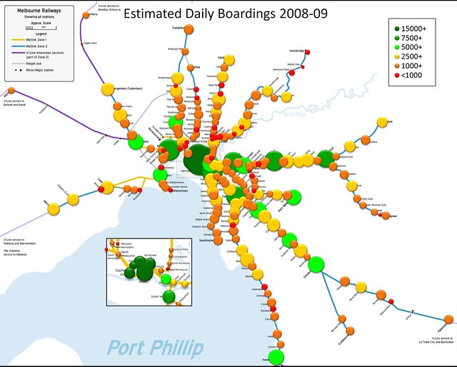
(Click to zoom)
The second version shows more clearly the relative numbers at each station:
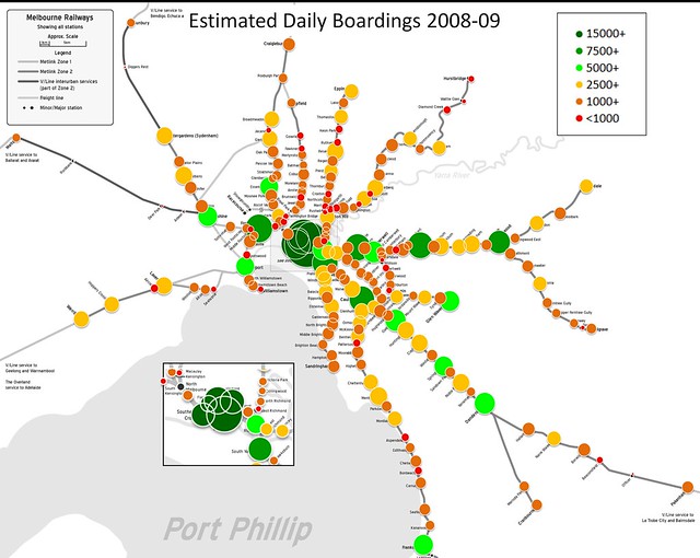
(Click to zoom)
Thanks Brendan!
Meanwhile, Alan Davies has also crunched the numbers and written a blog post pondering why some stations are busier than others.
12 replies on “Metro station patronage: the map version”
[…] how’s this for serendipity? Not long after I put up this post, Daniel Bowen posted a map of boardings by all stations prepared by one of his readers, Brendan […]
Woo! I’m sort of famous now!
I find it quite surprising that Brunswick Station has lower patronage than Royal Park station, zoo or not.
@Paul, the Sydney Rd tram line could have something to do with Brunswick’s lower than expected patronage.
I live near the Upfield train line / Sydney Rd spine, and given that the train and tram lines are only a couple of hundred metres apart, in theory I could catch either. In practice, I catch the tram much more often, even though it’s slower than the train, because (a) the No. 19 trams run more frequently than the Upfield trains – so frequently, in fact, that you often don’t need to bother looking at the timetable; (b) the peak hour trams are less likely than the trains to be so crowded that I can’t get on; and (c) they deliver me closer to my usual destinations: the university, RMH, or Carlton. I only bother catching the train if I’m travelling offpeak and my destination is right in the heart of the city, or if my trip involves changing to another train in the city.
I agree with Bonnie, it is because of the number 19 tram (I live near there too. *waves*). Train for city centre, tram for local areas and the university due to proximity at the destination and FREQUENCY.
I fail to see how the second version shows it “more clearly” than the first version.
@ enno, it’s not that much clearer (some station names are still hidden), but it’s markedly clearer if you download the image or click it. You will find they are better spaced, and more “letters” of the stations appear.
Great effort Brendan.
This map made me surprised the Frankston line doesn’t have as many commuters as I thought, or rather- as many daily boardings.
Other then that though- there is no major patterns of pattern of distribution! Gargh, I was hoping for a pattern :P
But I guess the stations with the most daily boardings tend to be junctions(Ringwood, Caulfield, Footscray, Dandenong) and on some occassions the terminus of the line (Glen Waverley and Frankston) well that’s because they are the retail hub in that area.
Some things I noticed…
Pretty easy to spot the biggest of the big stations by the big lumps they have on the maps.
It’s been said before that the Dandenong line has more patronage than the Frankston line – about double, and it’s easier to see on the map. A lot of that’s probably due to Dandenong having major destinations along its route (Oakleigh, Clayton, Springvale, Dandenong), whereas the Frankston line neatly bypasses Southland, and only has Frankston itself (shops plus major bus interchange). The Frankston line also has a bunch of stations close to the beach, almost halving the number of homes within walking distance.
The zone 1 boundary effect isn’t quite as pronounced as I thought it might be; for instance Brighton Beach gets less passengers than Hampton. That might be because those Z1 stations ultimately have limited parking available, so the demand might be high, but there’s only so many people who can drive to them. Ditto Laverton – it’s way busier than Aircraft, but almost on a par with Hoppers Crossing.
Patronage at Craigieburn and Roxburgh Park seems very healthy for stations only opened in 2007. Indicates the urban growth there occurred earlier and there was plenty of demand… so I’d expect to see the same happen at South Morang when it opens.
South Kensington has relatively low figures, but I wonder if that’s caused by the poor service they were getting up until May 2011 (every 20 minutes all day including peak — now it’s roughly doubled in frequency). Will be interesting to see if it grows now.
Oh, and someone should fix the source map in Wikipedia. There’s no such place as “La Trobe City”… suspect it was meant to be Valley.
Do you know how they collected the data?
If they were counting Metcard validations this could be causing quite large undercounting at some stations.
With Metcards people rarely re-validated tickets unless they had to. So, for example, outbound journeys from Huntingdale would probably be low – people from Monash with 2 hour tickets would validate on the bus, and people with dailys, weeklys, or monthlys wouldn’t validate at all. This would occur at places where the loadings were primarily going home (e.g. due to schools) and validation was not enforced by closed gates. Similarly, loadings at stations served by bus/tram lines could be also undercounted – people would validate on the bus going to the station and not re-validate on entering the station.
@Andrew, it was a combination of Metcard validations and manual surveys (“Origin Destination surveys”).
I think in terms of South Kensington, that station is relatively close to Kensington AND Footscray. If an individual is using any form of transport other than walking to get to their local station, it would be one of those two (bus routes pass through, more parking, etc)… The only ones going to South Kensington would be those walking to the station – the locals.
I had a go at calculating my line (Craigieburn) against another (Glen Waverley) just out of curiosity of which line has more commuters overall. By ignoring all stations where more than one line passes through, the Craigieburn line has an estimated 31,459 passengers per weekday. Dividing by the 14 stations (not counting Coolaroo) on that line, that’s an average of 2,247 passengers per station. Glen Waverley on the other hand (from Heyington onward) has an estimated 24,862, divided by the 12 stations on that portion of the line, is only 2,072… I also see a number of fare evaders along the Craigieburn line as there are quite a few stations with shopping centres nearby and many passengers travel the 1-4 stops to get there without validating.
I’ve always wondered what would change with the Upfield line patronage if they (finally) connected Upfield to Roxburgh Park (and therefore Craigieburn). I know a number of people who work around the Upfield line who live around Craigieburn, so surely that access would do something. It’d be interesting to see how many passengers from Roxburgh Park and Craigieburn would simply catch the first available train (assuming one would leave every 10 minutes with one going down through Upfield and the other it’s normal route) or would wait for a specific train.
Damo,
Why is Zone 2 not removed completely and why is it that people whom travel further by public transport into the city instead of clogging the roads with their cars are they punished at least $10 a day to come in and out of the city.
When do you believe public transport rationalization will be bought seriously into the carbon solution mix.
Sam sam the transport man