The Myki people finally posted some useful information on their web site, just days after the PTUA posted a Myki Q+A.
They’ve also posted this gem on the Myki web site: Under Maps / Metro trains, it purports to be a “Metro train zones” map.
What an utterly pointless creation. No reference point other than the bay. How does this help anybody at all?
(Stop press: I gave feedback to the TTA yesterday, and they appear to have already taken it offline.)
Mind you, it could be worse. Because it’s so uninformative, at least it’s not wrong.
Unlike this one, which appeared on stations in late-2003, and is riddled with errors:
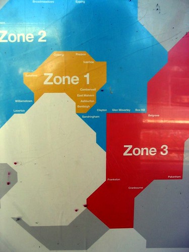
Apart from the fact that it’s severely not-to-scale (Box Hill is not next to Belgrave, and neither are Clayton, Glen Waverley and Box Hill all adjacent; Ashburton is actually north of East Malvern), it manages to put some places in the wrong zones: Williamstown is actually well within Zone 1, whereas Laverton, Sunshine and others are on the zone overlap.
In both of these cases, you really have to wonder: What were they thinking?
11 replies on “The most useless map ever”
[…] This post was mentioned on Twitter by Daniel Bowen, Stephen Rowley. Stephen Rowley said: RT @danielbowen Have the #Myki people provided the most utterly pointless map ever? http://tr.im/FBlX […]
It appears that the whole myki website is now down. What have you done Daniel ?
Indeed, WWTT.
Why is the regional blue space invader eating the urban yellow space invader?
Do Myki know something we don’t, is Melbourne under attack by giant freaking space invaders?
I particularly like how there’s absoluetly no sense of scale, if you tilt your head to the right a bit the blue area almost looks like a map of Australia itself.
Great to see we really got our billion plus dollars worth here.
i was on a tram yesterday and saw the top map – are you sure its new?
You’re right Matt – turns out it’s on the Metlink web site, however there it’s accompanied by a list of suburbs and which zone they’re in.
Mind you, it lists some suburbs as being in zone 1 which are actually in the zone overlap, so in that sense, it’s inaccurate, as anybody using it to calculate their fare from say Frankston to Bentleigh would get the wrong answer. The real train map is infinitely more useful.
What do you think of this map?
http://mikealex.com/images/metmap.gif
Regards,
Mike
Very London Underground, Mike! It’s certainly more informative, though perhaps a little complex for some punters. Nice to see something that covers more than one mode though.
What do you mean the map is hard to figure out- Zone 1 is the inner city, and Zone 2 is everything else!!!!!!!!!!!!!!!!
> perhaps a little complex for some punters
Well it’s a complicated system :-)
And you’re right – it is of course inspired by the London map. When I lived there and saw how useful their map was I always wondered “what if Melbourne had a similar map”. So I made one.
I stole their idea of distorting scale to make complex stuff bigger but still keeping relative positioning. I also focused on making it useful if you were using it while actually on a tram by incorporating most of the major twists and turns so that you can get your bearings. But I’ve had other feedback that it over-emphasises the tram network at the expense of trains because of that.
Not really sure how I could simplify it any further though.
Andrew, but apart from the fact that that’s not true (Burwood for instance is Z1, but not inner-city) how do you know that looking at it? You don’t. No points of reference. No point.
Mike, yeah, it certainly shows the connections well. I think that’s true, it probably does over-emphasise the trams; given trains are higher speed and higher capacity, it’d be nice to show them more clearly somehow.
Here is another of this type of map which over-complicates it (IMHO) by trying to include train stopping patterns, though I suppose there will be cases of people who are able to easily read and use such detail.